PHOTOS - Disney reveals new lobby design and Trader Sam's lounge for the Polynesian

Foolish Mortal

Well-Known Member
Did they do a nice job and it looks nice, yes. Overall I liked it better the other way. More open space and redistributed seating versus an awesome fountain, meh. Maybe if they had a statue of Don Ho coming out of the floor doing Hawaiin themed songs ????
 

DisneyJunkie

Well-Known Member
Looks very cheap, like crap, and an overall insult to those who've always loved the Poly as it was.

Before this make-over, I know I'd look forward to that first view of the waterfall as I walked into the lobby. Now there's nothing but tacky-looking red seats, stupid-looking multi-colored light orbs hanging overhead, and a complete lack of warmth and character.
 
Last edited:

Lee

Adventurer
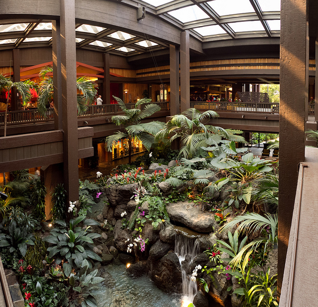
Any pics of the old lobby for a comparison?
Boom. For the win.
5823258394_87af1ce7c3_z.jpg
 

Next Big Thing

Well-Known Member
Boom. For the win.
5823258394_87af1ce7c3_z.jpg
That's great and really beautiful, but I still think the new lobby looks very nice. I never personally had a connection to the fountain, so it's not something that hurts me as much. I like the new look for the most part.

The only thing I really think was a questionable choice was the red/orange cushions. I mean really?
 

Rescue Ranger

Well-Known Member
I like it...but the water feature...(it is still a water feature isn't it?), looks ridiculous the way it is. If they do not add the Tiki person to it, it will be embarrassing to stay like that. They BETTER still add the TIKI!!!!
 

note2001

Well-Known Member
That's great and really beautiful, but I still think the new lobby looks very nice. I never personally had a connection to the fountain, so it's not something that hurts me as much. I like the new look for the most part.

The only thing I really think was a questionable choice was the red/orange cushions. I mean really?

They're trying to keep that 1971 feeling going. Apparently they felt more of a connection to Orange than to green. Oh, wait. ;)

From the ground floor the new layout looks okay, but I don't like the view from the second floor at all. Don't know why but I keep hearing the tune from Gilligan's island in my head when I see the lights from the second floor.
 

ford91exploder

Resident Curmudgeon
They're trying to keep that 1971 feeling going. Apparently they felt more of a connection to Orange than to green. Oh, wait. ;)

From the ground floor the new layout looks okay, but I don't like the view from the second floor at all. Don't know why but I keep hearing the tune from Gilligan's island in my head when I see the lights from the second floor.

Funny I hear a calliope - and then I think of the clowns in CP.
 

thehowiet

Wilson King of Prussia
Photo update as of Friday, Dec 19. Overnight, the Polynesian Village Resort lobby was completed and open to guests this morning. The curtains were gone overnight. New furniture, new rugs, new seating areas. Even the carpet on the lobby stairs to the second level was completely replaced. In these photos, the lobby floor is overly "blue", but in actual appearance it is more closely like the original stone around the center lobby.

View attachment 76948

View attachment 76949

View attachment 76950

View attachment 76951

On the second level, the waiting area for 'OHana's has new furniture and carpet to match the lower lobby.

View attachment 76952

Finally, the kid's TV area near the front door was being completed this morning, with all new furniture.
View attachment 76953

Yikes....Well, I guess that's one way to save on WDI design costs.

I wonder if they'll have binoculars so guests will be able to see the new water feature from the second floor.
 

SMRT-1Michael

Well-Known Member
No it does not, It looks like a Hampton Inn with some odd shaped lamps and yes I was there today, A complete and utter DEFURBISHMENT.

Oh boy. The one thing I hoped wouldn't be gone once the refurb was over. That and the Samoa Mickey, Minnie, Morty, and Ferdie statues that were on top of the shelves in Trader Jacks (now Moana Mercantile).... Shame. Was one of my favorite resorts since I was young.

This is kind of like the equivalent of them tearing out the Mary Blair mural in the Contemporary.
 

Register on WDWMAGIC. This sidebar will go away, and you'll see fewer ads.

Back
Top Bottom