NFL 2013 Discussion Thread

Lee

Adventurer
That means Ryan Fitzpatrick will get the start for the next three games presumably. They've got KC, Seattle and SF in those three games. Yikes if you're a Titans fan! :eek:
I see us beating KC at home. Seattle....could get ugly. SF...not the same team as last year, we can take them at our house.
 

flynnibus

Premium Member
gah! this week's picks don't get any easier...

bills/browns - I think the bills will screw up more
saints/bears - its still jay cutler.. so I'm thinking saints
bengals/patriots - there are a lot of people picking bengals.. but I've been burnt picking against brady
chiefs/titans - who is for real in this one?
seattle/colts - colts strong enough for an upset?
eagles/giants - can the giants REALLY goto 0-5? that's hard to fathom...
carolina/arizona - just ugh...
texas/sanfran - who plays up to their potential?
 

PUSH

Well-Known Member
Original Poster
I've just gotta vent something here.

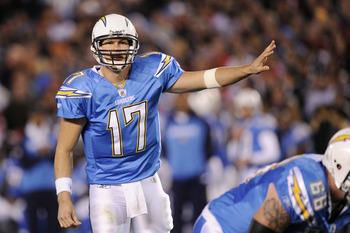
I really dislike the yellow outlines of the names on the back of the Chargers' jerseys. It looks stupid. They are getting farther and farther away from the greatness that was the powder blue jerseys. If they used their current design (sans the yellow outline) with the powder blue instead of the dark blue... perfect uniforms.

And that concludes my uniform critique.
 

jw24

Well-Known Member
Speaking of jerseys, I'm still adjusting to Miami's new look that I saw on MNF. I don't know. I don't think it's particularly bad but at the same time, I saw no need to change their look and logo. Also, it's that time of year were you see pink on everything the NFL players and coaches wear because October is Breast Cancer Awareness month.
 

PUSH

Well-Known Member
Original Poster
I'm not sure about the Dolphins new look either. The only problem I had with their old uniforms was the numbers. I just didn't like the outline (me and outlines...). And the Jaguars new uniforms are just brutal to look at. Kind of like their play.

And I really like how they do the Breast Cancer Awareness thing, but it's odd to look at players wearing pink on the field. And in Madden 25 they announce in the game that "A lot of players and coaches will be wearing pink this month to support breast cancer awareness" every three minutes - literally.
 

jw24

Well-Known Member
Have to agree about Jacksonville's new look. I prefer their original look during the Mark Brunell-Fred Taylor days. Minnesota's new look is probably the best one out of the teams that redesigned their unis. I mean, the previous ones they had with the purple and white panels, yeah, I wasn't a fan of that....
 

PUSH

Well-Known Member
Original Poster
I don't care for Minnesota's new uniforms. I wish they'd go back to the earlier days when they wore these.

favre.jpg

This was a throwback day, by the way. These uniforms weren't the main ones during the Favre era.

And I also hate the Seahawks' current uniforms. I've never liked any of the Seahawks' uniforms to be honest. Why can't teams go back to the simpler days? Why do all the uniforms have to be fancy and have weird design elements. The best uniforms are simple.
 

jw24

Well-Known Member
I don't care for Minnesota's new uniforms. I wish they'd go back to the earlier days when they wore these.

favre.jpg

This was a throwback day, by the way. These uniforms weren't the main ones during the Favre era.

And I also hate the Seahawks' current uniforms. I've never liked any of the Seahawks' uniforms to be honest. Why can't teams go back to the simpler days? Why do all the uniforms have to be fancy and have weird design elements. The best uniforms are simple.

Those throwbacks for the Vikes were pretty neat. Probably the best ones the Vikings ever wore. As for Seattle, well, the look is very similar to what the Oregon Ducks wear during their football games although they don't have quite the number of uniform combinations as the Ducks do. As long as they never wear neon green ever again, I have no problem with the Seahawks unis.

I do agree the best jerseys are the most simple ones. I've always liked Green Bay's unis the most. Simple and not overdone. Speaking of which, I found a really neat site that has all the history of the NFL jerseys: http://www.gridiron-uniforms.com/
 

PUSH

Well-Known Member
Original Poster
Those throwbacks for the Vikes were pretty neat. Probably the best ones the Vikings ever wore. As for Seattle, well, the look is very similar to what the Oregon Ducks wear during their football games although they don't have quite the number of uniform combinations as the Ducks do. As long as they never wear neon green ever again, I have no problem with the Seahawks unis.

I do agree the best jerseys are the most simple ones. I've always liked Green Bay's unis the most. Simple and not overdone. Speaking of which, I found a really neat site that has all the history of the NFL jerseys: http://www.gridiron-uniforms.com/
My favorites consist of these:

Packers, Chargers throwback, blue and white Rams, Falcons throwback, and Cowboys Thanksgiving Day.

I'm probably missing some, but I really like all of those. And I'll admit that the Bears' uniforms are pretty good, too.
 

PUSH

Well-Known Member
Original Poster
I'm sorry, but how can you not like these?

107812935_display_image.jpg


(Sorry, that's enough uniform pictures for now. I've just been Googling NFL uniforms. :oops:)
 

flynnibus

Premium Member
The Lions just have weird patches of dark blue everywhere. It doesn't make sense.

They all do.. its different material in the armpits.. across the belly... etc. Its supposed to be tighter fitting, but still offer the flexibility. But I think the chose to make the material look different on purpose to draw attention to the fact its not just 'all one piece' and in turn they make it look stupid out on the field.
 

jw24

Well-Known Member
For me, my top five jerseys based on aesthetics alone would be: Green Bay, Indianapolis, San Francisco, Pittsburgh and a 5th place tie between Kansas City and Oakland. Although I have to admit, the unis that Dallas wears are pretty sharp.
 

PUSH

Well-Known Member
Original Poster
They all do.. its different material in the armpits.. across the belly... etc. Its supposed to be tighter fitting, but still offer the flexibility. But I think the chose to make the material look different on purpose to draw attention to the fact its not just 'all one piece' and in turn they make it look stupid out on the field.
I've never noticed it on the Packers...

Rodgers1.jpg


I think team could've opted out of the Nike technology when they made the switch from Reebok. Because the Packers didn't want anything about their uniform changed.
 

jw24

Well-Known Member
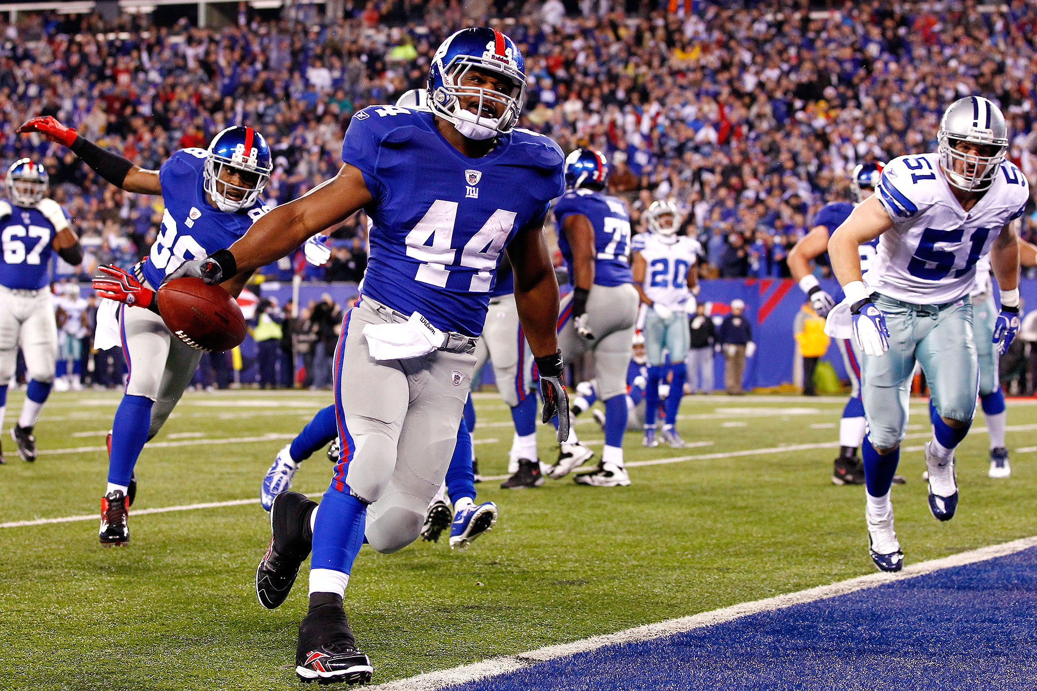
According to Fanatics: "The new Nike NFL Jersey is approximately 20-30% lighter than the old Reebok one while boasting added functionality like flywire technology in the collar for a better fit, stretch twill numbers, zoned mesh ventilation and customizable base layer padding. All of these improvements add up to a more comfortable uniform that fits each player's needs."

Reebok:
nfl_giants_02.jpg


Nike:
giants-cowboys-football.jpeg10-1280x960.jpg
 

Register on WDWMAGIC. This sidebar will go away, and you'll see fewer ads.

Back
Top Bottom