NickMaio
Well-Known Member
I ADORE the second pic of SE - - - - So awesome!!!But often less is more.
Which one looks more Disney and which one actually looks better?


I ADORE the second pic of SE - - - - So awesome!!!But often less is more.
Which one looks more Disney and which one actually looks better?


Well, except that it's (a) at the bridge going into Tomorrowland, and (b) crowned with the word "Tomorrowland."Nothing about it says Disney or themed, or Tomorrowland.
It says tommorrowland so tiny most people won't even notice.Well, except that it's (a) at the bridge going into Tomorrowland, and (b) crowned with the word "Tomorrowland."
Have you seen it in person? I won't judge it by its size until my eyes behold it. I did like the old one though. I guess I'll form an opinion when I actually see it, but from pics I prefer the old one.For starters, who approved the teensy-tiny letters you can barely read?
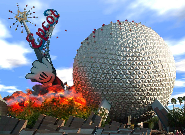
Meh...everything at Disney is not supposed to be over-the-top. It wasn’t treated as Vegas until the cardboard wand was slapped on the side of SSE. Before that, Disney was known for its expert theming that went just to the right point before exercising restraint—if you ignore temporary special events like the Castle Cake.The old one looked like Disney this looks like something unfinished that a second grader came up with, it has no theme just blah and boring and just might as well not be there because no one will even notice it. This is supposed to be Disney where everything is over the top.
I'm not a fan of the idea that Disney's new treatment for Tomorrowland is to pull it back into the 70's . . . however, this is a MUCH more beautiful and unified vision than they seem to actually be going for at the moment. I'd take it.
But often less is more.
Which one looks more Disney and which one actually looks better?


If I lived the rest of my life without ever having to see this or the birthday cake castle again, that would be great.Never show that....that thing again....

Register on WDWMAGIC. This sidebar will go away, and you'll see fewer ads.
