-
Welcome to the WDWMAGIC.COM Forums!
Please take a look around, and feel free to sign up and join the community.
You are using an out of date browser. It may not display this or other websites correctly.
You should upgrade or use an alternative browser.
You should upgrade or use an alternative browser.
New gastropub to replace Captain's Grille at Disney's Yacht Club
- Thread starter wdwmagic
- Start date
Horizons '83
Well-Known Member
- In the Parks
- No
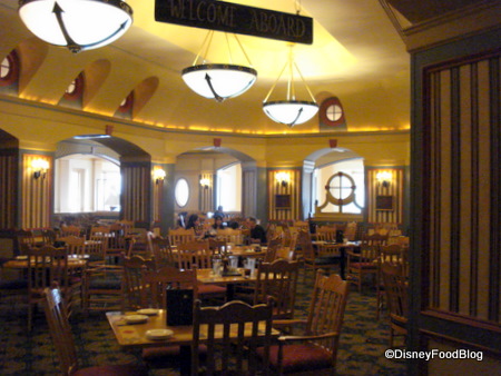
While agree the concept art leans it being pretty bland, this place just needed a huge face lift. Something about Captains Grill was dark and drab to me:wow more of the most generic and non-descript interiors on property....

surfsupdon
Well-Known Member
I still hope for some name changes. It's 3 Ale & Compass names. Just sounds redundantly excessive. Ha
Flynnwriter
Well-Known Member
Oh No! It looks like the design team of Drab, Dark & Dummy got hired to ruin this restaurant also! What is happening at the yacht club? Did they hire a design firm that hates Disney and loves trendy 2015? This is already laughable...and sad for the resort and Disney World. Disney Resorts tell stories and immerse guests in places that don't take their ques from the outside world, namely Hyatt Hotels in Kansas City.
Flynnwriter
Well-Known Member
This place was originally bright and nautical, until the last paint scheme went drab tan and sad blue. I presume the same lame designer who did the same to the Beach Club Lobby.While agree the concept art leans it being pretty bland, this place just needed a huge face lift. Something about Captains Grill was dark and drab to me:

Flynnwriter
Well-Known Member
Agree! This is really getting to be a bad trend on property. Who is in charge of Resort Design?wow more of the most generic and non-descript interiors on property....
NiarrNDisney
Well-Known Member
Jeesh so many negative opinions being voiced over something that has not even opened yet.
Can we attempt to be a little more positive? At least save the doom and gloom until the place opens and then once its been seen in its finished state give an opinion.
Can we attempt to be a little more positive? At least save the doom and gloom until the place opens and then once its been seen in its finished state give an opinion.
Flynnwriter
Well-Known Member
First, it’s being insightful and critical. It also comes from experices in interior design. When a concept image looks that amateurish and bad, it is usually a really good indicator that the project is headed the way of the yacht club store. Maybe we should express concern and critical insight before bad things are built since things rarely change once open.Jeesh so many negative opinions being voiced over something that has not even opened yet.
Can we attempt to be a little more positive? At least save the doom and gloom until the place opens and then once its been seen in its finished state give an opinion.
NiarrNDisney
Well-Known Member
First, it’s being insightful and critical. It also comes from experices in interior design. When a concept image looks that amateurish and bad, it is usually a really good indicator that the project is headed the way of the yacht club store. Maybe we should express concern and critical insight before bad things are built since things rarely change once open.
Insightful? Ugh / Critical? Yes
I honestly do not see how negative comments shared on a Fan Forum would sway the designers in any way to change their plans nor how they serve in any capacity at all except to put a dark cloud over those who are optimistic and excited to see new things coming to the World. Personally I think the concept art is bleak at most and really doesn't show enough detail to really grasp what the future restaurant will look like. You never know you may be surprisingly surprised at the finished product and if not you don't have to patronize the establishment.
Last edited:
Someone else coined the term "the commoditization of WaltDisney World."Recent restaurant additions (Geyser Point, Market Ale and Compass) along with the concept art lead me to believe it'll be charmless, unthemed, and weirdly reminiscent of an airport bar and grill. I know they are well-intentioned and that the place could use a fixer upper, but these renovations are generic beyond belief. I feel like the recent initiative to update the resorts loses sight of what makes them friendly and unique. We'll see I guess.
Did WDW hire UCF to redecorate the Values?Seriously. Have you seen what they did to the Pop Century rooms?

Bocabear
Well-Known Member
I have yet to be "surpisingly surprised"...just more and more disappointed as beautiful custom interiors are torn out and dumbed down to common place fixtures and drab Marriott style design...instead of the old Disney standard of unique placemaking design.... So yeah, I will critique until I see them release concept art that actually looks like an improvement over a defurbishment....Insightful? Ugh / Critical? Yes
I honestly do not see how negative comments shared on a Fan Forum would sway the designers in any way to change their plans nor how they serve in any capacity at all except to put a dark cloud over those who are optimistic and excited to see new things coming to the World. Personally I think the concept art is bleak at most and really doesn't show enough detail to really grasp what the future restaurant will look like. You never know you may be surprisingly surprised at the finished product and if not you don't have to patronize the establishment.
We are being positive. We're positive we're going to hate this place.Can we attempt to be a little more positive?
Flynnwriter
Well-Known Member
When someone shows you concept art that looks like a Greek tragedy, believe them.Amazing.
5 sentences of an article...a couple of frames of concept art.....and some geniuses have already come to the conclusion that it's terrible.
Brilliant! Glad I'm not taking advice from any of you seriously for my vacation plans.
ford91exploder
Resident Curmudgeon
Agree! This is really getting to be a bad trend on property. Who is in charge of Resort Design?
The guy with the green eyeshade down in cost accounting.
ford91exploder
Resident Curmudgeon
wow more of the most generic and non-descript interiors on property....
My local hospital cafeteria has more character than this effort by the accounting department at Disney
ford91exploder
Resident Curmudgeon
Did WDW hire UCF to redecorate the Values?
Holy crap my college dorm room had more character and that was before we moved in.
NiarrNDisney
Well-Known Member
Well as I said if it turns out to be a huge disappointment (to you) then don't patronize it! Simple as that.I have yet to be "surpisingly surprised"...just more and more disappointed as beautiful custom interiors are torn out and dumbed down to common place fixtures and drab Marriott style design...instead of the old Disney standard of unique placemaking design.... So yeah, I will critique until I see them release concept art that actually looks like an improvement over a defurbishment....
Register on WDWMAGIC. This sidebar will go away, and you'll see fewer ads.
