It's been a while since I did any armchair imagineering, but since it's the 20th anniversary of this forum, I decided to do a little creative writing.
How do you solve such a problematic conundrum like Tomorrowland? The problem child of Disneyland since inception, we all know its muddled history; a land that always seems to be outdated as it keeps trying to predict the future. Disneyland’s own land has had this problem, to the point Imagineers just gave up after 1994 plans were cut to pieces, leaving it a mishmash of broken themes, broken attractions, no overall theme, too much Star Wars, the People Mover tracks have remained there since the Rocket Rods were scrapped nearly 20 years ago, and the whole land feels uncared for in comparison to the other, finer detailed, thematically unified lands. If you go into any other part of Disneyland, do you feel a sense of inadequacy as you do in Tomorrowland?
The initial message of Tomorrowland was the optimism and potential of the future, the limitless freedoms that tomorrow can bring. There’s a great, big beautiful tomorrow just a dream away. That has been lost in the current land’s design, a cramped, disjointed mess in all levels. Yeah, it has Space Mountain, Buzz Lightyear, and Star Tours, but what else is there? How do they all connect to one another beyond being set in space and from the sci-fi genre. There is no sense of futurism here, but more, as the other Tomorrowlands have suffered, as a dumping ground for sci-fi brands before Star Wars eventually takes over everything. With Galaxy’s Edge, there is no need for Star Wars in Tomorrowland, including Star Tours.
Other issues include the use of space, cramped pathways that lead to a lot of bottlenecking, the daft placement of Astro Orbitor at the very front of the entrance, empty buildings, the exposed show buildings, a lack of shade, greenery, and water features, the rather flimsy path that runs past the Matterhorn that exposes the backside of Buzz’s show building, and the question of what to do with Autopia.
For a land that is meant to be about tomorrow, it is still very much stuck in the past. Autopia is likely only still around due to financial reasons, and because it is nostalgic; the last opening day attraction and a park of Walt Disney’s original park. But, it takes up way too much room, so much so that an entirely new land or an expansion could be put in its place. Plus, Star Wars takes place “a long time ago”, Toy Story is in the present, and even the architecture is old and long outdated. And what the heck does Finding Nemo have to do with the future? There’s some great irony to Tomorrowland being stuck in yesterday, an issue it has long struggled to overcome.
So, here’s my attempt at fixing Tomorrowland from the ground up.

AESTHETICS
The key themes of Tomorrowland should be a sense of optimism for the future, and how the development of new technologies can benefit mankind and the world. The dream of space travel remains a prominent vision of the future, but so does more modern ideas like eco friendly tech through transport, housing, and healthcare. There are new innovations in technology to explore and celebrate, though such ideas would not completely consume the land’s experience. Though there would be a sense of realism in Tomorrowland, it would not lose the magic and imagination that is expected of the other park as a whole.
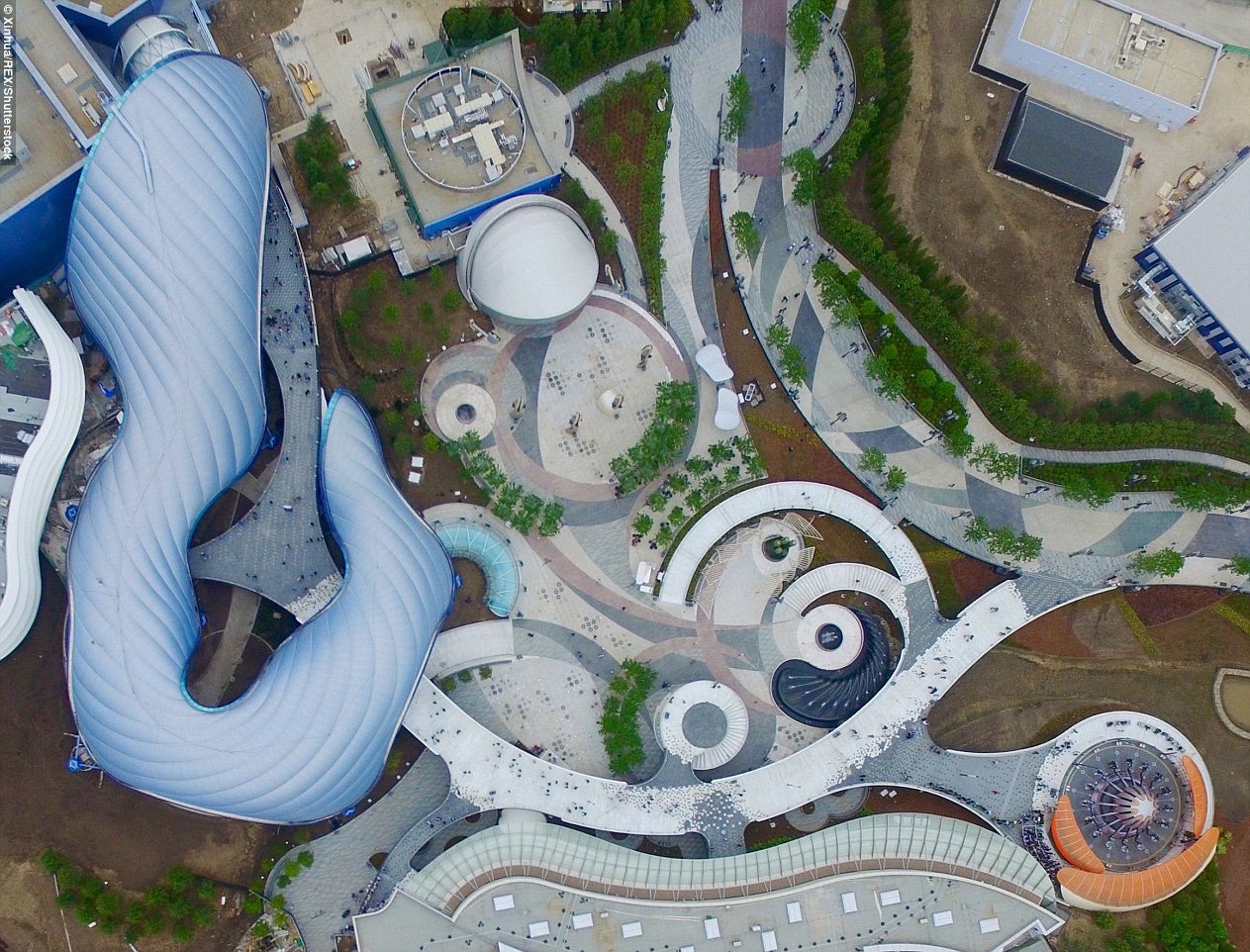
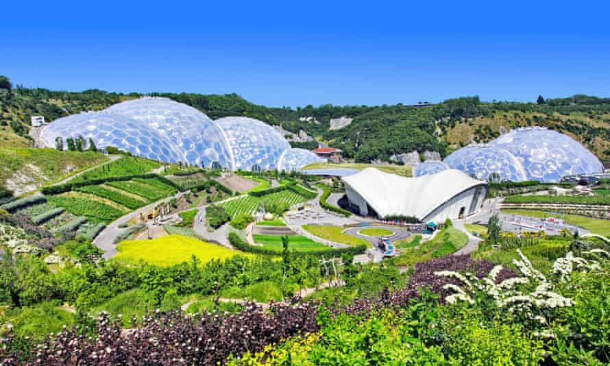
For starters, the primarily inspirations behind Tomorrowland’s new look and layout would be from Shanghai Disneyland’s version, and from eco friendly, futuristic architecture seen in Singapore, which heavily features an abundance of greenery, blending trees amongst the buildings to create a more environmental and warm community. This ties in neatly to one of Tomorrowland’s few positives. All of the land’s plants are homegrown, and include fruits and vegetables, which are sold within the park. This seems like a great root to be the basis of Tomorrowland. In a time where the landscape is being bulldozed for more ugly and identical housing blocks, creating a welcoming landscape where the architecture appears to have been built either around the trees or incorporated them into the planning process feels much more inviting and a little wondrous. A world of techno-organic possibilities.

Similar to Shanghai’s Tomorrowland, this upgrade will introduce raised walkways and multiples levels, allowing multistorey show buildings that blend in with the landscaping, using the foliage and unique designs to make the surroundings look inviting rather than ugly. The entryway will be wide and spacious with the removal of Astro Orbitor and the old People Mover tracks. The addition of the new levels and curving pathways avoids bottlenecking, as well as making the land and attractions more accessible for the disabled, prams, mobility scooters, etc., makes queue lines nicer, and some more flavoured visuals.
Story wise, Tomorrowland draws inspiration from Brad Bird’s flawed but mesmerising film of the same name, where brilliant minds pooled their resources and imaginations together to create a cityscape that benefits the world, jetpacks and all. I believe each Tomorrowland should be different and tell their own stories of the future. Disneyland’s tells one of endless possibilities where are realised and futurist optimism thrive.
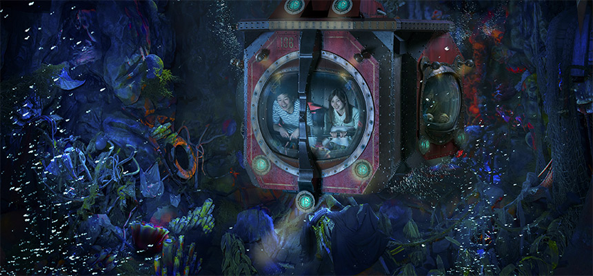
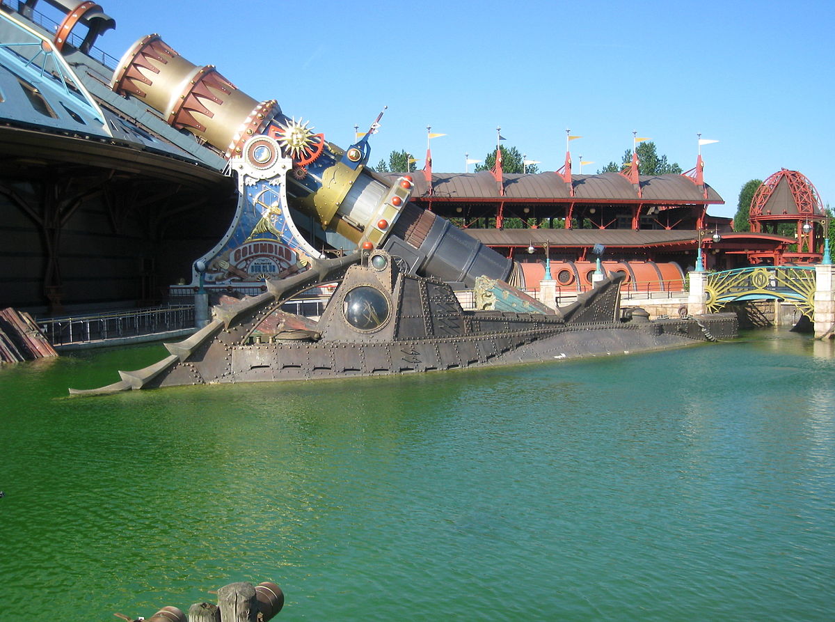
Tomorrowland is split between three different zones, the Innovation Hub, the Transportation Hub, and the New Frontiers Hub that is centred around space travel, with Space Mountain at its centre. If you are wondering about Autopia, that is removed entirely, and the Submarines would either be repurposed or removed. The Monorail will also be re-routed out of Fantasyland and restricted to the edge of Tomorrowland, looping back around.
The bare bones route between the back of Buzz Lightyear and the Matterhorn would undergo a more magical transformation. Not much can be done to widen it, but the rear of Buzz Lightyear can be covered by mountain rockwork, with carvings and cave paintings depicting the Abominable Snowman that dwells within the mountain peak. Other alterations could be made to make the path wider and more accommodating for the guests in the Matterhorn’s queue line. New alcoves would be built to allow guests some much needed shade – speaking of which, the presence of the new green-themed setting would allow for some natural shaded areas, as well as the introduction of park benches, dancing water fountains, and a collection of small waterways that descend down through negative-edged basins to the entryway and join the pools around Pixie Hollow.
How do you solve such a problematic conundrum like Tomorrowland? The problem child of Disneyland since inception, we all know its muddled history; a land that always seems to be outdated as it keeps trying to predict the future. Disneyland’s own land has had this problem, to the point Imagineers just gave up after 1994 plans were cut to pieces, leaving it a mishmash of broken themes, broken attractions, no overall theme, too much Star Wars, the People Mover tracks have remained there since the Rocket Rods were scrapped nearly 20 years ago, and the whole land feels uncared for in comparison to the other, finer detailed, thematically unified lands. If you go into any other part of Disneyland, do you feel a sense of inadequacy as you do in Tomorrowland?
The initial message of Tomorrowland was the optimism and potential of the future, the limitless freedoms that tomorrow can bring. There’s a great, big beautiful tomorrow just a dream away. That has been lost in the current land’s design, a cramped, disjointed mess in all levels. Yeah, it has Space Mountain, Buzz Lightyear, and Star Tours, but what else is there? How do they all connect to one another beyond being set in space and from the sci-fi genre. There is no sense of futurism here, but more, as the other Tomorrowlands have suffered, as a dumping ground for sci-fi brands before Star Wars eventually takes over everything. With Galaxy’s Edge, there is no need for Star Wars in Tomorrowland, including Star Tours.
Other issues include the use of space, cramped pathways that lead to a lot of bottlenecking, the daft placement of Astro Orbitor at the very front of the entrance, empty buildings, the exposed show buildings, a lack of shade, greenery, and water features, the rather flimsy path that runs past the Matterhorn that exposes the backside of Buzz’s show building, and the question of what to do with Autopia.
For a land that is meant to be about tomorrow, it is still very much stuck in the past. Autopia is likely only still around due to financial reasons, and because it is nostalgic; the last opening day attraction and a park of Walt Disney’s original park. But, it takes up way too much room, so much so that an entirely new land or an expansion could be put in its place. Plus, Star Wars takes place “a long time ago”, Toy Story is in the present, and even the architecture is old and long outdated. And what the heck does Finding Nemo have to do with the future? There’s some great irony to Tomorrowland being stuck in yesterday, an issue it has long struggled to overcome.
So, here’s my attempt at fixing Tomorrowland from the ground up.

AESTHETICS
The key themes of Tomorrowland should be a sense of optimism for the future, and how the development of new technologies can benefit mankind and the world. The dream of space travel remains a prominent vision of the future, but so does more modern ideas like eco friendly tech through transport, housing, and healthcare. There are new innovations in technology to explore and celebrate, though such ideas would not completely consume the land’s experience. Though there would be a sense of realism in Tomorrowland, it would not lose the magic and imagination that is expected of the other park as a whole.
For starters, the primarily inspirations behind Tomorrowland’s new look and layout would be from Shanghai Disneyland’s version, and from eco friendly, futuristic architecture seen in Singapore, which heavily features an abundance of greenery, blending trees amongst the buildings to create a more environmental and warm community. This ties in neatly to one of Tomorrowland’s few positives. All of the land’s plants are homegrown, and include fruits and vegetables, which are sold within the park. This seems like a great root to be the basis of Tomorrowland. In a time where the landscape is being bulldozed for more ugly and identical housing blocks, creating a welcoming landscape where the architecture appears to have been built either around the trees or incorporated them into the planning process feels much more inviting and a little wondrous. A world of techno-organic possibilities.

Similar to Shanghai’s Tomorrowland, this upgrade will introduce raised walkways and multiples levels, allowing multistorey show buildings that blend in with the landscaping, using the foliage and unique designs to make the surroundings look inviting rather than ugly. The entryway will be wide and spacious with the removal of Astro Orbitor and the old People Mover tracks. The addition of the new levels and curving pathways avoids bottlenecking, as well as making the land and attractions more accessible for the disabled, prams, mobility scooters, etc., makes queue lines nicer, and some more flavoured visuals.
Story wise, Tomorrowland draws inspiration from Brad Bird’s flawed but mesmerising film of the same name, where brilliant minds pooled their resources and imaginations together to create a cityscape that benefits the world, jetpacks and all. I believe each Tomorrowland should be different and tell their own stories of the future. Disneyland’s tells one of endless possibilities where are realised and futurist optimism thrive.
Tomorrowland is split between three different zones, the Innovation Hub, the Transportation Hub, and the New Frontiers Hub that is centred around space travel, with Space Mountain at its centre. If you are wondering about Autopia, that is removed entirely, and the Submarines would either be repurposed or removed. The Monorail will also be re-routed out of Fantasyland and restricted to the edge of Tomorrowland, looping back around.
The bare bones route between the back of Buzz Lightyear and the Matterhorn would undergo a more magical transformation. Not much can be done to widen it, but the rear of Buzz Lightyear can be covered by mountain rockwork, with carvings and cave paintings depicting the Abominable Snowman that dwells within the mountain peak. Other alterations could be made to make the path wider and more accommodating for the guests in the Matterhorn’s queue line. New alcoves would be built to allow guests some much needed shade – speaking of which, the presence of the new green-themed setting would allow for some natural shaded areas, as well as the introduction of park benches, dancing water fountains, and a collection of small waterways that descend down through negative-edged basins to the entryway and join the pools around Pixie Hollow.


