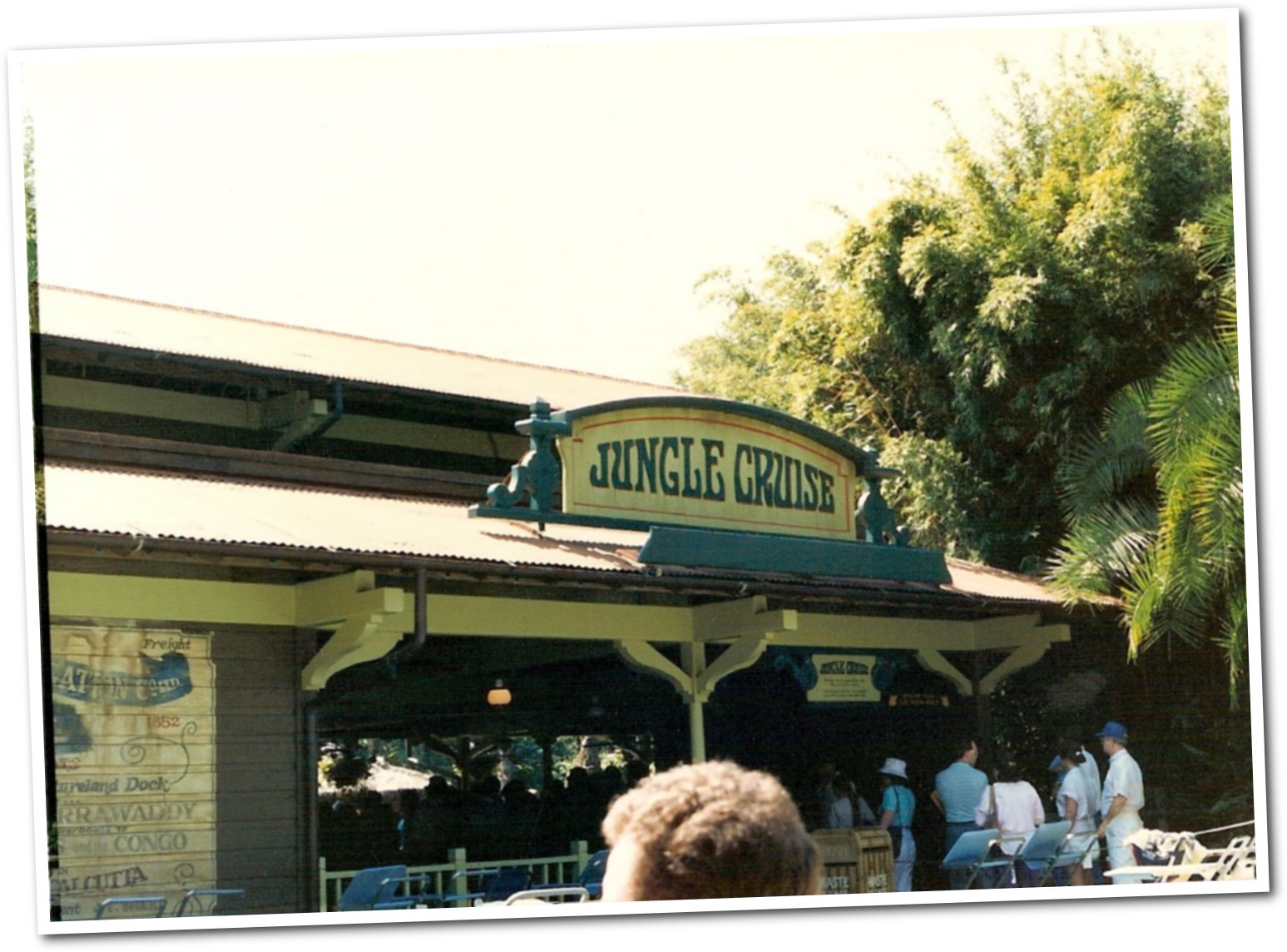
Jungle Cruise Re-Imagining

Incomudro

Well-Known Member
I would hope the mouse's inclusion-keteers would understand why Everest is untouchable and that it features real cooperation with international artists. Heck, WDI could work with and commission Polynesian and African artists if they wanted to replace the "appropriated" pieces in Adventureland with real authentic artworks and props. But that costs $$$$.... It's just sad because we are adventuring into places that are inhabited by people! Something is truly lost in the story here. Rather than taking an opportunity to re-tool or "correct" it, they're stripping the feeling of the space away all together...
Excellent post.
 

Phil12

Well-Known Member
I would hope the mouse's inclusion-keteers would understand why Everest is untouchable and that it features real cooperation with international artists. Heck, WDI could work with and commission Polynesian and African artists if they wanted to replace the "appropriated" pieces in Adventureland with real authentic artworks and props. But that costs $$$$.... It's just sad because we are adventuring into places that are inhabited by people! Something is truly lost in the story here. Rather than taking an opportunity to re-tool or "correct" it, they're stripping the feeling of the space away all together...
Some folks don't think the removal of crass racial stereotypes is a good thing. They've grown up seeing such depictions and see nothing wrong since they have always accepted such portrayals as normal. In some cases, major changes must be made. In other cases entire attractions must be re-themed. Therefore, it's obvious that some people are angered by these changes and truly think that the changes are unneeded. For them, it's just a case of political correctness that has gone too far.

However, TWDC understands that these changes must be made. In a few years people will look back upon these times and wonder why it took Disney so long to make the changes. Just as now people look back and wonder why it took Disney so long to ban smoking in all the parks. We all know that smoking it bad for everyone and there is no reason to allow such behavior within the parks. And we all know that racial stereotypes are bad and there is no reason for Disney to have such in any of the attractions.


Incomudro

Well-Known Member
Some folks don't think the removal of crass racial stereotypes is a good thing. They've grown up seeing such depictions and see nothing wrong since they have always accepted such portrayals as normal. In some cases, major changes must be made. In other cases entire attractions must be re-themed. Therefore, it's obvious that some people are angered by these changes and truly think that the changes are unneeded. For them, it's just a case of political correctness that has gone too far.

However, TWDC understands that these changes must be made. In a few years people will look back upon these times and wonder why it took Disney so long to make the changes. Just as now people look back and wonder why it took Disney so long to ban smoking in all the parks. We all know that smoking it bad for everyone and there is no reason to allow such behavior within the parks. And we all know that racial stereotypes are bad and there is no reason for Disney to have such in any of the attractions.


A sign for a boat company that utilized local decor is not crass racial stereotyping.
It's what such a place would do - gather local artifacts.
 

celluloid

Well-Known Member
Did the original Imagineers get it wrong in your opinion? Are spears really that critical to the experience given that they weren’t even included in the first design?

That has nothing to do with the argument. What is being said is the new signage is not of the same tone as the attraction currently is.

Besides, it is well known originally WED and Walt did have it wrong, because the Jungle Cruise was not growing in popularity until that salvage theming and humor came in.
 

No Name

Well-Known Member
And?

I'm a sign-maker. Giving a critique of a sign.

Whether or not it was the same before is irrelevant.

ETA: I take back the irrelevant part. That it was the same before makes the re-do worse.
You clearly seemed unaware of this because once you were told that the positioning was the same, you shifted your criticism to the frame, which is also the same. But yes, the criticism itself still stands and I didn’t intend to imply otherwise.
 

ImperfectPixie

Well-Known Member
You clearly seemed unaware of this because once you were told that the positioning was the same, you shifted your criticism to the frame, which is also the same. But yes, the criticism itself still stands and I didn’t intend to imply otherwise.
I WAS unaware of it - and wasn't trying to hide that. Sorry if it seemed like I was.
 

celluloid

Well-Known Member
There was one sentence in the beginning of the show that mention changes for cultural sensitivity and that was it.
And they showed the circle dancing Natives as if they were still a part of the attraction.

Also, some extremists will still have gripes with the way the Marc Davis Clip was narrated "At the time were not inappropriate" or something akin to that.

Now people love saying "It was wrong then and it was wrong now." so the official company stance is still not what a lot of the people wanting things changed want to hear.

As for the spears and such:

I never had an issue with offending headhunters. The same way I never rode The Great Movie ride and worried about offending gangsters or bandits.

As said, the sign is just not that well done with the oars and the "bite" It would be more fitting in a squinch and stretch land like Toontown or Toon Lagoon, but it does not fit the surreal caricature of the attraction.
 

LittleBuford

Well-Known Member
That has nothing to do with the argument. What is being said is the new signage is not of the same tone as the attraction currently is.

Besides, it is well known originally WED and Walt did have it wrong, because the Jungle Cruise was not growing in popularity until that salvage theming and humor came in.
The sign I'm referring to is that originally designed for the Magic Kingdom version of the ride, which featured humour and "savage theming" from the start.

To my mind, the new design works well and fits the tone of the attraction. It is thematically and aesthetically consistent with the existing signage (except, perhaps, for the bite, which is a little cartoonish for my liking):

659d5f1a0bdca41471cd2907f8223043.jpg
 

celluloid

Well-Known Member
The sign I'm referring to is that originally designed for the Magic Kingdom version of the ride, which featured humour and "savage theming" from the start.

To my mind, the new design works well and fits the tone of the attraction. It is thematically and aesthetically consistent with the existing signage (except, perhaps, for the bite, which is a little cartoonish for my liking):

659d5f1a0bdca41471cd2907f8223043.jpg

Yeah, I think we agree there. That is my main point. The sign's props and how they are rpesented(which is a part of the signage at that point) are not properly weathered and the bite is cartoonish. It is a tour company without the best ethics and optics in a nutshell. That has been the WDW joke since it started. Sometimes subvert and sometimes over the top overtly.
 

UNCgolf

Well-Known Member
The sign I'm referring to is that originally designed for the Magic Kingdom version of the ride, which featured humour and "savage theming" from the start.

To my mind, the new design works well and fits the tone of the attraction. It is thematically and aesthetically consistent with the existing signage (except, perhaps, for the bite, which is a little cartoonish for my liking):

659d5f1a0bdca41471cd2907f8223043.jpg

So wait, where did this picture come from? Is this part of the current signage?

I wouldn't think it was original due to the "don't video record" part of the message.
 

LittleBuford

Well-Known Member
So wait, where did this picture come from? Is this part of the current signage?

I wouldn't think it was original due to the "don't video record" part of the message.
I'm not sure when the reference to videotaping was added, but you can see that a version of the sign has been there for some time (and perhaps from the start). It's visible in the picture I shared a few pages back:

1985_JC_entrance.jpg
 

UNCgolf

Well-Known Member
I'm not sure when the reference to videotaping was added, but you can see that a version of the sign has been there for some time. It's visible in the picture I shared a few pages back:

1985_JC_entrance.jpg

I was just curious because I really like it. I hope it's still part of the current attraction. Might need a bit more weathering, but the overall style is exactly right.

Interestingly, the older photo you posted above has 1852 instead of 1911. I wonder why they decided to change the date.

I've never paid much attention to the Jungle Cruise signage etc. because I've never really enjoyed it. Always felt like a relic that should be replaced to me, especially with the existence of Animal Kingdom. The jokes/puns do not work for me.
 
Last edited:

Sharon&Susan

Well-Known Member
I'm not sure when the reference to videotaping was added, but you can see that a version of the sign has been there for some time. It's visible in the picture I shared a few pages back:

1985_JC_entrance.jpg
Interesting that they changed the establishment date for JC from 1852 to 1911. Guessing it must've been changed in the mid 90's when both the DL and MK version of the JC received a solidified time period of the 1930's. Not sure why though.
 

LittleBuford

Well-Known Member
Interestingly, the older photo you posted above has 1852 instead of 1911. I wonder why they decided to change the date.
Interesting that they changed the establishment date for JC from 1852 to 1911. Guessing it must've been changed in the mid 90's when both the DL and MK version of the JC received a solidified time period of the 1930's. Not sure why though.
An early twentieth-century date makes more sense to me. The mid-nineteenth century seems a little too early for such tours (even allowing for the fact that the whole thing is highly fictionalised).
 

UNCgolf

Well-Known Member
An early twentieth-century date makes more sense to me. The mid-nineteenth century seems a little too early for such tours (even allowing for the fact that the whole thing is highly fictionalised).

From a historical perspective, I completely agree. It would really need to be the late 19th century to make any sense, but even then it would have really been Egyptian Nile cruises by steamboat.

I just don't know why they set it as 1852 in the first place and then decided to change it.
 
Last edited:

LittleBuford

Well-Known Member
From a historical perspective, I completely agree. It would really need to be the late 18th century to make any sense, but even then it would have really been Egyptian Nile cruises by steamboat.

I just don't know why they set it as 1852 in the first place and then decided to change it.
I'm guessing the bolded is meant to read 19th.

As to your concluding sentence, it points to something that some of the detractors of the current changes have lost sight of: the ride was never concerned with accuracy or authenticity in any meaningful sense.
 

UNCgolf

Well-Known Member
I'm guessing the bolded is meant to read 19th.

As to your concluding sentence, it points to something that some of the detractors of the current changes have lost sight of: the ride was never concerned with accuracy or authenticity in any meaningful sense.

It is. I typed late 1800s at first, and then while rewriting the comment I switched to centuries and typed 18th while thinking 1800s.

And yes, that's what I mentioned above with regards to the queue props versus the Expedition Everest queue props. While the EE ride itself obviously isn't authentic (unless you believe yeti are real, I suppose?), the queue is very well done and relatively authentic in a way the Jungle Cruise queue never was.
 

celluloid

Well-Known Member
I just don't know why they set it as 1852 in the first place and then decided to change it.
I think a more specific art direction perhaps that helped with the major changes in the 90s. The music is old but familiar, khaki colors and excuses for technology and specific dramaturgy items that you see. It is not that the attraction ever took place in 1852, but the fictional company was established then.
 

UNCgolf

Well-Known Member
I think a more specific art direction perhaps that helped with the major changes in the 90s. The music is old but familiar, khaki colors and excuses for technology and specific dramaturgy items that you see. It is not that the attraction ever took place in 1852, but the fictional company was established then.

No, I know -- but at some point they changed the fictional establishment date from 1852 to 1911. The current sign (well, maybe current?) says 1911.
 

Register on WDWMAGIC. This sidebar will go away, and you'll see fewer ads.

Back
Top Bottom