Jungle Cruise Re-Imagining

ᗩLᘿᑕ ✨ ᗩζᗩᗰ

HOUSE OF MAGIC
Premium Member
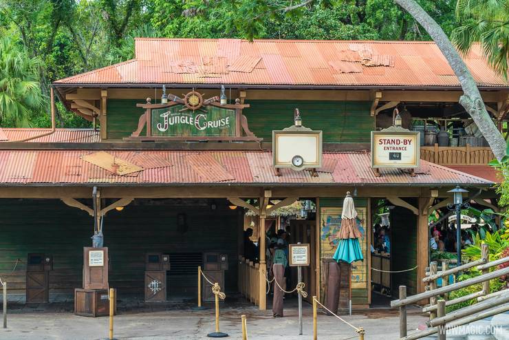
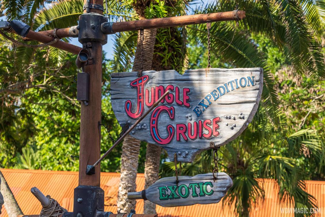
Any guesses as to why I think this sign redesign is a complete fail. This image holds the clues.

Jungle-Cruise_Full_43151.jpg
 

ImperfectPixie

Well-Known Member
Any guesses as to why I think this sign redesign is a complete fail. This image holds the clues.

Jungle-Cruise_Full_43151.jpg
To me it looks way too small. I don't like the fact that it's not centered, either, but I get why it isn't.

The green is still making me nuts...it's way too much green considering the building behind it is also green.

I also wish they'd used a board size and color that wasn't so similar to the siding of the building behind it...just making them vertical isn't enough of a difference, IMO, because it looks like they savaged the building itself for the boards, when I think looking like they salvaged boat wreckage would have been a better effect.
 

LaughingGravy

Well-Known Member
The J and the C bother me more than they should from a design standpoint. Those pairs of horizontal lines in each should be going in the same direction. There's also aging of the green, but not the white, and the ships wheel is brand new. It just seems cobbled together, which I guess could be a look they were going for, but it seems like the design dept. just phoned it in. The blank fast pass sign just looks lazy as well. They would do better to cover it with something, anything. A shipping crate, a stuffed plush gorilla, anything except leaving it blank.
 

WEDfan9798

Active Member

ᗩLᘿᑕ ✨ ᗩζᗩᗰ

HOUSE OF MAGIC
Premium Member
In addition to what's already been said; IMO Imagineering's effort to marry two competing concepts has resulted in a poorly executed sign. Their attempt at conveying the tone of the attraction doesn't quite work because it's not pushed to the extremes. They should have either doubled-down on the Tourist Trap silliness or dropped it altogether. The Jungle Navigation company emblem is spectacular, elegant and prestigious. The bitten paddle gag is silly and tropey and benefiting a Tourist Trap. If that was the intent; such a sign would be in high-contrast and downright tacky, designed to grab your eyes and not let go until you step inside. This sign doesn't do that. In fact it practically disappears against the building. On the flipside had they leaned on the Jungle Navigation Co. concept the results might have been more successful.

Imagine instead if the signage looked more like this:
659d5f1a0bdca41471cd2907f8223043.jpg


What's the better play? I honestly don't know. The current sign doesn't work in either scenario. Should they drop the silly? Or push it to the extremes? Regardless, the the image above looks 10x better than the green on green issue they have going on right now. I would have either liked something similar to the above or a sign befitting the "World Famous" Jungle Cruise. Was the subtle native decor so bad?
 
Last edited:

No Name

Well-Known Member
Then they squandered available space with the diagonal "supports" on the sides and should have used simpler framing. (And those "supports" also look different.)

Also...the proportion of the "J" and "C" relative to the rest of the letters is not good.
Everything about the frame is literally exactly the same as it was before. It’s the same frame. And the font of the new sign is almost exactly the same too.
 

ImperfectPixie

Well-Known Member
Everything about the frame is literally exactly the same as it was before. It’s the same frame. And the font of the new sign is almost exactly the same too.
And?

I'm a sign-maker. Giving a critique of a sign.

Whether or not it was the same before is irrelevant.

ETA: I take back the irrelevant part. That it was the same before makes the re-do worse.
 

celluloid

Well-Known Member
In addition to what's already been said; IMO Imagineering's effort to marry two competing concepts has resulted in a poorly executed sign. Their attempt at conveying the tone of the attraction doesn't quite work because it's not pushed to the extremes. They should have either doubled-down on the Tourist Trap silliness or dropped it altogether. The Jungle Navigation company emblem is spectacular, elegant and prestigious. The bitten paddle gag is silly and tropey and benefiting a Tourist Trap. If that was the intent; such a sign would be in high-contrast and downright tacky, designed to grab your eyes and not let go until you step inside. This sign doesn't do that. In fact it practically disappears against the building. On the flipside had they leaned on the Jungle Navigation Co. concept the results might have been more successful.

Imagine instead if the signage looked more like this:
659d5f1a0bdca41471cd2907f8223043.jpg


What's the better play? I honestly don't know. The current sign doesn't work in either scenario. Should they drop the silly? Or push it to the extremes? Regardless, the the image above looks 10x better than the green on green issue they have going on right now. I would have either liked something similar to the above or a sign befitting the "World Famous" Jungle Cruise. Was the subtle native decor so bad?

Like the awkward movie it is now trying to be based on but not. In the movie, the hippos and backside of water gags as well as the natives are a ruse to amuse people. It actually belittles the suspension of disbelief of the attraction as are we instead of letting our imaginations help us believe we are on a journey, are we in just one big touristy mishap? The entire thing for that and the reasons you pointed out are just a mess.
 

ChrisFL

Premium Member
myself I don't really care either way about if the sign has spears on it. I was thinking people 10-20 years from now taking their kids..."You know kids, ever since they removed the spears from the entrance sign, it just isn't the same"...I don't think people would say that....hopefully
 

Incomudro

Well-Known Member
The last few pages of this thread offer yet more proof that the angriest, loudest complainers out there aren’t the fabled “woke mob”.

(ETA: I’m not referring to those posters whose criticisms of the new signs are purely aesthetic.)
"We" are illustrating what is wrong with this path.
We are not the one's on a cleansing agenda.
Things will never be clean enough for the woke mob.
Up next: A cleanse of Tibetan items from the Expedition Everest queue.
Just wait, because it's coming.
Then tell me how authentic these places look, as one by one they become generic and pacified.
 
Last edited:

UNCgolf

Well-Known Member
"We" are illustrating what is wrong with this path.
We are not the one's on a cleansing agenda.
Things will never be clean enough for the woke mob.
Up next: A cleanse of Tibetan items form the Expedition Everest queue.
Just wait, because it's coming.
Then tell me how authentic these places look, as one by one they become generic and pacified.

There was never much authentic about the Jungle Cruise. There's a gigantic difference between that and the theming of the Expedition Everest queue.
 

Incomudro

Well-Known Member
myself I don't really care either way about if the sign has spears on it. I was thinking people 10-20 years from now taking their kids..."You know kids, ever since they removed the spears from the entrance sign, it just isn't the same"...I don't think people would say that....hopefully
Thing is, it (like other things) loses it's mystery bit by bit.
Paddles/oars?
What does that have to do with a jungle cruise on a gas powered boat?
It's not modeled on a canoe trip, where oars would certainly be appropriate.
Is the Adventureland sign next?
Probably.
 

Incomudro

Well-Known Member
There was never much authentic about the Jungle Cruise. There's a gigantic difference between that and the theming of the Expedition Everest queue.
It wasn't authentic in the way that EE was but it used items and decor as they would be used.
Seriously: If we must cleanse Jungle Cruise of such items, why not the EE queue?
 

Register on WDWMAGIC. This sidebar will go away, and you'll see fewer ads.

Back
Top Bottom