SteamboatStitch
Active Member
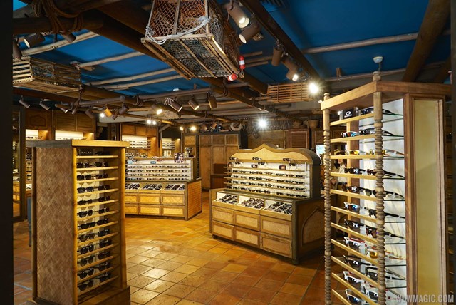
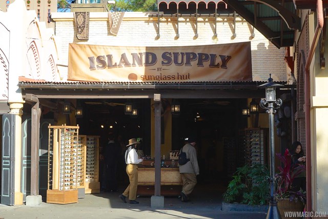
Some Before&After to try to analyze what changed.
Before:


After:

I think the signs encapsulate the overall change:


On the positive side, I won't miss the t-shirt racks pushed out front, and, thankfully, the sponser/owner name is subtitled to "Island Supply."
Is it weird of me that one of the things that strikes out most is the bare ceiling? The old look had more going on to distract you from the blue...ness.
Last edited:
