Andrew C
You know what's funny?
Nothing reflects nature as much as circa 1985 roller rink foosball tables.
the source says they photoshopped the foosball table in but I cannot tell if they are serious or not.
Nothing reflects nature as much as circa 1985 roller rink foosball tables.
The source is full of bull.the source says they photoshopped the foosball table in but I cannot tell if they are serious or not.
The source is full of bull.
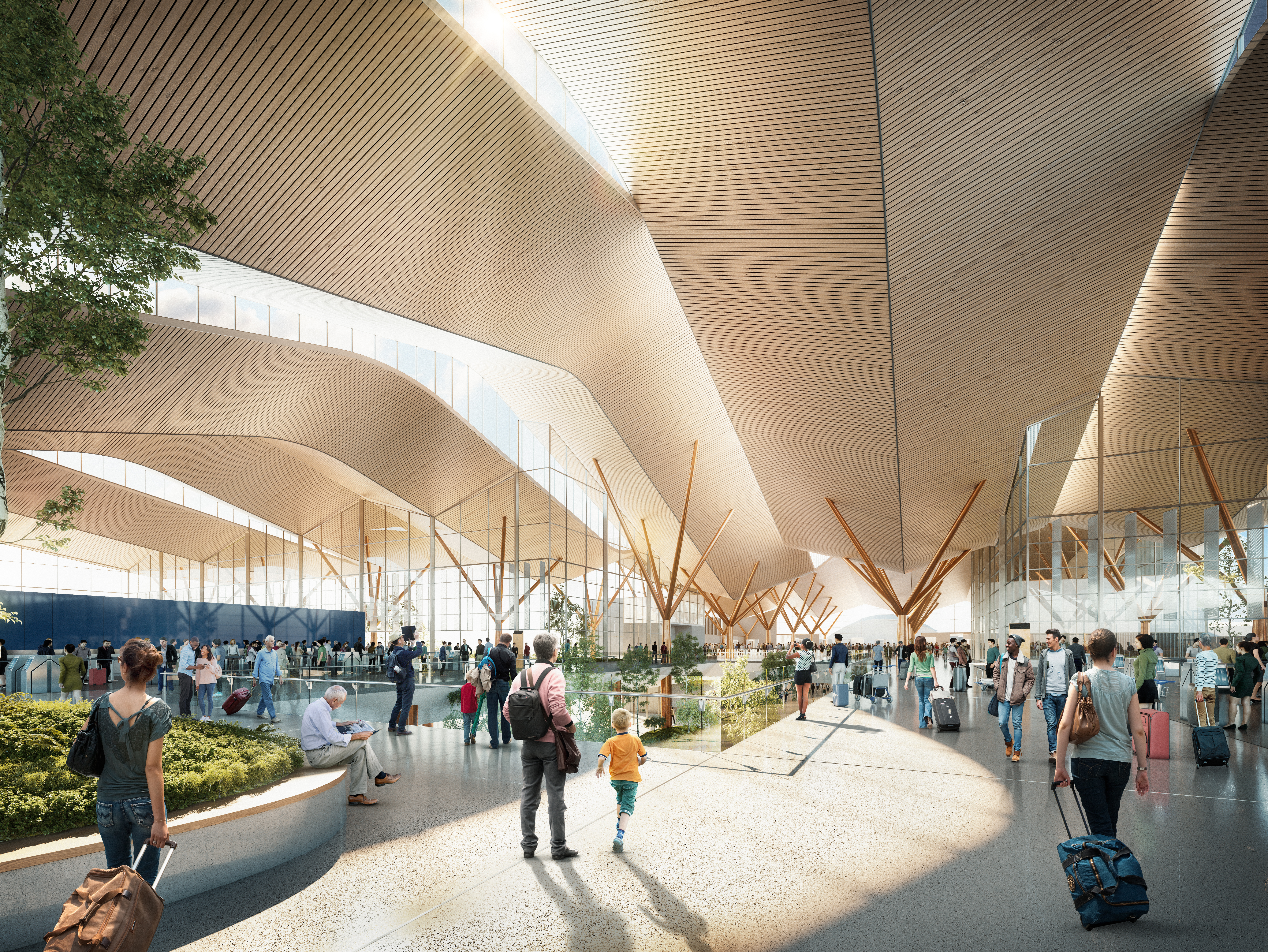
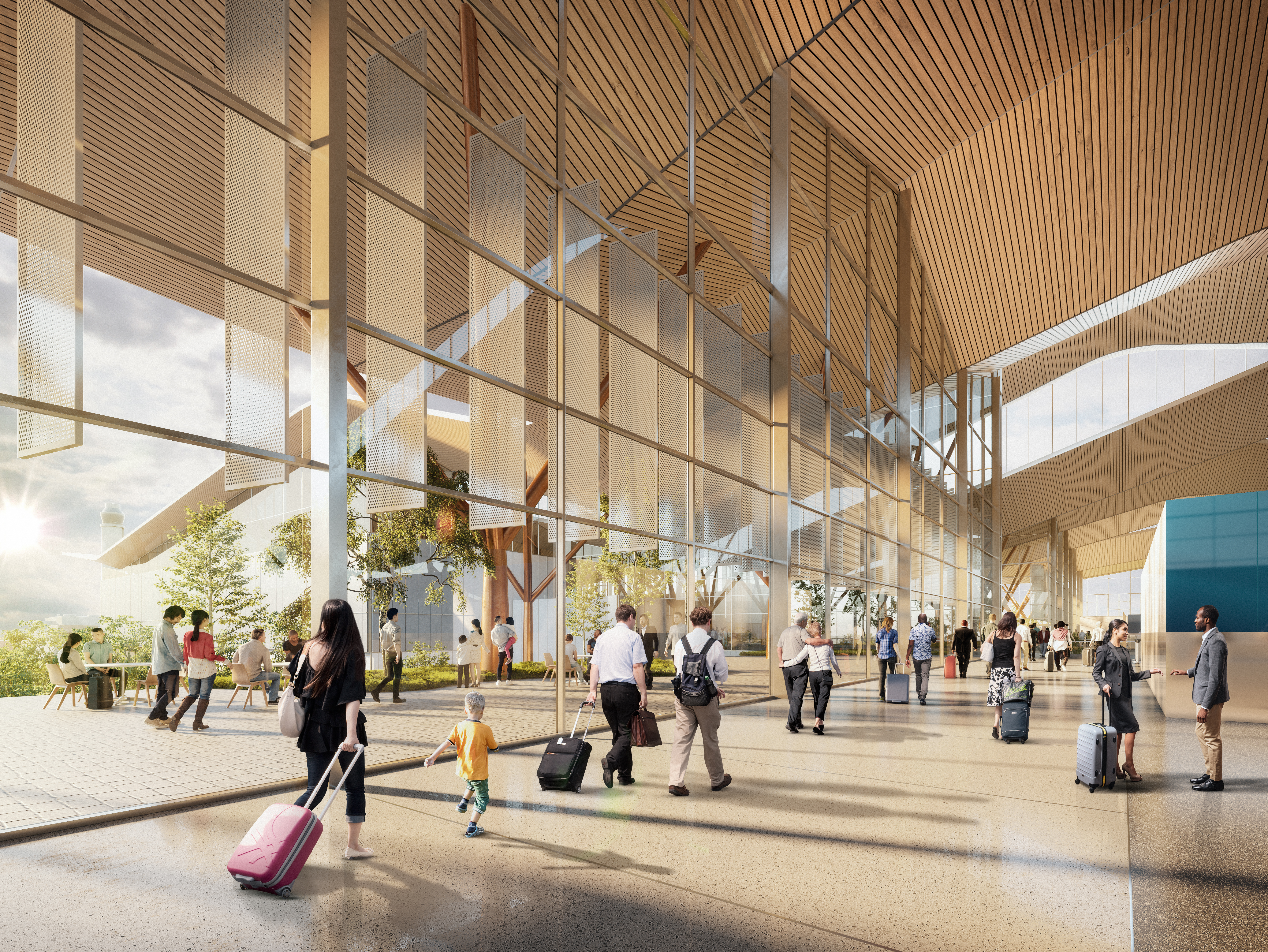
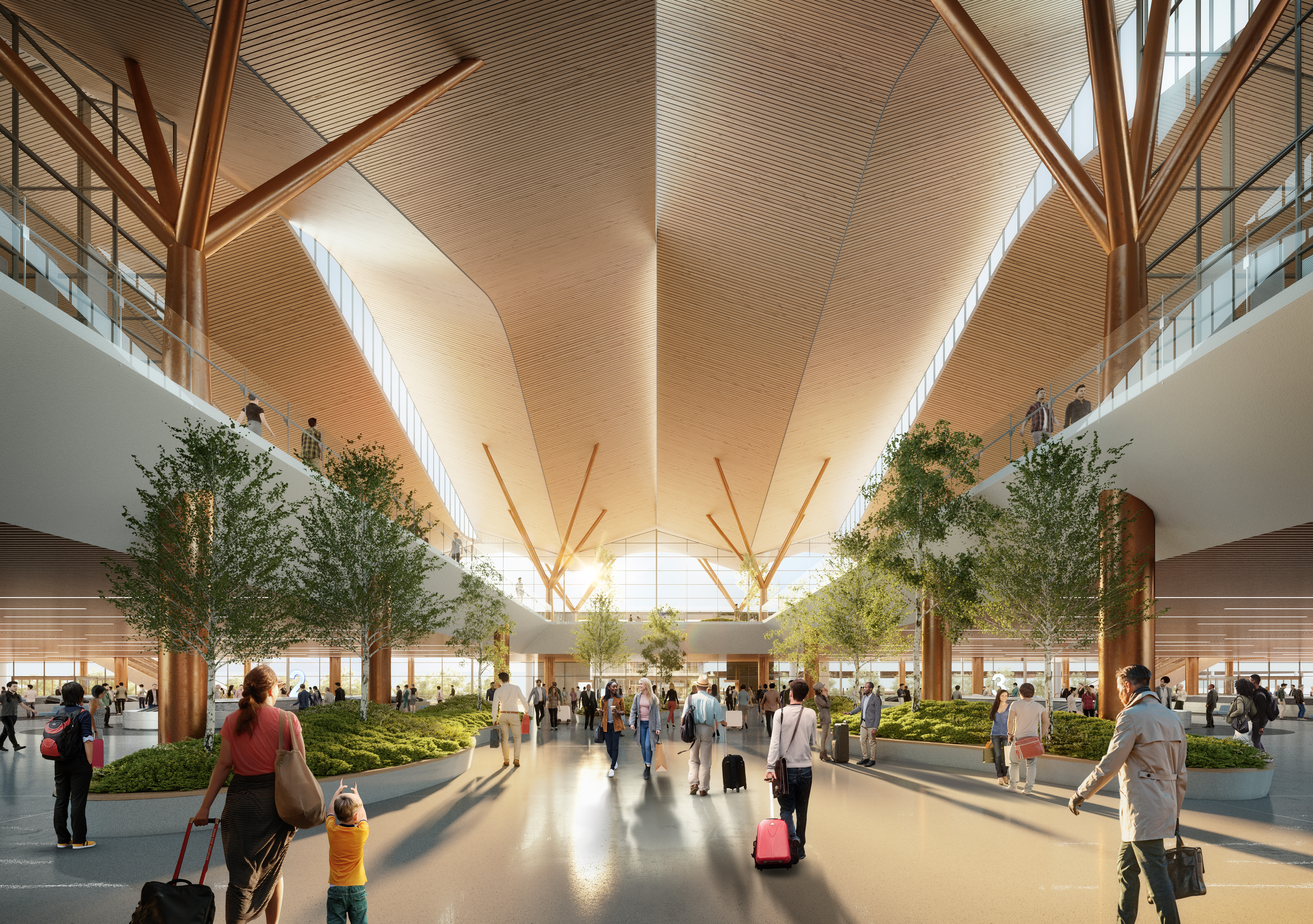
Which doesn’t look bad and is on trend for the most part. I see it as Disney following the modernism rage now and that it’s clearly “reflected” in the design of the hotel. Being kitschy with theming is very much out of style in my opinion.I was just looking at the concept art for my local airports new landside terminal again today and you know what? I see it too...


Still waiting on finalized art before I say I love or hate it though.
Well, I for one can admit when I have been wrong and now tip my hat to all of those who recognised the clear influence of Mr. Frank Lloyd Wright in the design of this hotel.Wow- there are some TERRIBLE new renderings of the lobby. How is this "nature-inspired"?? Incredibly generic and the Pochantas statue is tacky IMO. Remove that, and tell me how this looks remotely Disney.


In all seriousness, I think this post is spot on. If the hotel was architecturally interesting, it would be easier to give Disney a pass for deciding to go that route rather than a traditionally themed resort. Instead, everything we've seen so far of the exterior and interior (if these renderings are genuine) is bland and boring. As others have said, these interior renderings look like something out of an airport or a university. Not ugly per se, but generic.I see two ways Disney can be successful in their resort designs.
Typically they have had the most success with choosing a specific location, point in time, etc. and providing a literal but idealized version of that. WL, AKL, Poly, maybe GF to a lesser extent, succeed not particularly in any revolutionary design of their form, but in painstaking rich layered detail. While this approach to design may be “out of fashion” the result is the common areas of these resorts are never really out of style (cause they were never in style).
If they want to try something different and not literal, but provide a unique resort experience, then innovate with the architecture itself. Provide a form that is so engaging that the immersion and escapism is just from experiencing good architecture. So far, they aren’t showing that they know how to leave the literal and succeed at just straight up good design...instead they look to try to catch up to what the others are doing which inevitably will date.
If I’m paying Disney prices it has to be bc their environment can’t be duplicated elsewhere.
Aw come on... Disney would not put a Foosball table in the middle of the lobby of a Deluxe resort.
and the colorized statue of Pocahontas is quite iffy too.
the rest of it may be believable. My guess is this is an early version of the design.
I do like how open it is with all the glass.
Of course I love WL/VWL - I consider it home. However, I would not want to see this new resort become just a (cough) reflection of that, it needs its own identity in look and feel.A Foosball table inside essentially a glass-enclosed open space mindful of a nice mall sitting area, with a Pocahontas statue and swoopy things hanging from the ceiling...
Compare this to the full treatment next door of a Pacific Northwest style wooden lodge with a gentle waterfall through the building that meanders its way out to the outdoor pool area landscape and a fully functioning geyser in the form of "Old Faithful" in Yellowstone; with a lobby full of wood carvings with hardwoods throughout and featuring a large fireplace.
Which one seems more nature-inspired to you?
Actually on that note, they could have stayed with the country and lazy river theme and done the whole resort with a "Tom and Huck" country feel. Both WL and FW are sort of western style country (even though the name of "Fort Wilderness" references Tom Sawyer and Tom Sawyer Island). But truthfully, they could have done a more southern country take on the country resort theme and completely included a lazy river, and it would have tied in nicely. Think along the lines of Splash Mountain (which was based on Song of the South). It could have an Aunt Polly's restaurant (throwback to the island but also the book) and feature classic Southern dishes, but also perhaps a more upscale restaurant inside featuring modern Southern recipes, or even some Southern comfort food, such as corn bread, biscuits, and collards, all with a big front porch to wrap around the building. This would be different from the Port Orleans resorts because it is more mid-South than the Delta -- and also a single building or two, rather than a campus style. But it would fit in better with FW and WL, and give a nod to River Country. Just a thought.Of course I love WL/VWL - I consider it home. However, I would not want to see this new resort become just a (cough) reflection of that, it needs its own identity in look and feel.
FLW's designs were not made to blend in as natural elements and yet they were designed to highlight the natural environment for the humans occupying the spaces without being jarring blocks of existence. I think the problem here, other than many folk not liking the modernistic design is that Disney worded their release notes on this project wrong. Instead of saying "inspired by nature" they should have inferred "highlighting the beauty of nature around us".
I am looking forward to more images. There are a number of elements here I hate: top one being that I really hope the Pocahontas thing is wrong. Other than the penguins from Mary Poppins in the fountain at VGF is there another deluxe resort that features a character in the lobby as you enter? Not sure why they'd start now. I see what they're trying to do (playing up on nature, climate change is the biggest topic in the news these days, so why not use a character known as being a mediator) There is so much wrong with this whole thing that the idea makes me want to vomit.
------
So on a happier note... what does that lazy river look like? Is this worthy of a River Country location?
What in the flaming pile of garbage is that concept art? Are they joking? (I really hope this is a joke.)
It somehow looks *worse* than Gaylord's attempt at a similar concept. Just let Marriott run the hotels at this point if you can't deliver better theme-ing. At least I would get points, and I am pretty sure the service and cleanliness standards would be higher.
View attachment 398251
I am looking forward to more images, I really hope the Pocahontas thing is wrong, other than the penguins from Mary Poppins in the fountain at VGF is there another deluxe resort that features a character in the lobby as you enter? I can't think of one. Not sure why they'd start now. There is so much wrong with this that the idea makes me want to vomit.
The Swan and Dolphin say, "Hey, thanks for the compliment!"
Register on WDWMAGIC. This sidebar will go away, and you'll see fewer ads.
