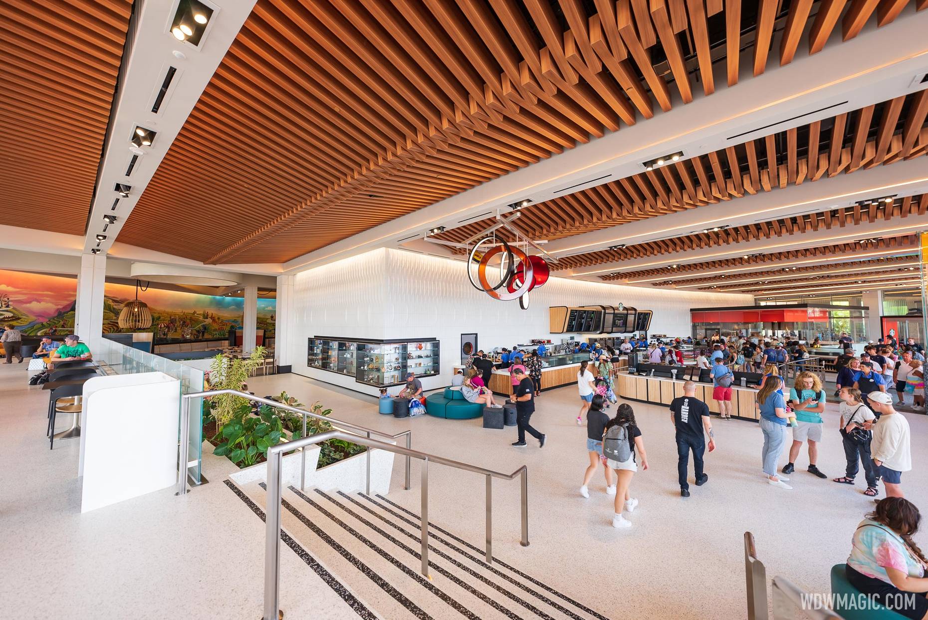
Connections Cafe and Eatery

Jambo Dad

Well-Known Member
Genuine question, where would you add colour that wouldn't look garish and out of place?

Right now there's a huge colourful mural, decor elements with pops of colour, panel dividers with colour, seating with colour...

Is there something wrong with white textured/sculptural walls?

Genuinely asking, as I don't understand the critique. For me it's a nice blend of pops of colour, clean white, modern, and fresh aesthetic.
You are violating the current favorite topic of these boards - that the new spaces are antiseptic and sterile. They are, for the most part, engaging in overblown hyperbole and are a loud minority. Makes it hard to read the boards.
 

WondersOfLife

Blink, blink. Breathe, breathe. Day in, day out.
I guess that is for everyone to decide on their own?

I am safe to use a WDWMAGIC photo on the WDWMAGIC forum, right? :)
View attachment 634621View attachment 634622
Maybe it's just nostalgia... But the dark colors with the classic Epcot music made for such a nice and relaxing casual burger lunch... I had many many many good family lunches in that building. Lots of memories. Sigh.
 

TikibirdLand

Well-Known Member
Maybe it's just nostalgia... But the dark colors with the classic Epcot music made for such a nice and relaxing casual burger lunch... I had many many many good family lunches in that building. Lots of memories. Sigh.
some of our best epcot memories are in the EU, 2nd floor. Best place to stop before getting on the Monorail to head back to the Poly. I thought they kept the place clean and tidy. Did it look like the 90's? Sure. But, it had character; either you loved it or hated it. Now, I just miss it.
 

Andrew C

You know what's funny?
some of our best epcot memories are in the EU, 2nd floor. Best place to stop before getting on the Monorail to head back to the Poly. I thought they kept the place clean and tidy. Did it look like the 90's? Sure. But, it had character; either you loved it or hated it. Now, I just miss it.
Was Paula Abdul playing in the background as well!? :)

Just giving you a hard time...no offense meant.
 

Andrew C

You know what's funny?
Congrats WDI and WDW on creating a generic upscale mall food court. :rolleyes:

I guess creative theming is a thing of the past.
Honestly, whether you like it or not, did anyone expect anything else after seeing the Creations Shop? This is pretty much dead on with that theme. They are providing a cohesive look, so once the shop opened, I pretty much knew what to expect with the cafe and eatery. I do like this particular mural a lot better, however.
 

Epcot82Guy

Well-Known Member
To be fair, this has a similar (albeit contemporary) vibe of Centorium and Stargate. They weren't incredibly themed spaces. The big issue I have is they were very well integrated and seamless into the greater CommuniCore spaces. So, they felt like part of an overall "pavilion" vs. their own destinations. That's what I think is the more disappointing piece to me. These aren't particularly good or bad spaces. They are nice. The miss is that they aren't part of a greater, connected (no pun intended), more ambitious whole. So, they end up feeling a bit more generic as a result IMHO.
 

Vegas Disney Fan

Well-Known Member
It’s funny how the angles of the photos change my opinion, the straight on photo of Starbucks looks pretty bland and boring, the sideways angles looks fantastic.

I’m curious to see how it looks in person. I wasn’t a very big EU fan so the bar is pretty low.

Guessing there’ll be pros and cons just like the shop, I enjoy that it’s brighter and easier to wander around in but I miss some of the fun details like the dreamcatcher.
 

HauntedPirate

Park nostalgist
Premium Member
To be fair, this has a similar (albeit contemporary) vibe of Centorium and Stargate. They weren't incredibly themed spaces. The big issue I have is they were very well integrated and seamless into the greater CommuniCore spaces. So, they felt like part of an overall "pavilion" vs. their own destinations. That's what I think is the more disappointing piece to me. These aren't particularly good or bad spaces. They are nice. The miss is that they aren't part of a greater, connected (no pun intended), more ambitious whole. So, they end up feeling a bit more generic as a result IMHO.

No no, you have it all wrong. This fits perfectly with the other boring, bland, sterile shop across the breezeway. It's more Disney! Synergy!!!

I'm more curious about whether or not the burgers come with a side or if it's truly a la carte.
 

HauntedPirate

Park nostalgist
Premium Member
Here I was hoping for the prolog and the promise mural to make an appearance..
Or maybe SMART-1 to take our orders..

Oh well.

Oh god, no. 'The Prologue and The Promise' should never be desecrated in such a way. Ever. That would like like hanging the Mona Lisa in a Burger King.
 

wdwmagic

Administrator
Moderator
Premium Member
Original Poster
Is this two floors like electric umbrella was?
Here is a look at the two tiers.

Connections-Cafe_Full_47179.jpg
 

Register on WDWMAGIC. This sidebar will go away, and you'll see fewer ads.

Back
Top Bottom