-
The new WDWMAGIC iOS app is here!
Stay up to date with the latest Disney news, photos, and discussions right from your iPhone. The app is free to download and gives you quick access to news articles, forums, photo galleries, park hours, weather and Lightning Lane pricing. Learn More -
Welcome to the WDWMAGIC.COM Forums!
Please take a look around, and feel free to sign up and join the community.
You are using an out of date browser. It may not display this or other websites correctly.
You should upgrade or use an alternative browser.
You should upgrade or use an alternative browser.
News Scaffolding up at the Magic Kingdom's 'Be Our Guest Restaurant' as exterior refurbishment gets underway
- Thread starter wdwmagic
- Start date
hpyhnt 1000
Well-Known Member
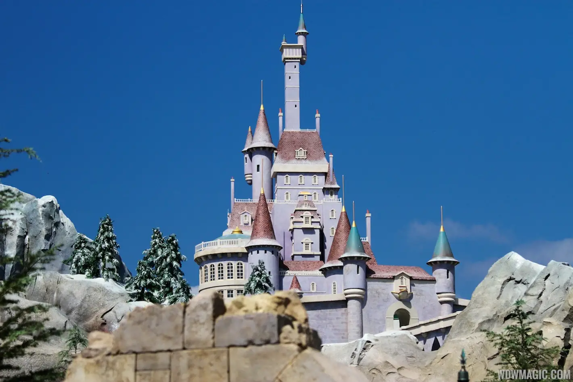
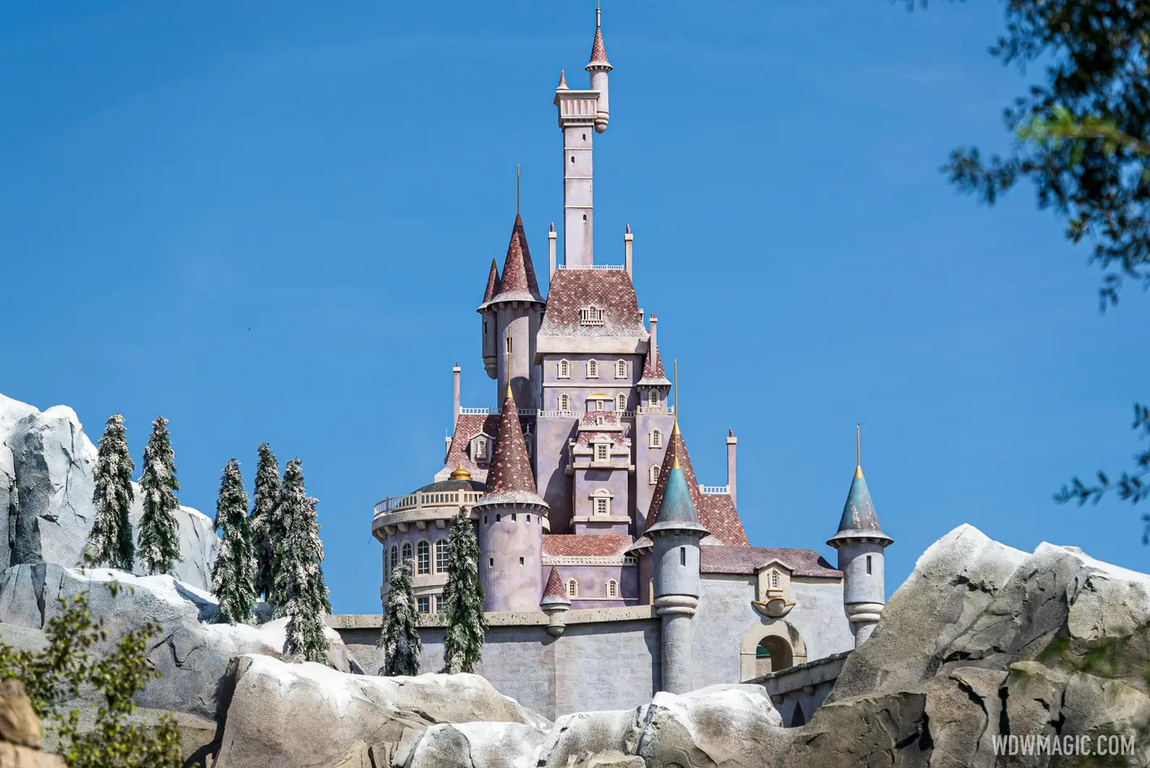
Bear in mind camera settings and lighting conditions can have a sizable impact, but a comparison of the castle using photos from @wdwmagic when it was new in 2012 vs. post 2021 refurb.
2012:

2021:

The 2021 version looks nicer to me. Better detailed and more realistic snow and weathering effects. The mini-trees are better, too.
2012:
2021:
The 2021 version looks nicer to me. Better detailed and more realistic snow and weathering effects. The mini-trees are better, too.
James Alucobond
Well-Known Member
I'm not entirely sure, but I don't think it's actually done. The main castle looks complete to me, but I think the portcullis and the adjacent towers still need to be reworked. The roof of the tower on the right in particular looks like it's the result of flaking from powerwashing rather than intentional distressing. I'm thinking they just don't need the scaffolding anymore to reach that area. I do agree that the roof, weathering, and trompe l'oeil architectural details look much better now, though.
owlsandcoffee
Well-Known Member
This is such an amazing improvement. Nice job WDI
Walt d
Well-Known Member
It should never, over shadow the other castle..“Disney uses Forced Perspective at all of their theme parks. Some of the most notable examples include, Cinderella’s Castle, Sleeping Beauty Castle, Pandora World of Avatar and Main Street USA.
Other ways Disney uses this technique are places like Beast’s Castle in Fantasyland at Magic Kingdom. The castle is actually quite small but it sits on top of a very large plot of land that is the Be Our Guest restaurant.
The restaurant itself houses three separate dining rooms and seats up to 550 guests. Imagineers don’t want guests thinking they are walking into a large square concrete building, they want guests to feel as though they are transported to Beast’s Castle in the Beauty and the Beast film.
Disney wants guests to feel as though they are walking up the walkway to the castle itself perched high atop the castle grounds. So Disney set the much smaller castle facade atop the large, plain building that houses the actual restaurant but hid that with forced perspective, paint and details so that all guests see is the magic.”
Tony the Tigger
Well-Known Member
I probably wouldn’t have noticed if you hadn’t told me! But it looks nice. 
cookiee_munster
Well-Known Member
It seems almost like they tried to go with a castle that was more fitting to the forced perspective rules of trying to stick to less detail and not looking so vibrant etc but then essentially giving in to public demand of customers wanting pictures of a really beautiful castle during their trip and so the castle was repainted and given more details to be more photo friendly...
That Paris version is stunning.
That Paris version is stunning.
Bocabear
Well-Known Member
I think you are absolutely right on that! The forced perspective is not so successful in the case of this castle...It needed to be a little bigger and it needs a little more integration into the mountainside... somehow... Maybe if we get a version of the Beauty and the Beast ride they will revisit the castle... but until then I think it is what it is... Looks better though...It seems almost like they tried to go with a castle that was more fitting to the forced perspective rules of trying to stick to less detail and not looking so vibrant etc but then essentially giving in to public demand of customers wanting pictures of a really beautiful castle during their trip and so the castle was repainted and given more details to be more photo friendly...
That Paris version is stunning.
James Alucobond
Well-Known Member
The final touches are going on today as the portcullis and its towers are repainted.
Register on WDWMAGIC. This sidebar will go away, and you'll see fewer ads.

