-
The new WDWMAGIC iOS app is here!
Stay up to date with the latest Disney news, photos, and discussions right from your iPhone. The app is free to download and gives you quick access to news articles, forums, photo galleries, park hours, weather and Lightning Lane pricing. Learn More -
Welcome to the WDWMAGIC.COM Forums!
Please take a look around, and feel free to sign up and join the community.
You are using an out of date browser. It may not display this or other websites correctly.
You should upgrade or use an alternative browser.
You should upgrade or use an alternative browser.
New gastropub to replace Captain's Grille at Disney's Yacht Club
- Thread starter wdwmagic
- Start date
Bocabear
Well-Known Member
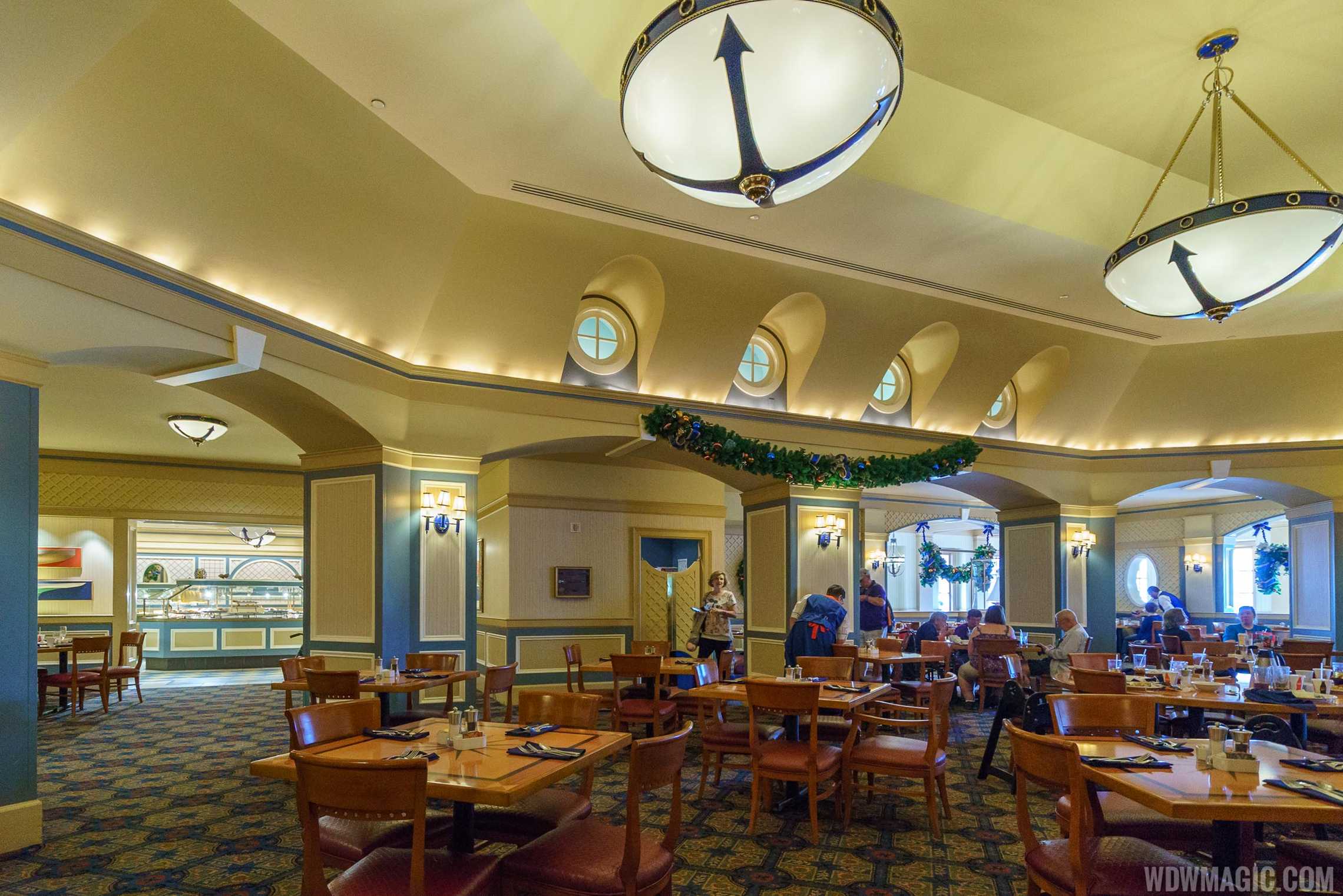
Whike I think it looks nicer than the diningroom it has the similar problem of loking a bit bleak, and when the styler trend you are following has already trickled down to Target and Home Goods, it's going to be dated in like 10 minutes... The look would be more timeless if this was a mid-century style interior, not mid century inspired furnishings in an early 20th century yacht club....
aladdin2007
Well-Known Member
OMG I was thinking the same thing! It looks like a Mauseleum or funeral home....
Ok, so paint out all the existing architecture of the rooms gray, put in Diner style booths and metal chairs and add pre-worn carpet....and that is supposed to be evocative of a gastropub restaurant in an expensive 1940s era yacht club?
This kind of interior is more suited to Disney Springs than a premium flagship rsort hotel boasting some of the most expensive accomodations on property....And I wish I didn't have to say it, but yes...this is a common look that can be found most places...it certainly doesn't have the "Disney Difference".... and the food looks sad....I mean literally unhappy to be on those depressing plates....even the blueberries look like they are trying to run away....
Sadly I have to agree, there is nothing Disney about these locations anymore. They are stripping them one by one into a generic standard sterile atmosphere. On its own I admit it looks okay, maybe if it were somewhere else. Just too bad this is the trend in the resorts now too, sure doesn't entice me to stay in them anymore.
Epcot82Guy
Well-Known Member
I feel the same. Having stayed at YC recently in a renovated room, I get the change to something more upscale and subtle. But, it feels a step too far. These places are actually really great backdrops. It's not bad design to me - it's simply lacking. I'll wait until I get there, but it seems the same way I felt about the room. I just wanted some additional touches that had a Disney theme. Like having the admiral Mickey lamps. Throw pillows that showed nautical knots or something. Etc.
Same here. I think if there were some larger-scale nautical artwork on the walls, a trophy case or shelf in the lounge, etc. - it would go a long way. (Same thing I feel about Sassagoula Float Works redo.) I know minimalist is somewhat in, but these simply need MORE in the details department.
Same here. I think if there were some larger-scale nautical artwork on the walls, a trophy case or shelf in the lounge, etc. - it would go a long way. (Same thing I feel about Sassagoula Float Works redo.) I know minimalist is somewhat in, but these simply need MORE in the details department.
durangojim
Well-Known Member
Looks ok, but not Disney enough for me. It seems like they're really catering to the conference/convention crowd who aren't there because of Disney (unlike me who only goes to those conferences if they ARE at Disney). YC used to be tied with the GF for our favorite resort, but with the recent changes it has dropped down. We'll be trying the BC again after about 6 years.
ABQ
Well-Known Member
I know I'll be slammed for asking....but as the phrase has been used a few times recently in this thread...
What made this "Disney" vs what it is now?
I mean, it wasn't the most ornate place before. Now you could go way back to where it was too decorated imho, with all the vertical stripes, but to me that looked a bit too TGI Friday's.
What made this "Disney" vs what it is now?
I mean, it wasn't the most ornate place before. Now you could go way back to where it was too decorated imho, with all the vertical stripes, but to me that looked a bit too TGI Friday's.
Horizons '83
Well-Known Member
- In the Parks
- No
To me it always looked like a Piccadilly's Cafeteria. I like the new look, clean and simple although some more theming would have been nice.I know I'll be slammed for asking....but as the phrase has been used a few times recently in this thread...
What made this "Disney" vs what it is now?
I mean, it wasn't the most ornate place before. Now you could go way back to where it was too decorated imho, with all the vertical stripes, but to me that looked a bit too TGI Friday's.
MrHappy
Well-Known Member
IMHO, this old version doesn't symbolize "Disney" either (maybe Eisner 90s). The lastest YC couldn've had more story telling (see Skippers Canteen), or subtle hints of Disney characters.I know I'll be slammed for asking....but as the phrase has been used a few times recently in this thread...
What made this "Disney" vs what it is now?
I mean, it wasn't the most ornate place before. Now you could go way back to where it was too decorated imho, with all the vertical stripes, but to me that looked a bit too TGI Friday's.
Figment82
Well-Known Member
I had the opportunity to dine in the remodeled restaurant, and I think part of the problem is it suffers from a bit of an identity crisis. They tried to “class it up” for the convention and business guests, but it’s caught somewhere between signature and family friendly and doesn’t succeed at either.
I totally agree that Yacht Club Galley and Captain’s Grille did not offer much in terms of details or “Disney”, but at least they felt comfortable and inviting. The gray-purple paint really changed the atmosphere in a way that just felt off to me. This restaurant used to feel like an old friend, and we’d frequently drop in for a nice lunch or early dinner - especially when we needed a break from the crowds at Epcot. I’m sure we’ll still go from time to time, but not as often and I don’t think it’ll top our list when deciding where to eat.
I totally agree that Yacht Club Galley and Captain’s Grille did not offer much in terms of details or “Disney”, but at least they felt comfortable and inviting. The gray-purple paint really changed the atmosphere in a way that just felt off to me. This restaurant used to feel like an old friend, and we’d frequently drop in for a nice lunch or early dinner - especially when we needed a break from the crowds at Epcot. I’m sure we’ll still go from time to time, but not as often and I don’t think it’ll top our list when deciding where to eat.
surfsupdon
Well-Known Member
Where did the extra space come from? Did they get it from expanding into the old Captain's Grill??
Bocabear
Well-Known Member
Aww no one is going to slam you...lol I agree the original interior was not majestically themed either... The architectural details in the chandeliers had a nautical theme, the stripes and white trim work looked like an old yacht club...and yes I agree...Piccadilly Cafeteria-like as well, but it felt friendly in the color palette...warm, friendly. I always found this and Ariel's to be lacking any real theme... and hoping that a remodel would bring it more in line of the uunique thematic environment Disney has always been known for...Instead we have cold, dark and rather grim looking... The modern mid-century furnishings and details ( or lack thereof), just don't evoke the spirit of a yacht club...or a Disney Resort...they look more like a Marriott Hotel lobby...or a new Hampton Inn....that also has a funeral parlor off the lobby...lolI know I'll be slammed for asking....but as the phrase has been used a few times recently in this thread...
What made this "Disney" vs what it is now?
I mean, it wasn't the most ornate place before. Now you could go way back to where it was too decorated imho, with all the vertical stripes, but to me that looked a bit too TGI Friday's.
Epcot82Guy
Well-Known Member
I know I'll be slammed for asking....but as the phrase has been used a few times recently in this thread...
What made this "Disney" vs what it is now?
I mean, it wasn't the most ornate place before. Now you could go way back to where it was too decorated imho, with all the vertical stripes, but to me that looked a bit too TGI Friday's.
Totally agree! But, they took the opportunity to update it (much needed) and missed the mark. That's at least my personal view on it.
NiarrNDisney
Well-Known Member
Wow they look beautiful though I do wish the Lounge had a little more art on the wall. Can't wait to try it on my next trip!
NiarrNDisney
Well-Known Member
I know I'll be slammed for asking....but as the phrase has been used a few times recently in this thread...
What made this "Disney" vs what it is now?
I mean, it wasn't the most ornate place before. Now you could go way back to where it was too decorated imho, with all the vertical stripes, but to me that looked a bit too TGI Friday's.
Personally this looks really dated like it could be any hotel restaurant like it was decorated from the nautical section found in the decorating aisles at BigLots, Homegoods or Michaels! As I said I like the changes yes the Lounge is lacking art and I don't care for some of the lighting choices in the dining room but overall I like the updated look.

Register on WDWMAGIC. This sidebar will go away, and you'll see fewer ads.