Cmdr_Crimson
Well-Known Member
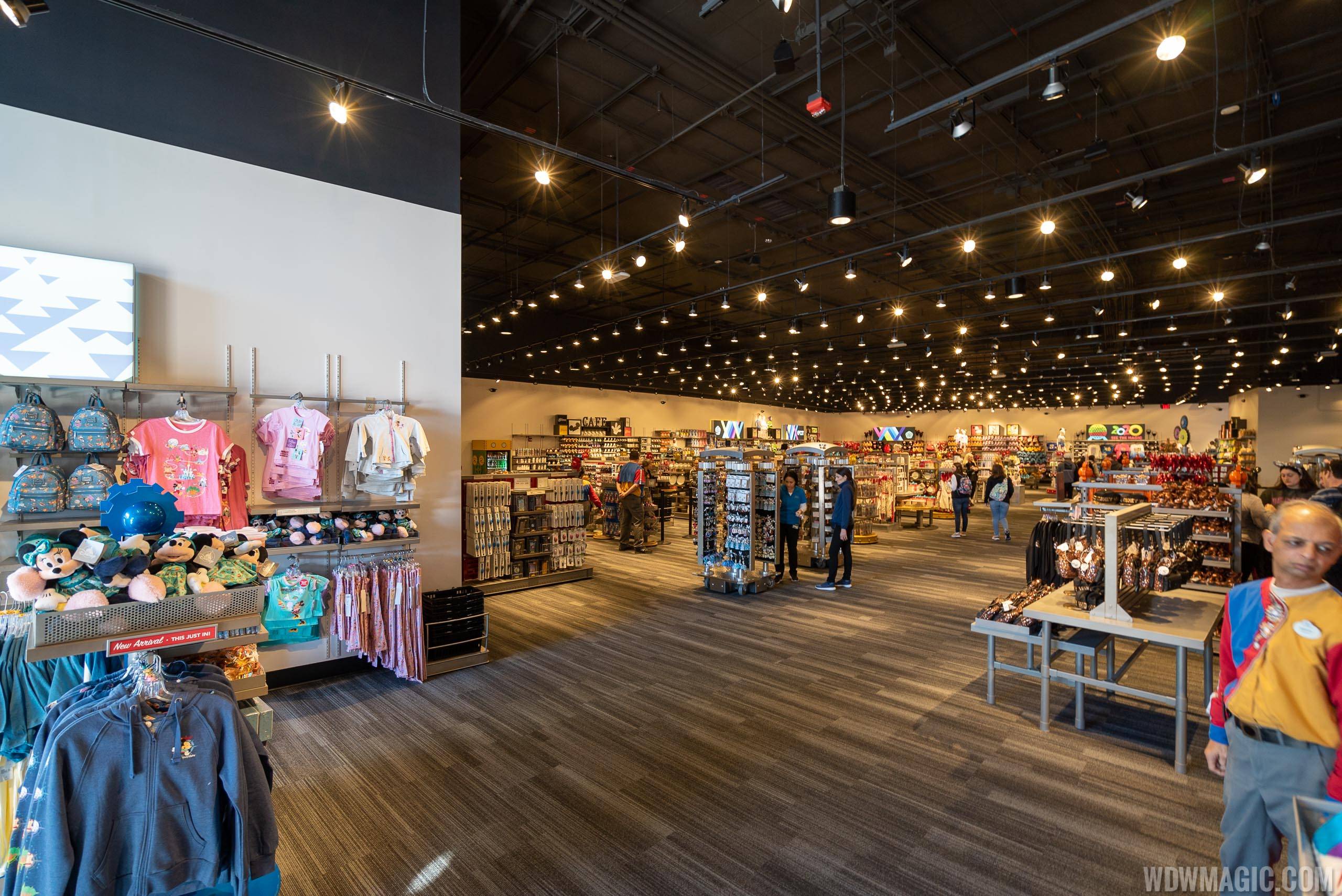
That should just get moved to TSL..Removal of Toy Story Aliens merch stand that didn't fit
That should just get moved to TSL..Removal of Toy Story Aliens merch stand that didn't fit
In Future World I'd expect something that looks... futuristic rather than contemporary?I’m confused ?
If this was World Showcase I would agree but what would you expect to see in FW ?
The Electric Umbrella wasn’t exactly the pinnacle of themed design. Tacky and outdated as well as ugly would be the words I would describe it.

Future World was always fairly contemporary in its design, just with exhibits that were cutting edge at their opening. Monumental and impressive, but contemporary.In Future World I'd expect something that looks... futuristic rather than contemporary?
I guess Future World is gone though, right?
So an orb holding an attraction you walk under was contemporary?Future World was always fairly contemporary in its design, just with exhibits that were cutting edge at their opening. Monumental and impressive, but contemporary.
I'd just argue that the replacements seem essentailly unthemed - could have been part of a convention hotel, could have been in an upscale mall, could have been fast-service at an airport - really any place you'd find a collection of food choces that isn't locked behind the $150 pawall of admission... Could have been the Riviera resort, I suppose.
It matched the energy of the redo of the area around it. It was certainly tacky, especially by modern standards but it shared a building with part of Inoventions and as a rather minor renovation, didn't take years to develop, either.To be fair, this would also describe Electric Umbrella when it opened. It was very much like a contemporary mall food court or a concession area at a movie theater.
It matched the energy of the redo of the area around it. It was certainly tacky, especially by modern standards but it shared a building with part of Inoventions and didn't take years to open, either.
I suppose this matches the engery of the area around it, too, though, doesn't it?
Maybe that's really my underlying gripe.I wouldn't even call it tacky (at least at the time), just based on contemporary design trends (which I am personally rather fond of in a nostalgic way, because I was a kid when that style was in vogue).
I don't really have a problem with EPCOT's overhaul using contemporary trends because I think there's always been some of that at EPCOT. To me, the problem now is less the underlying design style and more the execution -- mainly in the surrounding areas rather than Connections itself, which is ultimately okay to me and not a major problem compared to other parts of the re-do.
It was contemporary with the ambition and scale appropriate for something mimicking a World's Fair. Spaceship Earth is obviously a unique centerpiece, but the other buildings are not out of character for the time. Look at the Slovak Radio Building, the Saddledome, the Kuwait Towers, the Metropolitan Cathedral of Saint Sebastian, etc.So an orb holding an attraction you walk under was contemporary?
A pavilion with solar panels was contemporary in 1982?
You'd call the design of WOM contemporary?
You'd say the experimental construction techniques used to build Horizons was contemporary?
Things like the Fountain of Nations predating anything like the Bellagio by decades was contemporary?
the semi-circular Comunicore halls with mutli-level design visible through the giant windows was not something that i'd have considered common looking at all in the 80's. All that got dumbed down over time and some (ADA) for good reasons but I'd hardly call any of it contemporary when it opened.
This redo was a totally clean slate, though. they weren't constrained by existing design like they were with the half-a$$ed previous redos - remember they tore down a building to basically rebuild most of its layout in the exact same spot and then tore down another building to put an exhibit that faces away from the spine in its place. They certainly had options.
"Jumping" water?
We'll agree to disagree, I guess.
It was contemporary with the ambition and scale appropriate for something mimicking a World's Fair. Spaceship Earth is obviously a unique centerpiece, but the other buildings are not out of character for the time. Look at the Slovak Radio Building, the Saddledome, the Kuwait Towers, the Metropolitan Cathedral of Saint Sebastian, etc.
You're talking about something I wasn't responding to in your post. You were complaining about the contemporary interior of Connections, suggesting it should be futuristic instead. I was saying that the interiors were always contemporary, in line with the monumental contemporary exteriors. This was not meant as a defense of the obvious blunders in western World Celebration.Great examples of architecture you wouldn't find in most places at the time.
So lets say it was "contemporary with the ambition and scale appropriate for something mimicking a World's Fair" which I'd say is a safe statement since the look of the pavilions of the corporate sponsored "future-like" pavilion sections of something like the 1964 World's fair were not intended to look of their own time either, what would you say the ambition and scale is of what they were trying to mimic with this redo?
I'm confused.You're talking about something I wasn't responding to in your post. You were complaining about the contemporary interior of Connections, suggesting it should be futuristic instead. I was saying that the interiors were always contemporary, in line with the monumental contemporary exteriors. This was not meant as a defense of the obvious blunders in western World Celebration.
The Temporary version of MouseGears was what I was thinking they were going to do once they were remodeling the store..Hard to believe this is now the seating area for Connections...No argument that Electric Umbrella was past its prime. What it was fit with the 90's redo of FW which far outlived it's fit. Same with Mousegears so I don't begrudge that they were replaced.
I mean that the part of your post that I quoted was very specifically in relation to you thinking that the Connections interior should be futuristic, with which I disagree. I only broached the subject of the exteriors because you did in response, but they are similarly relevant because they were also contemporary, even if they were special within that context.I'm confused.
So you're saying those references to all these other structures and to the World's Fair were about their interiors rather than their exteriors?
Or did I just accidentally lead you off my original topic and this was you backtracking to the original point (which you're absolutely right, I did stray from)
In the end, I guess what I really mean though, is that it's incredibly bland, uninteresting and nondescript.
But in thinking about it, that may be intentional. Large cavernous space, without much to catch the eye creates an environment people are unlikely to want to linger in.
I keep thinking of the food areas in Las Vegas hotel convention centers and I suppose in that context, it might make sense. Just like those spaces, they want you to come in, eat and then get out so someone else can use that table - not feel like you're in a cozy place to relax and take interest in your surroundings.
It didn't feel at all congested when we ate there at lunch time. Maybe that's why?
You're confusing largest with popular.They probably haven’t done anything with it because it’s already one of the most popular restaurants in the park and it wouldn’t really be worth it to change it separate from a big Tomorrowland overhaul.
Except it's not in Future World anymore, right?I mean that the part of your post that I quoted was very specifically in relation to you thinking that the Connections interior should be futuristic, with which I disagree. I only broached the subject of the exteriors because you did in response, but they are similarly relevant because they were also contemporary, even if they were special within that context.
Perhaps I'm anomalous, but I never walked into the Centorium thinking I was in the future; I just thought I was in a very nice shop with lovely displays. To me, that should still be the feeling today. Is enough being done to make it feel expensive and impeccable? No, but that doesn't mean that the right path forward is to make it a gimmicky vision of the future that will quickly become passé.
Correct. "Future World" is dead.Except it's not in Future World anymore, right?
Like I said back when first questioned, it's now a part of "World Celebration".
") )
)I mean it’s filled with a ton and I mean a ton of people all the time. Do you have evidence that suggests it isn’t popular?You're confusing largest with popular.
Perhaps it's just better off gutted out and made into a bigger startraders store instead of having 2 on either side of the attraction..And that's why SGE is sitting empty. (Sorry, I had to bring it back on topic!
When there are few QS options to choose from, of course it is going to be busy. Lack of options doesn't equal popular. The food is awful.I mean it’s filled with a ton and I mean a ton of people all the time. Do you have evidence that suggests it isn’t popular?
Register on WDWMAGIC. This sidebar will go away, and you'll see fewer ads.