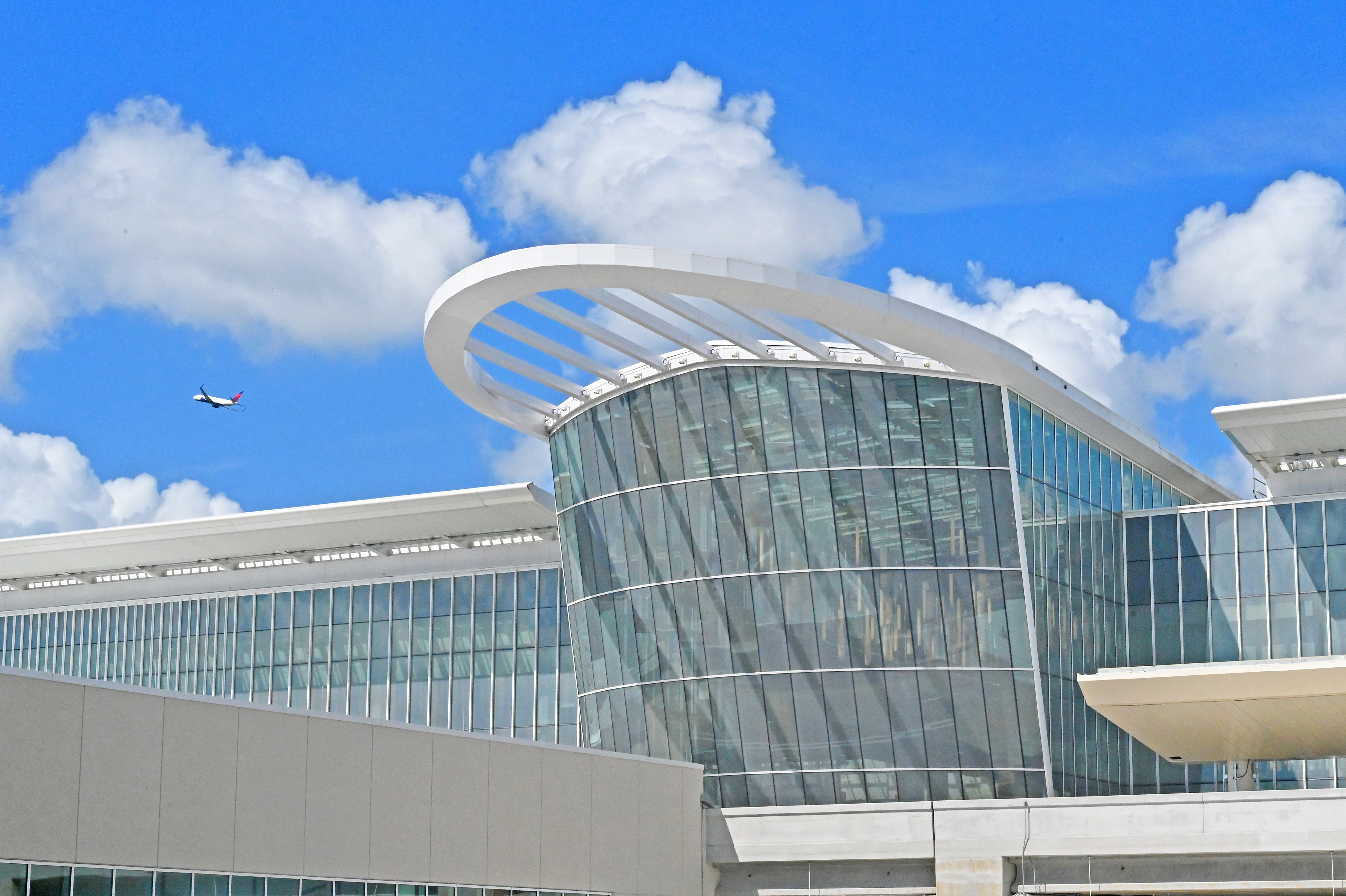
Orlando International Airport embarks on major expansion with Terminal and Airfield enhancements
Orlando International Airport embarks on major expansion with Terminal and Airfield enhancements

Work on a connecting bridge has begun and is targeted to be completed in late 2024. The bridge was part of the original plan, but cut for budget reasons.Any info about reducing the physical walking distance to get from terminal C to the APM to terminal A & B? We painfully navigated this in May and had to go outdoors in the heat. IMO, poorly designed.
Three new surface lots that will add around 700 spaces are already under construction.They also really need to address the parking issues. All 3 garages (A/B/C) and usually one or two of the economy lots are full. For example as of this post all 3 garages are full. MCO has already outgrown the parking added with garage C and more parking needs to be added.
I don’t personally like surface lots because of the need to shuttle to and from the terminals, but hopefully it helps ease parking congestion. Especially with Bright line now openThree new surface lots that will add around 700 spaces are already under construction.
It was finished and opened during covid. It was cost-cut like crazy due to the airport commission not knowing when demand would reboundIt's hard to believe terminal C is a modern, purpose built facility. It's just so badly designed and full of obvious cost cutting. The walk from arriving international flights down featureless corridors without moving walkways is ridiculous as is the distance between the terminal and the transit to A and B, and the only lounge is way too small to cope with demand. Meanwhile landslide is full of bizarre empty expanses and security search feels outdated and inefficient by international standards (but then I guess that's the fault of TSA rather than the airport). Instead of having people barking orders, why not have some clear signage or animations on TVs showing exactly what documents are required and what needs to be removed from luggage?
Register on WDWMAGIC. This sidebar will go away, and you'll see fewer ads.
