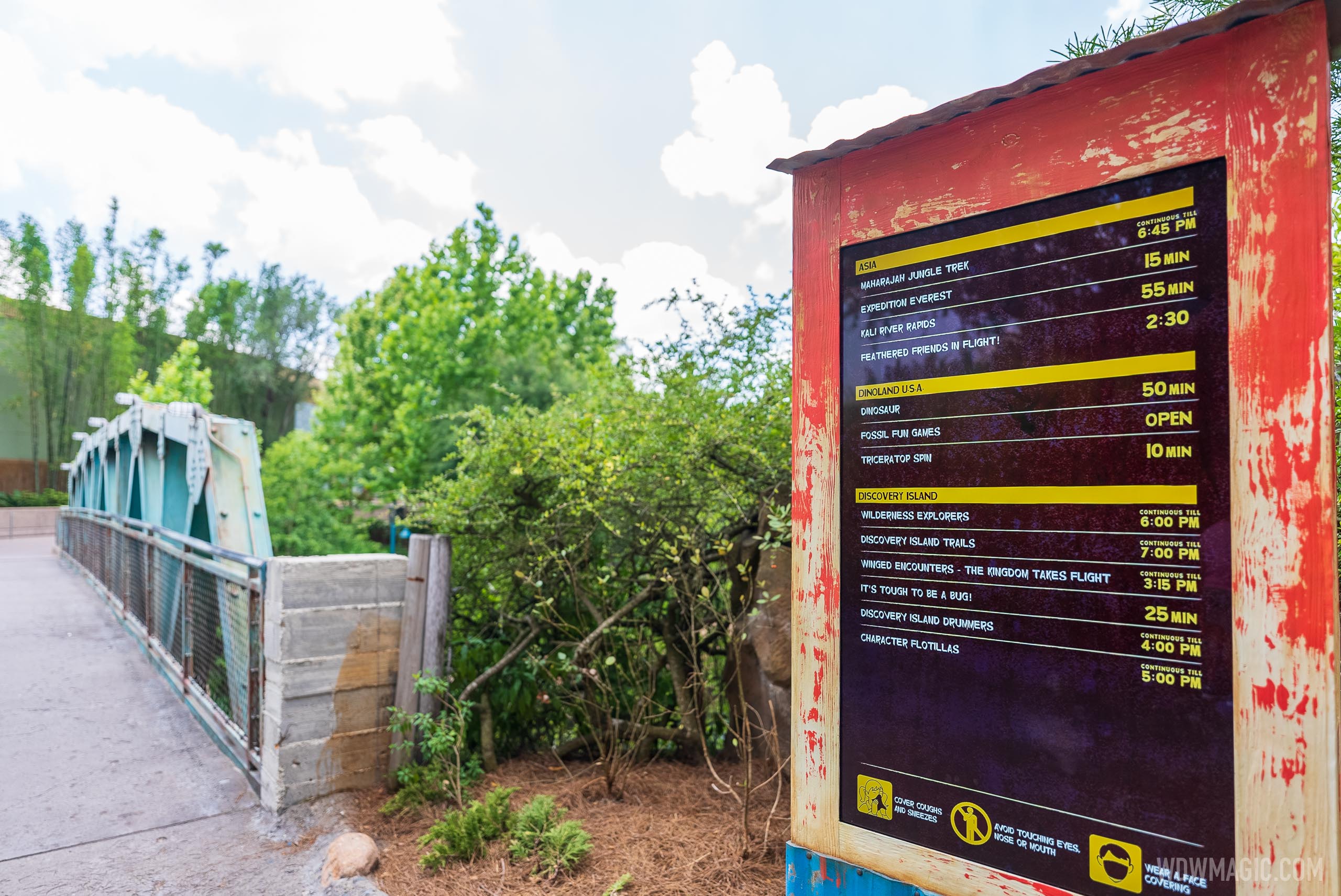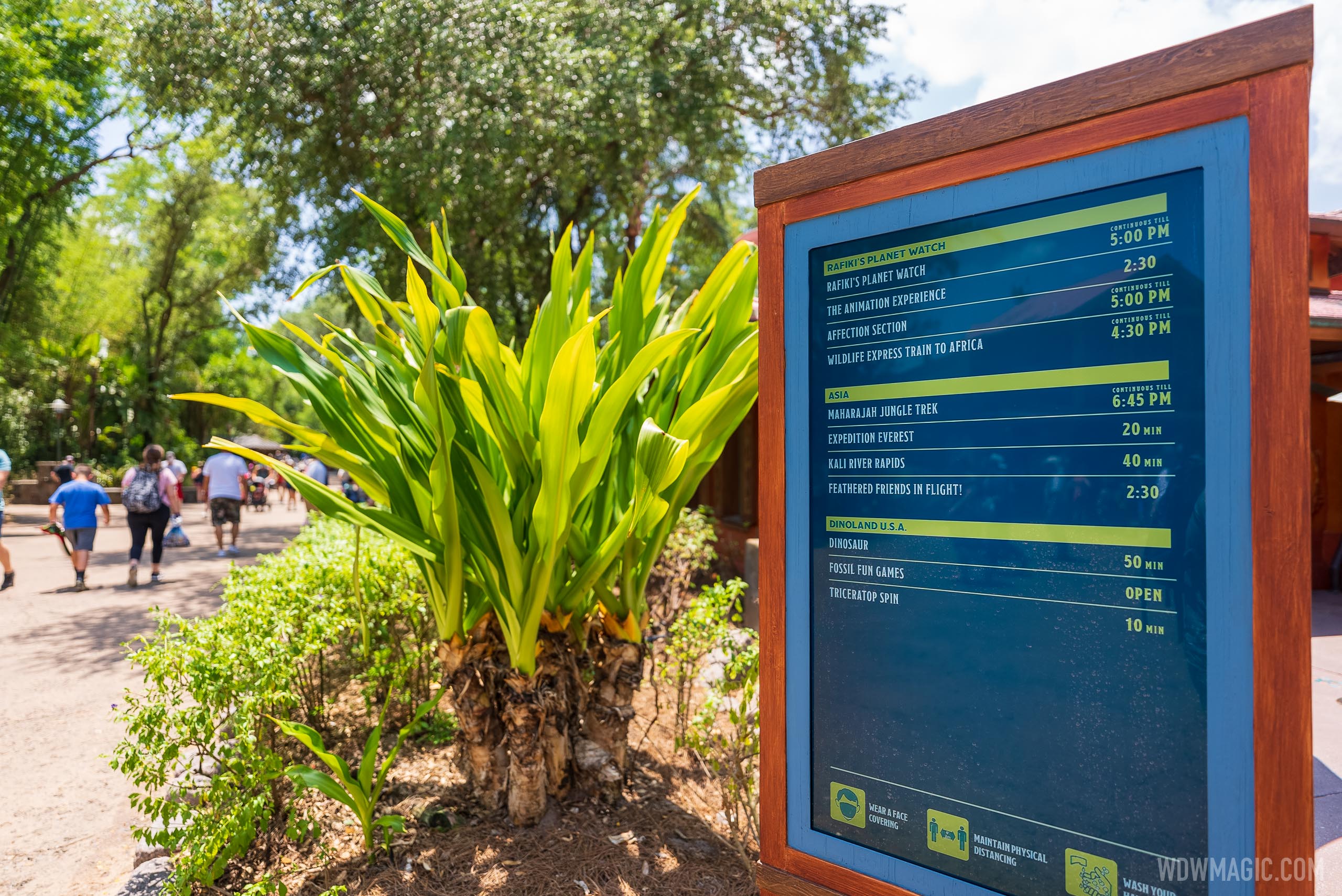
Digital Tip Boards arrive at Disney's Animal Kingdom
New displays offer information to park visitors.


You'd think they'd be able to blend the graphic in a bit better with the environment. Keep it readable, but make it look like paper maybe?
You'd think they'd be able to blend the graphic in a bit better with the environment. Keep it readable, but make it look like paper maybe?
Interesting. They pulled these out of most parks years ago.
It looks half done. When I say paper, I mean maybe newspaper, or whatever would suit the land the display is in. To me, as is these only fit Pandora.This is funny because I was about to say that I appreciate the weathered look they gave the kiosks and I think it blends in nicely!

When they installed them at MK they started with an unthemed generic display such as these and then after a little time changed them to each have a more appropriate graphic for each location.It looks half done. When I say paper, I mean maybe newspaper, or whatever would suit the land the display is in. To me, as is these only fit Pandora.
Oh good God, I'm becoming one of you all. Being overly critical. What have you done to me?!
These seem to be focused heavily on health And safety reminders at the moment, at least from the pictures in the article. These might be seen as replacements or supplements for the temporary signs everywhere with the COVID info. Them being digital would make it easier to update as they begin changing things in the coming months too.So they got rid of tip boards because of their desire to move as much to the app as possible. Now they are bringing tip boards back because... people need them? I’m confused.
This project began before Covid. MK had its new tip board displays installed before the shut down. This was part of the same initiative that brought the guest experience team. It’s just a benefit that they can now be utilized for health and safety reminders. They’re intended purpose is to permanently display wait times.These seem to be focused heavily on health And safety reminders at the moment, at least from the pictures in the article. These might be seen as replacements or supplements for the temporary signs everywhere with the COVID info. Them being digital would make it easier to update as they begin changing things in the coming months too.
It slowly happens to all of us.It looks half done. When I say paper, I mean maybe newspaper, or whatever would suit the land the display is in. To me, as is these only fit Pandora.
Oh good God, I'm becoming one of you all, I'm becoming an armchair imagineer. What have you done to me?!
Interesting. They pulled these out of most parks years ago.
So they got rid of tip boards because of their desire to move as much to the app as possible. Now they are bringing tip boards back because... people need them? I’m confused.
In areas that are pre-digital (and at AK with this particular example, I admit there is room for debate on this), theme supersedes the necessity of having digital tipboards & displays everywhere. The charm/quality of park graphics/displays of yesteryear was far greater than today's (across all parks, in everything from exit signs to wait displays to menu boards) and was so for decades without digital tip boards or menu LCDs. Remember when they had someone writing wait times in chalk on 1930s Hollywood Blvd. They could have easily had a digital board all those years. That was because WDI got it back then - they actually wrote the book on it. It was the John Hench School of Design. The sum of a thousand little differences are what differentiate the very best theme parks from amusement parks. Putting hi-tech digital displays in all the pre-digital lands, replacing analog graphics, is one of those nuances that modern Disney/WDI doesn't get.For those who want more 'theming' on something like this, it's important to keep in mind the purpose of a board like this. They are meant to communicate information in as clear and precise a way as possible. They need to be distinguishable and understandable by every guest in a wide range of outdoor lighting conditions. It's needs to be legible and clear no matter your native language or age. Themed and detailed decoration will commonly detract from the clarity of the information on the board.
Who among us (at least above a certain age) hasn't gone to a restaurant where they went crazy with the fonts and theming on the menu and you can't read a blessed thing. Simple and accurate should always be the goal for something like this. The enclosure seems to be appropriately themed but clear and concise on the content is better.,
Animal kingdom is not exactly pre digital. Everything is set in the present.In areas that are pre-digital (and at AK with this particular example, I admit there is room for debate on this), theme supersedes the necessity of having digital tipboards & displays everywhere. The charm/quality of park graphics/displays of yesteryear was far greater than today's (across all parks, in everything from exit signs to wait displays to menu boards) and was so for decades without digital tip boards or menu LCDs. Remember when they had someone writing wait times in chalk on 1930s Hollywood Blvd. They could have easily had a digital board all those years. That was because WDI got it back then - they actually wrote the book on it. It was the John Hench School of Design. The sum of a thousand little differences are what differentiate the very best theme parks from amusement parks. Putting hi-tech digital displays in all the pre-digital lands, replacing analog graphics, is one of those nuances that modern Disney/WDI doesn't get.
It bugs me to no end when they build a beautiful period environment and then slap a big digital wait time display on the main marquee.
View attachment 555505
Correct. These are permanent installations replacing the temporary versions that were rolled out as part of the GET initiative.Don’t they have all of these around HS, especially near the GET umbrellas/kiosks?
I recall seeing them everywhere when I was there Christmas ‘19
Still, I expect vines to cover them up. Man can't control nature. Nature wins.Animal kingdom is not exactly pre digital. Everything is set in the present.
Register on WDWMAGIC. This sidebar will go away, and you'll see fewer ads.
