News Contemporary Refurbishment--April to Sept 2021

castlecake2.0

Well-Known Member
The lobby has received a few updates this week, assuming they either ran out of time or materials last year. The cheap looking vinyl-ish “hardwood” at the check in desks and Steakhouse71 entrance has been replaced with actual hardwood. The desks have also been replaced with a new more stylish looking desks with a bit more flaire to them. The other site has pics ;)
 

Disney4family

Well-Known Member
The lobby has received a few updates this week, assuming they either ran out of time or materials last year. The cheap looking vinyl-ish “hardwood” at the check in desks and Steakhouse71 entrance has been replaced with actual hardwood. The desks have also been replaced with a new more stylish looking desks with a bit more flaire to them. The other site has pics ;)
1647882316414.png
The new desk design reminds me of this.
And what happened to the iconic scent in the lobby??? Did the new, cheap, uncomfortable, plastic furniture on the other side of the lobby take over the scent?
They really destroyed this hotel, from the operation room style, bright lights that make the main area now glow orange (from the horrible new carpet) to this.
I always thought "deluxe" meant luxurious, elegant or high quality, not plastic, cheap and tacky.
 

UNCgolf

Well-Known Member
In general they did a good job with the Contemporary lobby (especially compared to what they did to the rooms and what they've done to other resorts overall), but I think the rectangle desks looked a lot better than these rounded ones.
 

Skywise

Well-Known Member
I'm kind of torn on the desks. I think they're going for a late 60s aesthetic where everything was curves and rounded but the new desks don't really match that retro-style so it's kind of a fail for me there.

OTOH they're kinda cool looking but I think the original desk (before the retheme) would've worked just fine in the new decor.

Also love "that other site that shall not be named" thought that the rounded corners were done for 'safety reasons' :facepalm:
 

UNCgolf

Well-Known Member
I think they're going for a late 60s aesthetic where everything was curves and rounded but the new desks don't really match that retro-style so it's kind of a fail for me there.

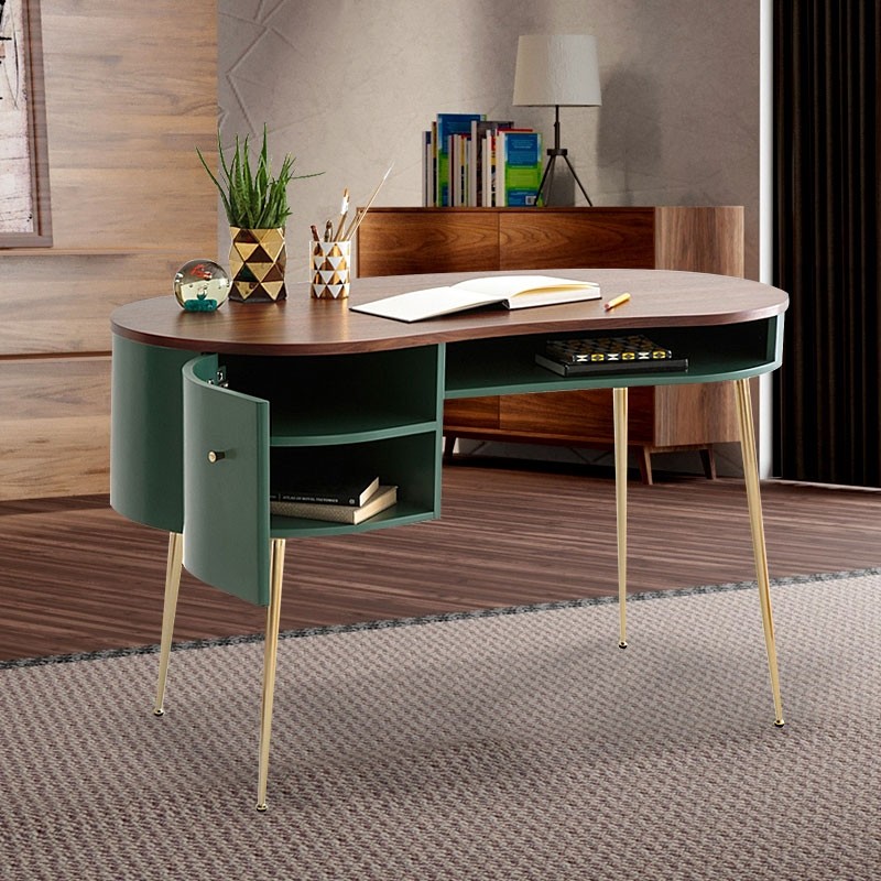
I was wondering if they were trying to go for a mid-century modern feel, but if so, they didn't really succeed. They'd have been better off with a desk that looked something like this:

mid_century_modern_green_curved_office_desk_computer_desk_with_shelves_amp_storage_gold_legsj040415_4.jpg


Regardless, in the grand scheme of things, it's incredibly minor and the overhaul was still well done, especially compared to other places at WDW.
 

Register on WDWMAGIC. This sidebar will go away, and you'll see fewer ads.

Back
Top Bottom