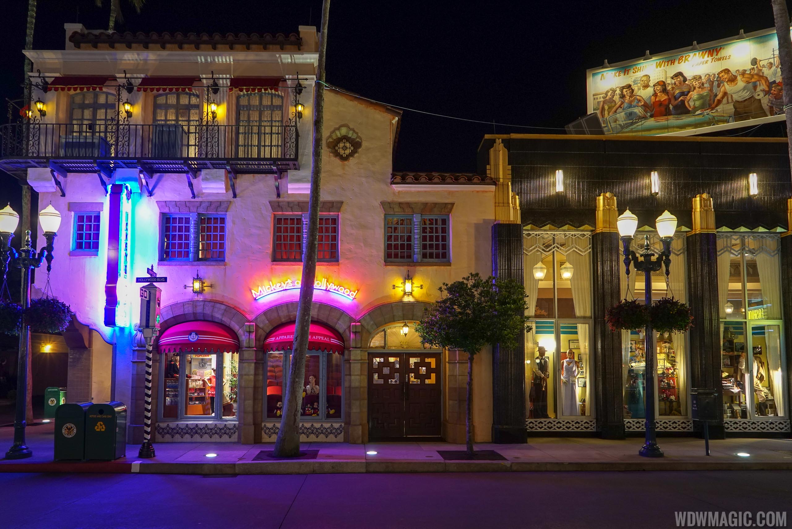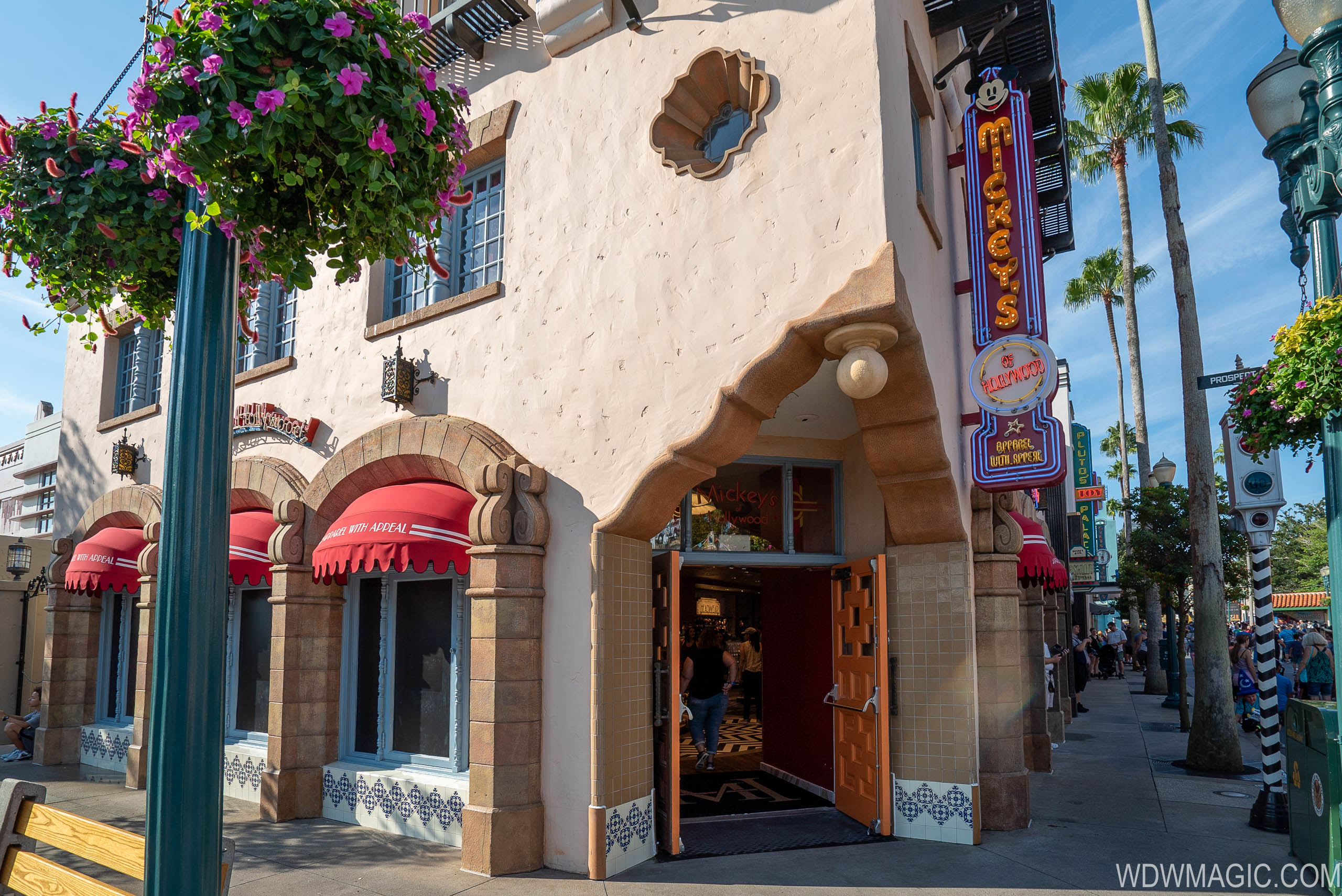
Mickey's of Hollywood closing for refurbishment
The main merchandise location at Disney's Hollywood Studios is closing for refurbishment.

I am not sure what is more surprising: the number of closed retail spaces this summer or that Disney is realizing 3 months out from SWL opening that the park needs work elsewhere.
Signs point to an unusually quiet summer in the parks, however.
Of course they will.true, just very concerned they are going to strip them of any theming/personality making them generic like other location refurbs.
Only the interiors of shops and restaurants. And resort hotel rooms. The facades are still allowed to be themed at least. It also doesn’t look like SWL retail and dining will be light on theming. I’m not sure why they have multiple rule books on interior design now.Disney is removing the "theme" from theirthemeparks.
Don't even get me started on the Banana Repubization of the World of Disney and now apparently the theme parks shops."We're giving guests what they want - a modern, bland, industrial look that allows us to maximize sales per square inch" - Bob Chapek
Just go to World of Disney, Emporium, MouseGear, or Island Mercantile...So what is the big store in DHS now? I'm going while this is closed and was hoping to get Magic Bands at DHS (staying at Swolphin). Mickey's of Hollywood was my plan, but it seems like all the large retail stores are now closed at DHS.
The one across the street, right side as you enter, and the ones on Sunset Blvd are still open. But like someone said above, every big store on property has the same stuff.So what is the big store in DHS now? I'm going while this is closed and was hoping to get Magic Bands at DHS (staying at Swolphin). Mickey's of Hollywood was my plan, but it seems like all the large retail stores are now closed at DHS.

Pure Bob Chapek - dumb down the stores, less merchandise, middle of the road, and merchandise like target or Kohl’s.
It’s straight out of Paul Presslers playbook. Less Sku’s, less unique itemsIn a way I agree, at the same time though it does look really nice except would it have hurt them to have included some character silhouettes or a nice image/mural on the boring walls? They are voiding out all whimsy and detail for way too sterile designs. I dont even feel like Im at Disney World anymore....yet it does look nice for what it is I just have a contradicting on the seesaw view of these changes. These stores could be in any upper scale mall, its just not Disney to me but yes its nice. It looks better than what they did to keystone clothiers and that jewelry store across the way.
They dont even have any Hollywood Studios souvenirs anymore, its all the same stuff, toys, purses, and tees. Just like you cant find anything that says Magic Kingdom on it anymore either.
Register on WDWMAGIC. This sidebar will go away, and you'll see fewer ads.
