Interior refurbishment at Main Street Uptown Jewelers

WDWtraveler

Well-Known Member
Original Poster
Photo update as of Saturday, July 23. Uptown Jewelers on Main Street is closed for an interior refurbishment. The exterior doors on both sides are closed, as well as interior passages between stores. The windows now advertise that Pandora is still open, but only accessible by their door in the side street.
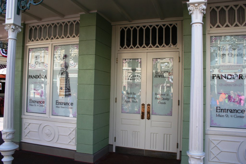
IMG_8153.JPG


A Pandora sign is posted in the street to alert shoppers.
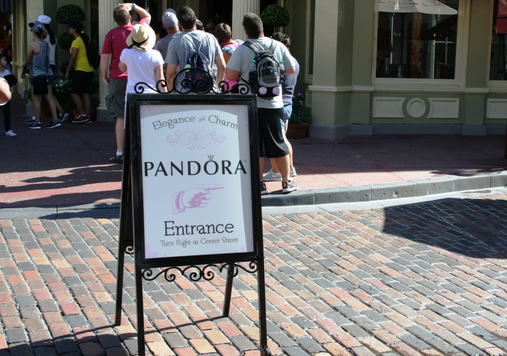
IMG_8157.JPG


Here is the only entrance to Pandora on the side street, off of Main Street. Note the blocked door to Uptown Jewelers on the right.
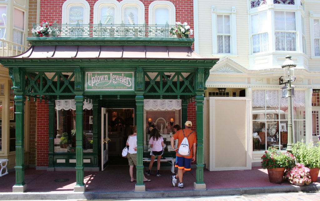
IMG_8164.JPG
 

mouse_luv

Well-Known Member
They do a cosmetic refurb yearly or bi-yearly. No biggie. How else do you think they keep the place looking decent with so many guests yearly?!
 

Bocabear

Well-Known Member
So....they removed the central display and checkout counter?
Ceiling looks nice...I guess... Looks a lot emptier and of course, no big jewelry cases in the jewelry store...just lots of small ones that are unmanned... odd for a jewelry store...
so...ummm...
 

wdwmagic

Administrator
Moderator
Premium Member
So....they removed the central display and checkout counter?
Ceiling looks nice...I guess... Looks a lot emptier and of course, no big jewelry cases in the jewelry store...just lots of small ones that are unmanned... odd for a jewelry store...
so...ummm...
I actually prefer to look in those cases without someone hovering right over the top. Lots of CMs on hand if anyone needs assistance.
 

RandySavage

Well-Known Member
As counterpoint, I see that they took out the corinthian columns of the inner octagon among the revisions.
slideshow.asp


In this age, when Disney does interior renovations on earlier-designed Period Spaces, it typically equates to removal of more unique historic details/aspects (in this case, the ring of floor-to-ceiling columns) in favor of more open crowdflow, modern, brighter lighting & modern shelving.
 

HiYa Pal

Active Member
One small detail that I love, as someone who's been in retail merchandising for 15 years, the corner bumpers at the bottom on every piece you see, that's one of the first parts of a fixture to get damaged and make it look like crap. And with all the strollers going through these stores, I'm sure the fixtures get a ton of bumps and bruises.
 

WDWtraveler

Well-Known Member
Original Poster
Photo update as of Wednesday, November 2. Beautiful photo posted above by @AJH219 showing the new ceiling and overall room. The new interior for Uptown Jewelers did open last Friday, October 28. Here are a few additional interior photos. There are only a few jewelry display cases now (two at center of this photo and at the front door, see next photo). The rest of the store is Disney merchandise. Most of the jewelry is located in the back at Pandora. P.S. The street billboard advertising Pandora was still outside as of today.

IMG_8586.JPG


The new wall paper is reminiscent of William Morris designs from the early 20th century.

IMG_8591.JPG


The check out counter is along the north wall. Pandora is at the right in the below photo.

IMG_8592.JPG
 
Last edited:

MarkTwain

Well-Known Member
As counterpoint, I see that they took out the corinthian columns of the inner octagon among the revisions.
slideshow.asp


In this age, when Disney does interior renovations on earlier-designed Period Spaces, it typically equates to removal of more unique historic details/aspects (in this case, the ring of floor-to-ceiling columns) in favor of more open crowdflow, modern, brighter lighting & modern shelving.

I've noticed this as well. There's definitely a push toward more contemporary and less historical "period" look in Disney's refurb projects. It's especially visible in a lot of their hotel renovations.

I'm not sure if I'm troubled by this or not. Part of that could be the greater fascination with historic architecture back in the 80s/90s versus the push toward open floorplan/contemporary design today. Maybe it really is just Disney losing touch with their roots in themed design and immersive placemaking. Or maybe it's just a change of demand in what people expect from an entertainment resort. Maybe all of the above?

Regardless, it's interesting.
 

The Empress Lilly

Well-Known Member
The columns support the arches, the arches support the ceiling structure. Without the columns, the ceiling structure is mere ornamentation.

The porch still has the columns, their use throughout the structure, interior and exterior, creates calm harmony.

I do agree the modern layout follows modern shop layout and 2016 shoppers preferences. Which is a negative for a historically themed shop. One with a sign saying 'established 1881'.

To end on a positive note: does this mean that crass billboard is gone?
 

The Empress Lilly

Well-Known Member
I've noticed this as well. There's definitely a push toward more contemporary and less historical "period" look in Disney's refurb projects. It's especially visible in a lot of their hotel renovations.
This!

I'm not sure if I'm troubled by this or not. Part of that could be the greater fascination with historic architecture back in the 80s/90s versus the push toward open floorplan/contemporary design today. Maybe it really is just Disney losing touch with their roots in themed design and immersive placemaking. Or maybe it's just a change of demand in what people expect from an entertainment resort. Maybe all of the above?

Regardless, it's interesting.
I have no idea why that is. All of the above indeed?

I like it when WDW reflects both the style and period it is themed as, and the period in which it was built. I loves me a 70s 1900/10/20s street!
 

Register on WDWMAGIC. This sidebar will go away, and you'll see fewer ads.

Back
Top Bottom