-
Welcome to the WDWMAGIC.COM Forums!
Please take a look around, and feel free to sign up and join the community.
You are using an out of date browser. It may not display this or other websites correctly.
You should upgrade or use an alternative browser.
You should upgrade or use an alternative browser.
PHOTOS - Magic Kingdom and Disney's Animal Kingdom launch new guide maps updated for MyMagic+
- Thread starter wdwmagic
- Start date
TipTopclubmember
Member
Is it odd to anyone else that Gaston is the chosen character to represent NFL on the cover of the new MK guide map?
englanddg
One Little Spark...
They are the same maps that are on the MDE app...a very "google maps" view of the parks.Am I the only one that thinks these maps lack an artistic flair? Almost nothing shown looks beautiful or inviting, it all looks hollow like a pre rendered model in blender or something.
And I agree, they are not inviting.
Sped2424
Well-Known Member
I guess for the app it's okay, but for the official park map you need some warmth! You would think they want guests to be wowed by something to head in that general direction in the first place. A map for many is a place to start, and if they aren't wowed on paper why should they head in that direction.They are the same maps that are on the MDE app...a very "google maps" view of the parks.
And I agree, they are not inviting.
englanddg
One Little Spark...
With MM+, they don't have to! They planned it out on the website 60 days in advance!I guess for the app it's okay, but for the official park map you need some warmth! You would think they want guests to be wowed by something to head in that general direction in the first place. A map for many is a place to start, and if they aren't wowed on paper why should they head in that direction.
Sped2424
Well-Known Member
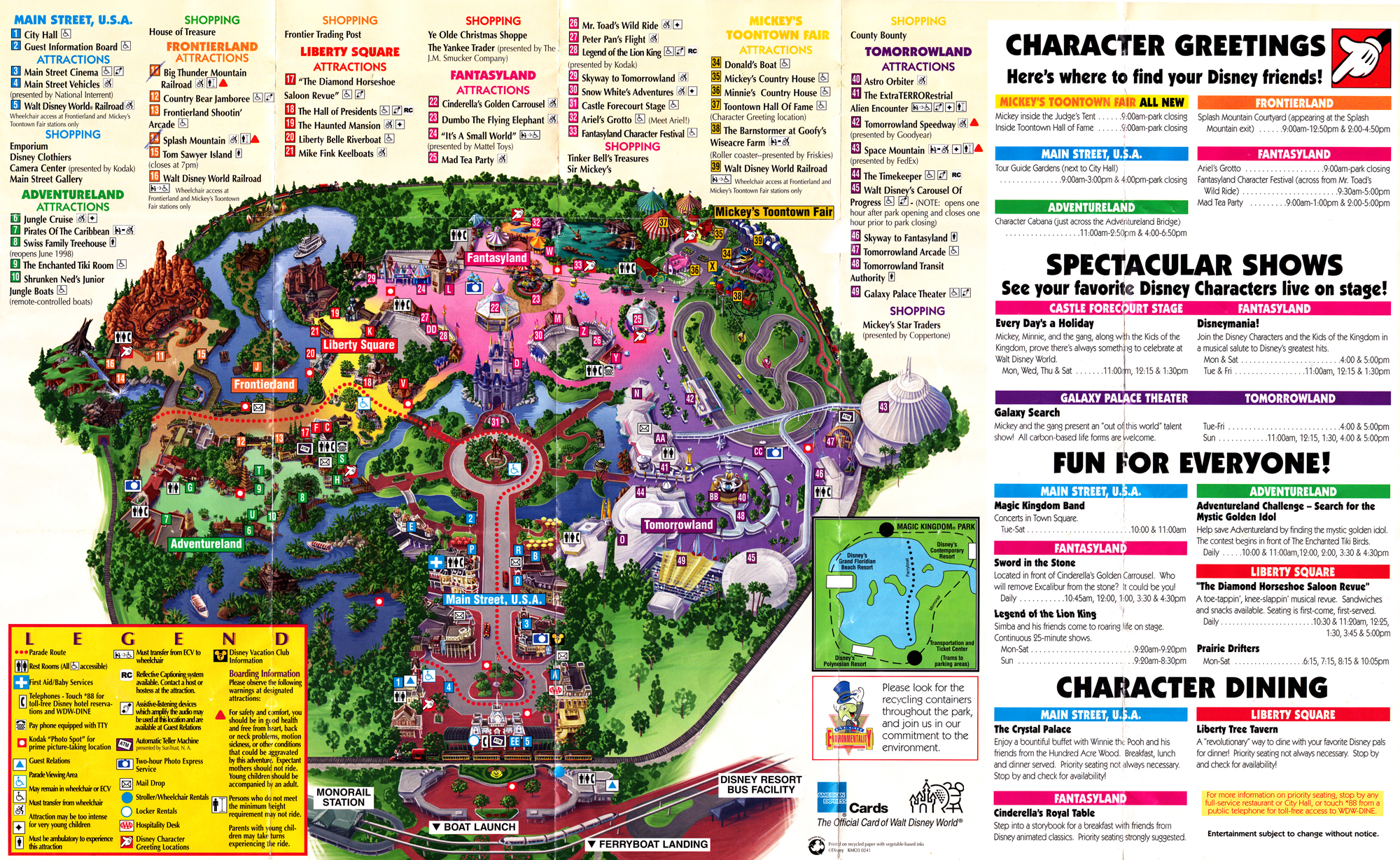
This has warmth! The color schemes of each land gives you a feel for them while still being useful. Plus the land looks populated, things are in motion there is steam out and boats moving about.
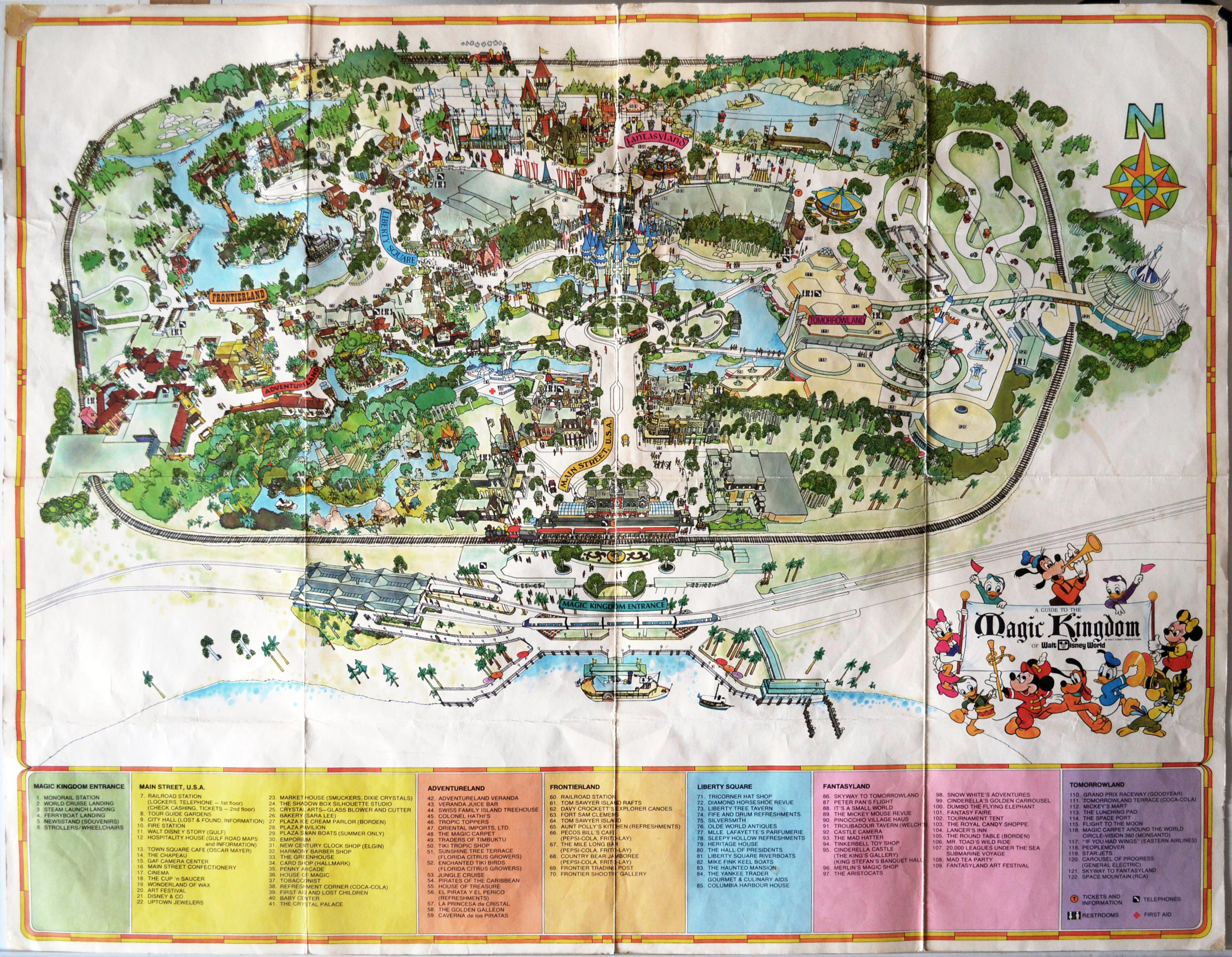
This one to me is my favorite, a beautiful water color like page that looks like its out of a storybook, perfect for the magic kingdom.
englanddg
One Little Spark...
He's the most unique M&G there. The moms are dying to see him!Is it odd to anyone else that Gaston is the chosen character to represent NFL on the cover of the new MK guide map?
MOXOMUMD
Well-Known Member
That's because:Is it odd to anyone else that Gaston is the chosen character to represent NFL on the cover of the new MK guide map?
"No one's slick as Gaston
No one's quick as Gaston
No one's neck's as incredibly thick as Gaston's..."

JohnD
Well-Known Member
Their goal is to have the maps be consistent with Google Maps. But I agree it makes the hand out versions stale. I do wish they brought back the more whimsical maps.
Another issue is that all maps are oriented by the compass instead of the entrance at the bottom. This is less of an issue for AK and MK since the entrance is already from the south.
But with Epcot and HS, I feel like I'm looking at the maps upside down since you enter from the north, even if the maps are represented correctly geographically. I prefer these maps be POV with the entrance at the bottom. They would be more helpful as you walk through the parks.
Register on WDWMAGIC. This sidebar will go away, and you'll see fewer ads.