'it's a small world' Refurbishment July 27-29

Little Green Men

Well-Known Member
The photos don't do it justice...It was beautiful and vibrant...and the fountains gave it some lovely kinetic appeal. They could do so much more with it now with new technology. Even digital mapping projections on the current all white building motifs that would come to life every hour with the clock would be a wonderful surprise...
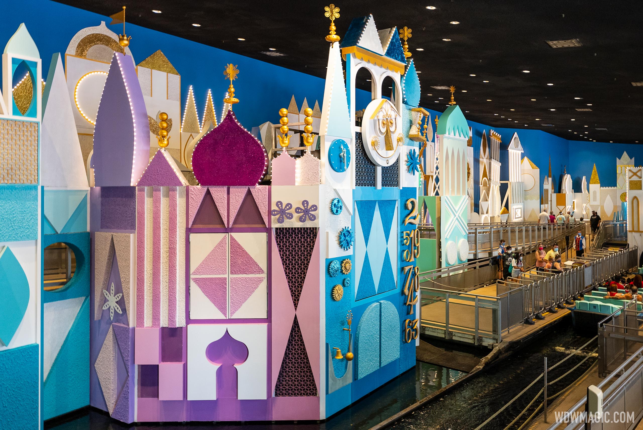
I saw it in person many times. Other than the fountains I prefer the current look more.
 

LittleBuford

Well-Known Member

raymusiccity

Well-Known Member
Considering what has happened in the past few months. My guess is someone thought it wasn't inclusive enough.
You're probably treading close to what they've been discussing behind closed doors. Maybe it's too white. They'll probably say that the maintenance costs of all of those white costumes would be so much lower in muted colors.....or, how about a rainbow of colors! :(
 

Introvert

Member
I like the bright colors and wish they used them in the whole area. White on white is not always a great
decorating style.
White on white works it there is texture introduced and different shades of white otherwise it is bland , boring and does not help in depicting details in the structure. I too like the use of color since it encourages your eyes to roam the whole canvas and notice the details and difference in designs
 

Skywise

Well-Known Member
Was the queue area always a sort of white with gold trim? I prefer this but get the sense they went with the white color scheme later? (and yes, bring back the fountains)
 

Register on WDWMAGIC. This sidebar will go away, and you'll see fewer ads.

Back
Top Bottom