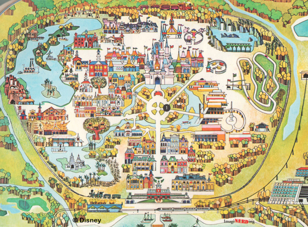
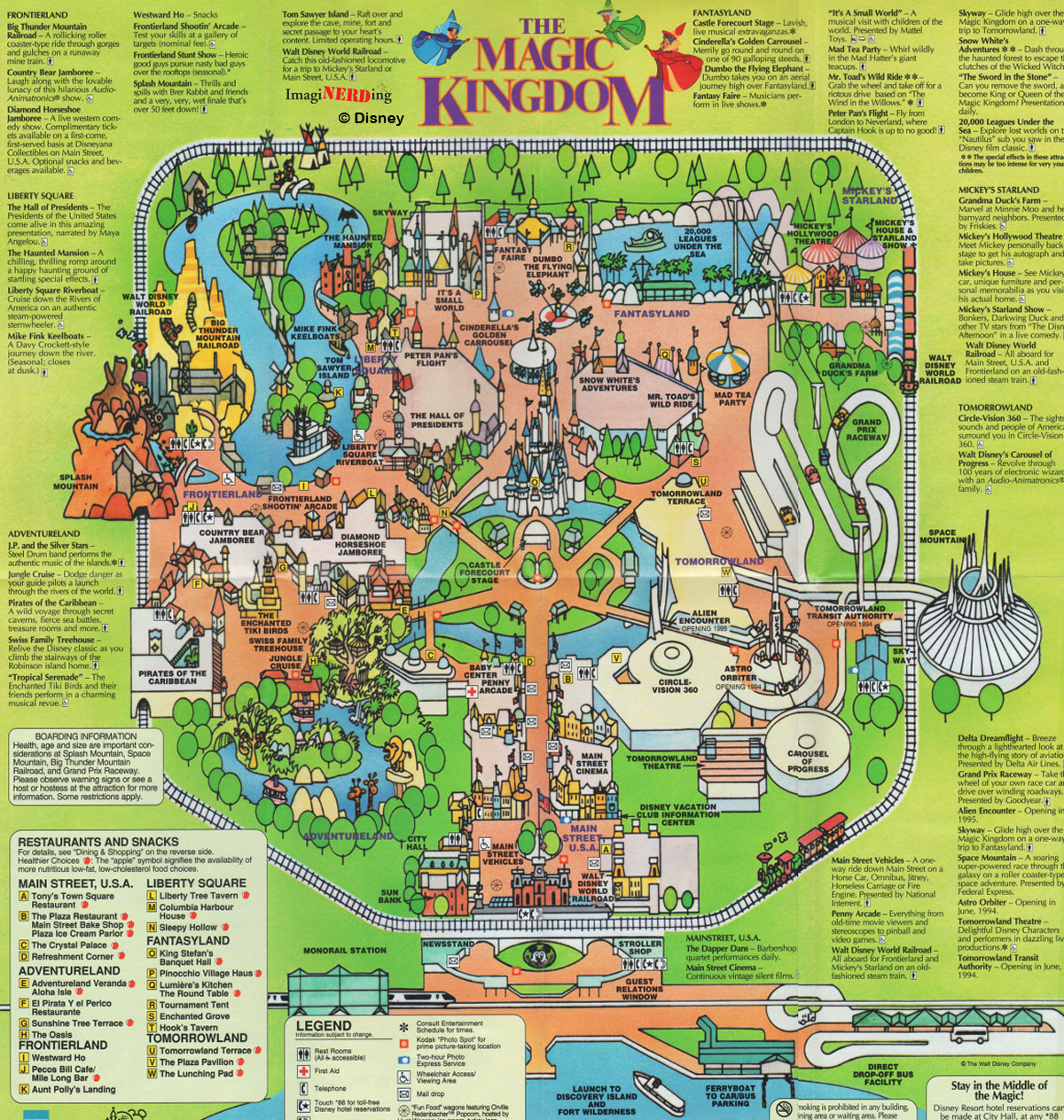
Gee, it's almost as if they've realized that using maps that are entirely true to scale isn't the most effective way for guests to navigate the park.
Disney's park maps evolved over the years, but they consistently eschewed an overly-exact design in favor of one that places emphasis on points of interest, whether those be attraction entrances, shops and restaurants, or iconic pieces of scenery that could be helpful in wayfinding.
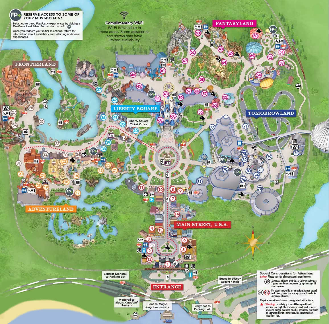
However, when the NextGen/MyMagic+ resort-wide integration rolled out, so did new maps. This iteration was designed to be seen on a phone/computer screen first and a printed piece of paper second. While they added the functionality of realistic location-based directions, much of it came at the expense of hiding the valuable information amongst the clutter of vast rooftops, meandering walkways, and unnecessary detail.
If I'm a guest trying to find my way to iasw, it's a lot more important for me to know to look for the (blue and white?) striped marquee than it is to know how far the building extends into backstage, or exactly how many pennants are sticking up over the waiting area.
The field of mapmaking has spent hundreds of years trying to find ways to deliver the most important information, rather than the most exact; in a 3-dimensional world, a 2-dimensional map is never going to be accurate, but that doesn't mean it can't be useful. The MM+ maps, for all their tech savviness, put too much emphasis on accuracy at the expense of usability.
This latest update seems to put more emphasis on these important wayfinding landmarks. The facades take up more space, and the big blank roofs are minimized so as not to be a distraction; the changes in scale not only highlight points of interest, but also help delineate different zones within the land for easy identification. It looks like the guest walkways are still shown roughly to scale to allow in-app navigation, it appears that the pendulum is swinging back toward a more user-friendly direction.


