George Lucas on a Bench
Well-Known Member
Also, let's just appreciate the remarkable charm of the aborted Rocket Rods entrance, a two lane road shooting off into the distance, presumably into the future. The Road to Tomorrow!

Changing out the rocks for the white oval flowerbeds really highlights how out of place the Astro Orbiter truly is.
Sounds terrible. I don’t trust that modern Disney would adapt Tron into Disneyland’s small footprint.
Yes. And that was the official artwork where they tried to shade it in its most flattering light and color tone. The reality will be more glaring.
The buildings behind it aren't helpful either; the 1998 Rocket Rods marquee repurposed for Buzz Lightyear, and the 1998 Star Tours marquee, that are both brown and bronze and coated in steampunkish goo-gaws that are not sleek or smooth a la' 1967.
The tailfin panels that jut up in front of the 1998 marquees, the old Bell System building on the left and the Monsanto building on the right, work fine now that they've been repainted silver. And they were designed specifically to incorporate into the 1967 aesthetic, so of course they'd still work.
But it's the whole rest of the entry that just messes it all up, most notably the Astro Orbiter that has absolutely nothing to do aesthetically with Tomorrowland 1967 or any mid-century modern design. Again, I'm afraid WDI is trying to fix a cheap mistake from 1998 by simply making another cheap mistake in 2020. Why?!?
They're never going to get this back, so why try some weird and wimpy half-butt version of it?
White and Blue would be a good start.I'm not very astute when it comes to color coordination, but for those who are, how could the Orbiter be painted to better fit the surroundings?
Would require creativity, imagination, outside the box thinking, originality, a sense of time and place.
I'm not very astute when it comes to color coordination, but for those who are, how could the Orbiter be painted to better fit the surroundings?
As a geologist... I approved of the columnar basalt features and their removal has saddened me...
No one thinks about the rocks, especially in these trying times...
View attachment 505690
Someone's not getting a Christmas card from me this year.... tear it all down and start fresh with an all new space mountain...
This. Is. Perfection.Yes. And that was the official artwork where they tried to shade it in its most flattering light and color tone. The reality will be more glaringly mismatched.
The buildings behind it aren't helpful either; the 1998 Rocket Rods marquee repurposed for Buzz Lightyear, and the 1998 Star Tours marquee, that are both brown and bronze and coated in steampunkish goo-gaws that are not sleek or smooth a la' 1967.
The tailfin panels that jut up in front of the 1998 marquees, the old Bell System building on the left and the Monsanto building on the right, work fine now that they've been repainted silver. And they were designed specifically to incorporate into the 1967 aesthetic, so of course they'd still work.
But it's the whole rest of the entry that just messes it all up, most notably the Astro Orbiter that has absolutely nothing to do aesthetically with Tomorrowland 1967 or any mid-century modern design. Again, I'm afraid WDI is trying to fix a cheap mistake from 1998 by simply making another cheap mistake in 2020. Why?!?
They're never going to get this back, so why try some weird and wimpy half-butt version of it?
Yes. And that was the official artwork where they tried to shade it in its most flattering light and color tone. The reality will be more glaringly mismatched.
The buildings behind it aren't helpful either; the 1998 Rocket Rods marquee repurposed for Buzz Lightyear, and the 1998 Star Tours marquee, that are both brown and bronze and coated in steampunkish goo-gaws that are not sleek or smooth a la' 1967.
The tailfin panels that jut up in front of the 1998 marquees, the old Bell System building on the left and the Monsanto building on the right, work fine now that they've been repainted silver. And they were designed specifically to incorporate into the 1967 aesthetic, so of course they'd still work.
But it's the whole rest of the entry that just messes it all up, most notably the Astro Orbiter that has absolutely nothing to do aesthetically with Tomorrowland 1967 or any mid-century modern design. Again, I'm afraid WDI is trying to fix a cheap mistake from 1998 by simply making another cheap mistake in 2020. Why?!?
They're never going to get this back, so why try some weird and wimpy half-butt version of it
That looks good. I think the main reason I don't like the new ovals with little pointy things that they put in your sandwich is because they're dinky and just look slapped in there. They don't blend in at all whereas this perfectly arranged entrance looks consistent, practical and pleasant.
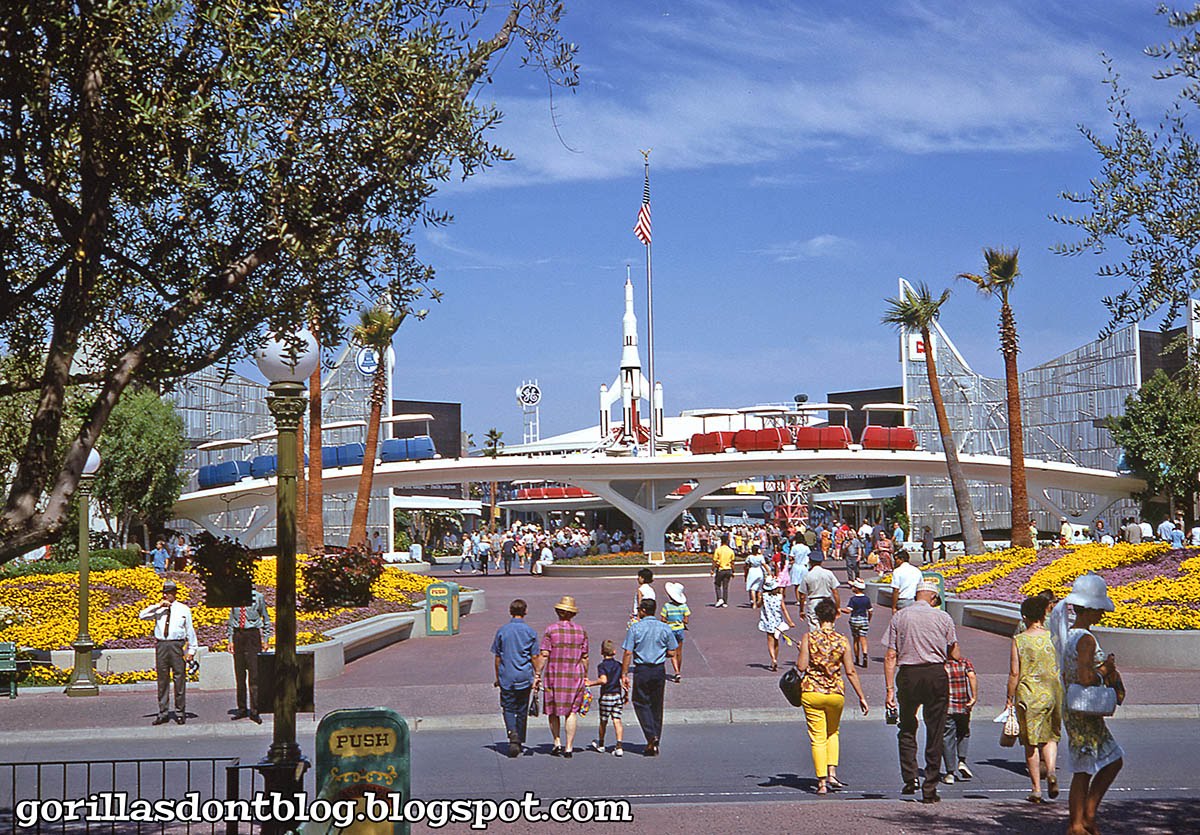
Old Tomorrowland was dated, but it still works more or less in this appearance. Clean public transit on elevated trackway, nice silvery and white futuristic aesthetics, palm trees to signify that the ideal future would be located in a pleasant warm climate and a big American flag to remind everyone that America is better than everywhere.
View attachment 505869
I can see why people didn't like this redone version looking at it side by side. The 1998-2020 entrance looks like a junkyard. I liked the rocks and their vague similarity to the Vasquez Rocks famous for appearing in Star Trek sort of fits, but it's most certainly a huge disaster that I can't really defend.
I only wish the 10 year old me would have truly appreciated that amazing GE corporate sponsor signage weenie. Visible from the hub, that's impressive. Makes those Monsanto and Bell corporate alliance guys look like jerks.


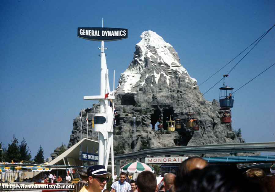
General Dynamics is still going strong. A place I worked at a few years back here in the Bay Area makes broadband microwave-frequency components and they are one of the company's larger clients.I always chuckle when some youngster complains about a minor Starbucks logo on Main Street.
I'm thinking "You kids would have hated the way Walt ran the place! Giant corporate logos glowing above everything and anything they could get a sponsor for!"
They also had some great graphic design back in the day.General Dynamics is still going strong. A place I worked at a few years back here in the Bay Area makes broadband microwave-frequency components and they are one of the company's larger clients.
Register on WDWMAGIC. This sidebar will go away, and you'll see fewer ads.