The Miscellaneous Thought Thread

Rich T

Well-Known Member
They are categories that people can filter when looking at the list of attractions.
That’s cool. The overall effect, as it stands however, is a sterile and poor up-front presentation (IMO). The more entertaining description should be the first thing you see when browsing, and THEN have the option to view by filter categories.

Right now, you get a cold classification first, with another click necessary to reach a genuine description, which I really believe is what most of the site visitors are actually interested in.

I realize it’s just the alphabetical order of attractions that hilariously brings up “LOUD, DARK and SLOW” as the first thing one sees when opening the attraction section, but it’s a lousy first impression.

Just my opinion, of course, but for me the priority is backwards… which for me kind of sums up the current state of today’s Disney.
 

Rich T

Well-Known Member
I don't think it's saying slow to mean bad; there are people out there visiting the park who have no interest in going on anything fast.

It's not an inaccurate description.

If not slow, what would be a better term to get the same point across?
Please see my above reply to lazyboy97o. For me it’s about priorities in presentation, and I’m not surprised that today’s Disney would get it backwards (in my opinion).
 

PiratesMansion

Well-Known Member
Please see my above reply to lazyboy97o. For me it’s about priorities in presentation, and I’m not surprised that today’s Disney would get it backwards (in my opinion).
What the Disneyland website looks like for me doesn't match what you or TP2000 are showing at all.

This is what I see on Disneyland's website right now:
Screenshot (13).png


To me, this is fine. All of the necessary information is there in what seems to me to be an appropriate order.
 

The Empress Lilly

Well-Known Member
I'm afraid I would consider it the correct order to first classify a ride, then to describe it.

If your party for whatever reason can't do fast big thrill rides, doesn't it make more sense to have the first (preferably filtered) info be 'fast big thrills' rather than having to read the ride’s entire story before finally being given the relevant info? Times eighty rides.
 

TP2000

Well-Known Member
What the Disneyland website looks like for me doesn't match what you or TP2000 are showing at all.

This is what I see on Disneyland's website right now:
View attachment 784578

At first, I was thinking "What the heck, is there some alternate version of Disneyland.com that I don't know about?"

But then I went and searched, and when you go to the Attractions page and see the list of attractions in alphabetical order, you have to click on each one to get a separate page to come up like you saw. This is the first pass "Attractions Information" page on their website, and I doubt most people click past it. Or on their App, since they are trying to get away from paper guidemaps now, this is the type of thing you see first...

Website.jpg


For what it's worth, anyone who can't figure out that Astor Oribtor is "SPINNING" probably has no idea what a website or App is in the first place. 🤣
 

TP2000

Well-Known Member
Please see my above reply to lazyboy97o. For me it’s about priorities in presentation, and I’m not surprised that today’s Disney would get it backwards (in my opinion).

It's not just you, their priorities are entirely backwards now.

Instead of prioritizing showmanship and warm hospitality, they are prioritizing legaleze and humorless corporate-speak.
 

PiratesMansion

Well-Known Member
At first, I was thinking "What the heck, is there some alternate version of Disneyland.com that I don't know about?"

But then I went and searched, and when you go to the Attractions page and see the list of attractions in alphabetical order, you have to click on each one to get a separate page to come up like you saw. This is the first pass "Attractions Information" page on their website, and I doubt most people click past it. Or on their App, since they are trying to get away from paper guidemaps now, this is the type of thing you see first...

View attachment 784582

For what it's worth, anyone who can't figure out that Astor Oribtor is "SPINNING" probably has no idea what a website or App is in the first place. 🤣
If you're going through a list of all a park/resort's rides on one page, it's probably more important to the average guest to cut to the chase and get to the need-to-know information, especially if they have young kids, than to front-load with the fanciful description.

I'm not saying the lawyers have nothing to do with it, but there really are average guests visiting the parks that want to know immediately what a ride does so that they can determine if they or (often more importantly) their small child would want to do the attraction. And some adults want this information too-I've been to parks, Disney or otherwise, with grown adults that didn't want to do anything that had drops, or involved getting in a ride vehicle, or anything that got off the ground (seriously-worst park visit ever because that person did like three rides the whole day and the other person was willing to placate the do-nothinger, leaving me the only person doing rides at a park :rolleyes:). The full description is still there for people who want to click on the page.

And this isn't just a Disney trend either; it feels to me like the average website is less wordy and more to-the-point than they were 10-20 years ago.

So if anything, don't blame Disney, blame the rubes that now dictate how websites are designed for pretty much every company, and certainly pretty much every site for a tourist attraction.
 

mickEblu

Well-Known Member
Original Poster
The Balloon Mickey/ Minnie figure and flags in the Carnival scene on MMRR (the only moving physical objects in that scene) haven't moved in months. That ride needs some help. In particular the Stampede and Carnival scenes. They have practically no physical objects or practical effects. Which is noticeable as they are large and you are in those rooms for a decent amount of time. The tunnel with Mickey and Minnie works very well. It's intimate and has moving 3D figures/ AA's. Everything from the Tornado until the climax is "fine" IMO. Not great but passable. The tornado scene is quick, you feel the wind, it's dark and the tornado spins. The volcano room is quick, the transformation to the ocean is neat as is the waterfall scene. The sewer to the city is fine. The city scene is great. Staged very well with a nice physical presence in Pete. Personally I would have went a different direction than Daisy's dance studio. Maybe Donald (who needs more of a presence) is angry and chasing us around the room for some reason. The climax is meh but I don't have anything better off the top of my head. The finale with Mickey, Minnie and Pluto is quite charming. If they fixed the Stampede, Carnival and climax/ factory scenes I think I would have a different perception of the ride.
 
Last edited:

TP2000

Well-Known Member
If you're going through a list of all a park/resort's rides on one page, it's probably more important to the average guest to cut to the chase and get to the need-to-know information, especially if they have young kids, than to front-load with the fanciful description.

I'm not saying the lawyers have nothing to do with it, but there really are average guests visiting the parks that want to know immediately what a ride does so that they can determine if they or (often more importantly) their small child would want to do the attraction. And some adults want this information too-I've been to parks, Disney or otherwise, with grown adults that didn't want to do anything that had drops, or involved getting in a ride vehicle, or anything that got off the ground (seriously-worst park visit ever because that person did like three rides the whole day and the other person was willing to placate the do-nothinger, leaving me the only person doing rides at a park :rolleyes:). The full description is still there for people who want to click on the page.

And this isn't just a Disney trend either; it feels to me like the average website is less wordy and more to-the-point than they were 10-20 years ago.

So if anything, don't blame Disney, blame the rubes that now dictate how websites are designed for pretty much every company, and certainly pretty much every site for a tourist attraction.

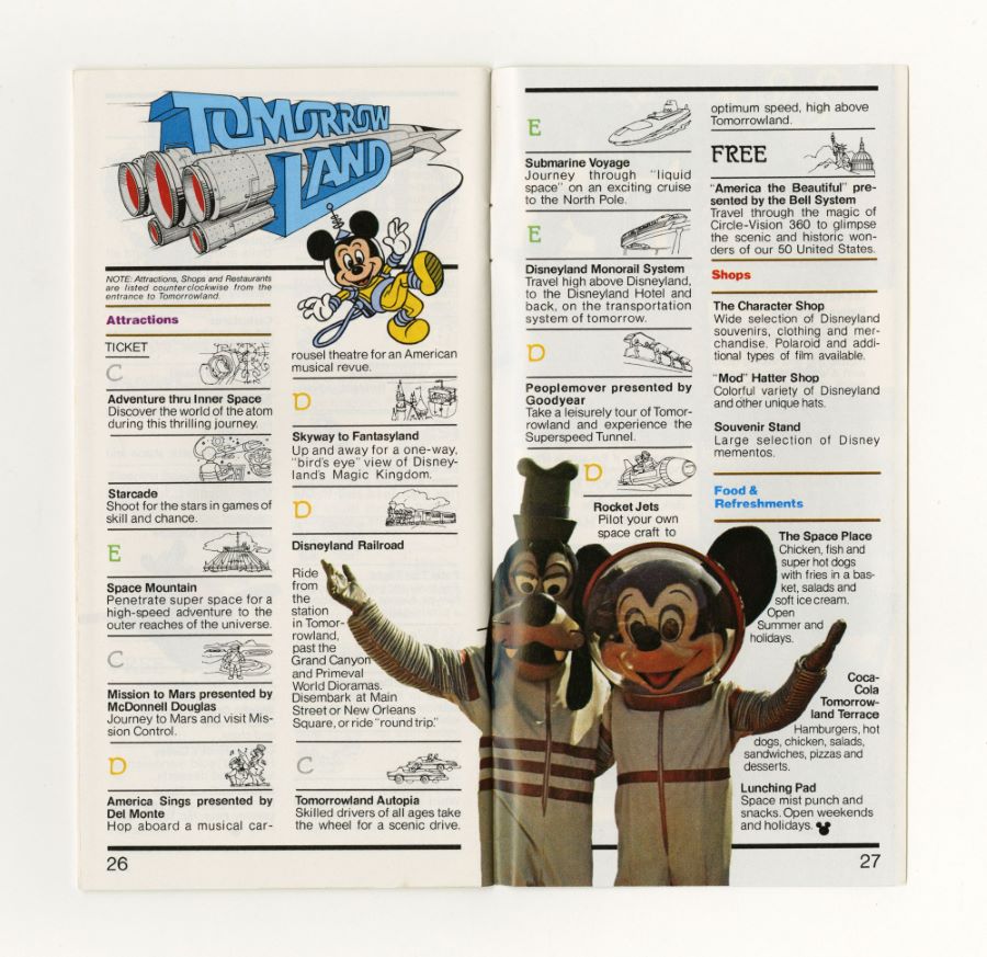
How did Disneyland ever make it to it's 50th Anniversary in 2005 with nothing but a paper guidemap?!?

may22541e.jpg
 

lazyboy97o

Well-Known Member
If you're going through a list of all a park/resort's rides on one page, it's probably more important to the average guest to cut to the chase and get to the need-to-know information, especially if they have young kids, than to front-load with the fanciful description.

I'm not saying the lawyers have nothing to do with it, but there really are average guests visiting the parks that want to know immediately what a ride does so that they can determine if they or (often more importantly) their small child would want to do the attraction. And some adults want this information too-I've been to parks, Disney or otherwise, with grown adults that didn't want to do anything that had drops, or involved getting in a ride vehicle, or anything that got off the ground (seriously-worst park visit ever because that person did like three rides the whole day and the other person was willing to placate the do-nothinger, leaving me the only person doing rides at a park :rolleyes:). The full description is still there for people who want to click on the page.

And this isn't just a Disney trend either; it feels to me like the average website is less wordy and more to-the-point than they were 10-20 years ago.

So if anything, don't blame Disney, blame the rubes that now dictate how websites are designed for pretty much every company, and certainly pretty much every site for a tourist attraction.
I don’t think lawyers have anything to do with it. It’s not a static list. It’s search results. The information presented on the list refers to the search criteria available at the top of the page. It directly ties to the function of the page. Giving people the more descriptive language would be user hostile as it would break from their input.

Some parks have a list of attractions near the front that is organized by height requirements. That’s not the place to put more detailed descriptions because that’s not the information being presented. The attraction list isn’t actually the same as the old park guides and treating it as such would be forcing it into being a skeuomorph of something it’s not actually trying to be.
 

Rich T

Well-Known Member
…So if anything, don't blame Disney, blame the rubes that now dictate how websites are designed for pretty much every company, and certainly pretty much every site for a tourist attraction.
Naw, I’m still gonna blame Disney for following the dictation instead of trusting their own legacy and (IMO) not understanding what made them great in the first place. Just as (IMO) they don’t trust their own studio to generate great ideas, and instead go out and purchase already-established IPs… and no longer trust their Imaginaneers to create brilliant, original non-IP experiences. It’s almost as if Disney doesn’t wanna be Disney; they instead want to conform to the current mass norm…in my opinion. Just sayin’.
 
Last edited:

Rich T

Well-Known Member
What the Disneyland website looks like for me doesn't match what you or TP2000 are showing at all.

This is what I see on Disneyland's website right now:
View attachment 784578

To me, this is fine. All of the necessary information is there in what seems to me to be an appropriate order.
To me, having to click on each individual attraction to get the actual description is backwards. This should be the first thing you see. They’ve put the cold and sterile up front and the warm and creative in back.

It’s like if you wanted to find a definition in an electronic dictionary, but each entry on the list just gave you the word type and origin, and you had to click on the word to bring up the definition. Why not just design it to have the definition up front in the first place?

It’s just a matter of design preference, but I personally think the priorities are backwards.

Every now and then I see something that just reconfirms to me why I really don’t like the Bob-era way of handling the parks. Recent minor examples:

1) The website design priorities.
2) Smellephants.
 
Last edited:

Rich T

Well-Known Member
And now I’m gonna use my pass to go to Epcot and ride Spaceship Earth. I don’t care what it’s about; I just wanna ride something dark, loud and slow. 😃
(Update: Oh, poo. It’s dark, loud, slow and MOBBED.)
 
Last edited:

lazyboy97o

Well-Known Member
To me, having to click on each individual attraction to get the actual description is backwards. This should be the first thing you see. They’ve put the cold and sterile up front and the warn and creative in back.

It’s like if you wanted to find a definition in an electronic dictionary, but each entry on the list just gave you the word type and origin, and you had to click on the word to bring up the definition. Why not just design it to have the definition up front in the first place?

It’s just a matter of design preference, but I personally think the priorities are backwards.

Every now and then I see something that just reconfirms to me why I really don’t like the Bob-era way of handling the parks. Recent minor examples:

1) The website design priorities.
2) Smellephants.
You wouldn’t expect a listing of movie showtimes to prioritize descriptions of the movies even though that is more engaging than a list of places and times. There’s no legacy to look to because the list is not what you want it to be, it is not a digital version of a printed park guide that has to contain a bunch of different information in one place. It is a search tool. Getting the ride description tells you nothing if you’re trying to see which rides are available to a kid of a certain height. It tells you nothing if you’re trying to know which rides are spinners. Or which rides include darkness or the other criteria that the list can be filtered by. Just like getting a movie description wouldn’t help you if you want to know what’s playing nearby in the afternoon.
 

Rich T

Well-Known Member
You wouldn’t expect a listing of movie showtimes to prioritize descriptions of the movies even though that is more engaging than a list of places and times. There’s no legacy to look to because the list is not what you want it to be, it is not a digital version of a printed park guide that has to contain a bunch of different information in one place. It is a search tool. Getting the ride description tells you nothing if you’re trying to see which rides are available to a kid of a certain height. It tells you nothing if you’re trying to know which rides are spinners. Or which rides include darkness or the other criteria that the list can be filtered by. Just like getting a movie description wouldn’t help you if you want to know what’s playing nearby in the afternoon.
Again, why put the most sterile info first and require another step to reach the description? Why not design it so DARK, LOUD and SLOW isn’t the headline?

It’s not what I want it to be. Darn tootin’.

Thank you for tolerating the rants of a senior citizen who prefers theme parks to pickle ball. 😃
 

lazyboy97o

Well-Known Member
Again, why put the most sterile info first and require another step to reach the description? Why not design it so DARK, LOUD and SLOW isn’t the headline?

It’s not what I want it to be. Darn tootin’.

Thank you for tolerating the rants of a senior citizen who prefers theme parks to pickle ball. 😃
Because it is directly related to the inputs at the top of the page.

Again, think of movie showtime listings. If you want to know what’s playing this afternoon the description is not what you want first even though it is more engaging content than a time and location. You’d probably even be annoyed if you were hooked by a description and then learned it doesn’t meet your search criteria.
 

Rich T

Well-Known Member
Because it is directly related to the inputs at the top of the page.

Again, think of movie showtime listings. If you want to know what’s playing this afternoon the description is not what you want first even though it is more engaging content than a time and location. You’d probably even be annoyed if you were hooked by a description and then learned it doesn’t meet your search criteria.
Without a description of a movie, I have no interest in seeing it. I don’t start by seeing what’s available at a certain time or place. Content comes first for me, and then I make the plans.

It’s possible to design a page to take search inputs and then present the results in a way that doesn’t use a short, sterile classification as the first thing you see.

I hate to quote a Ren and Stimpy character, but, “Nope, I don’t like it!” 😃
 

The Empress Lilly

Well-Known Member
How did Disneyland ever make it to it's 50th Anniversary in 2005 with nothing but a paper guidemap?!?

may22541e.jpg
It would be even more charming if that guidebook were delivered to your house by stagecoach...

The times they are a-changing, as a Bob you no doubt prefer to the current Bobs once sang. Like me you probably slept with a guidebook under your pillow, perusing it for years. But technology moved on. Information is diffused differently nowadays. More info, presented more succinctly, more personalised. If it's true that today's kids only got a fifteen second attention span anymore and never read anything longer than 500 words, it is also true they get exposed to much more information which they can absorb within 15 seconds. A different brain for a different world.

All progress entails the loss of a world, much is always lost, a world in which people operated. And the new world nearly invariably appears cold and sterile in comparison, valuing practicality over humanity. But that is deceptive, because the first thing you notice is the technological innovation itself, not the new world it, too, creates. The mobile phone may mean you no longer talk to the person next to you in the room. But you are talking to multiple persons throughout the entire world. The cold and sterile DL website may be more personal and caring than it appears, when you are no longer the 400 trip veteran but the busy first time parent with no time to read the descriptions of all 80 attractions, 60 shops and 25 restaurants.
 

Rich T

Well-Known Member
…. But you are talking to multiple persons throughout the entire world. The cold and sterile DL website may be more personal and caring than it appears, when you are no longer the 400 trip veteran but the busy first time parent with no time to read the descriptions of all 80 attractions, 60 shops and 25 restaurants.
See, what I’m trying to say is that it doesn’t have to be an either/or situation. Disney could have a website that can categorize its rides AND let you know what the ride actually IS… all in one clean, efficient entry. It really is possible! 😃
 

Register on WDWMAGIC. This sidebar will go away, and you'll see fewer ads.

Back
Top Bottom