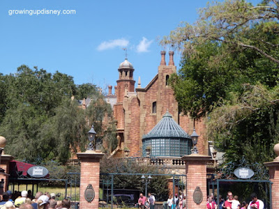
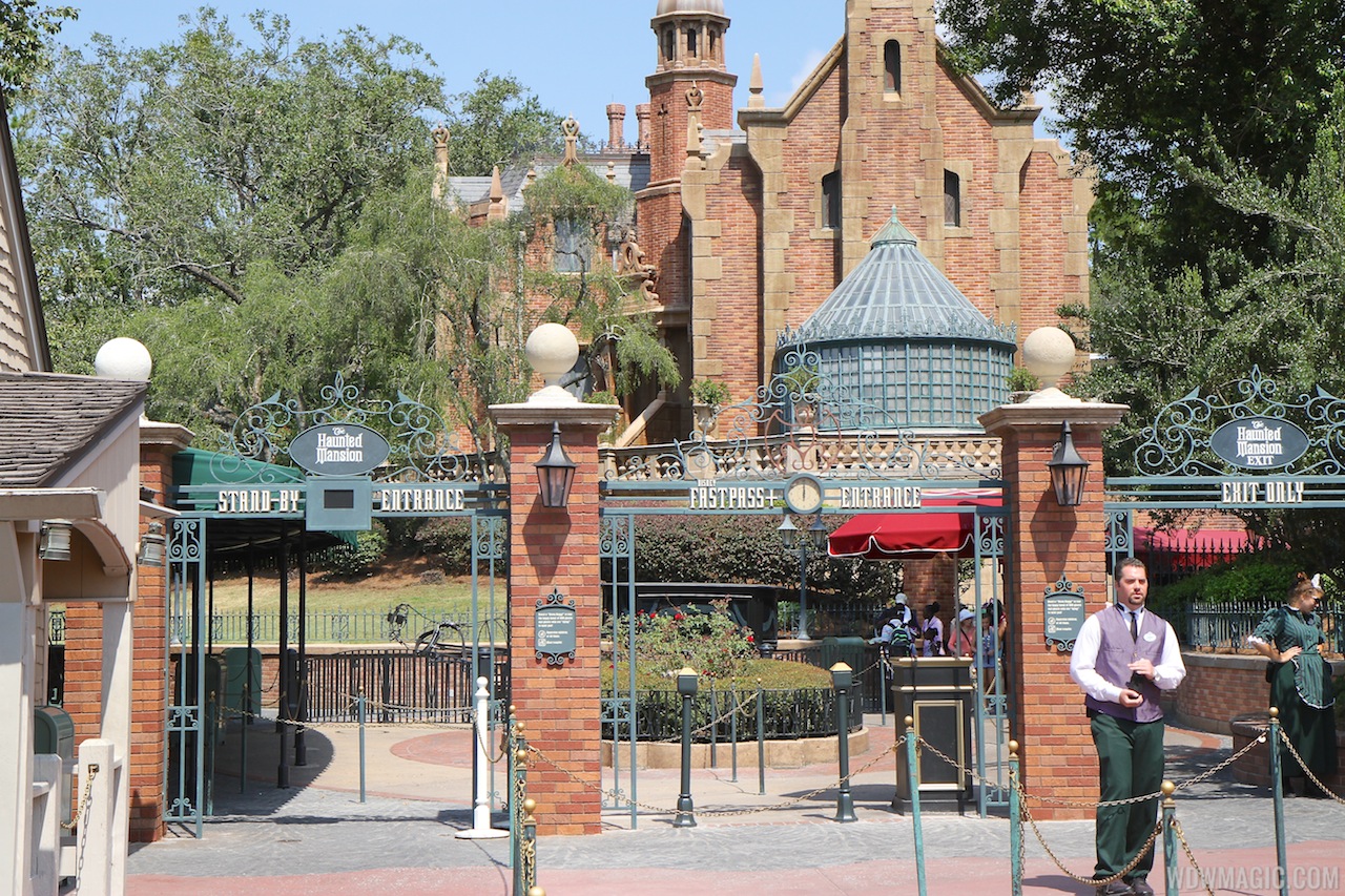
In one, the signage is unobtrusive, yet does the job it is supposed to do - the eye is drawn to the Mansion, not the gates. In the other, the Mansion is subordinate to the sign and the gateway - the eye is drawn to the signs and the large ball finials, whereas before, the lights capping the pillars were not a visual obstruction. There is a difference. You just think the difference is less important, which is a valid consideration. Is it a major change? No. Does it chip away at the "experience" a bit? To me, yes. It's a choice that senior people within WDI or the attractions industry who are considered the top designers would likely not have made. In my opinion, it takes away from the attraction's experience, knowing how Bill Martin, Chuck Myall, Sam McKim and Harper Goff thought about the architecture and design experience of the parks and the attractions. Everything @
Lee said are the points I would try to make also. To me, the entries of BTMRR or the DL Jungle Cruise are examples of how to do this in a better way.
I do agree with the points brought up about the entry once inside the gates at Hogwarts, and so do many of the people who were involved in building it. It's a choice that wasn't the best.