
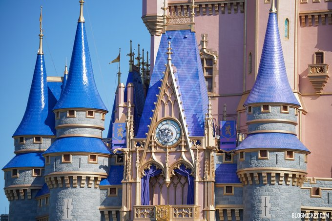
It seemed pretty blue last March when I was there before the shutdown.But did you notice the new roof color is not so purple? Looks better with the blue... The first color was way too violet.

It seemed pretty blue last March when I was there before the shutdown.But did you notice the new roof color is not so purple? Looks better with the blue... The first color was way too violet.
Ah, yes. Let's double down on the wrong color.
View attachment 538995
If you notice the spire on the right is more of a violet blue color than the newly painted ones on the right... Could just be the picture, but when the castle was painted pink all the blue roofs were painted a violet hued blue... I am glad to see the cleaner Royal blue going up...
 March 11, 2020
The blue turrets aren’t the problem. If they continue with the wrong color on the castle itself... fully agree.
The blue is nice in the sun, it really pops. Too bad it can’t drown out the inexcusable color choice for the castle itself.

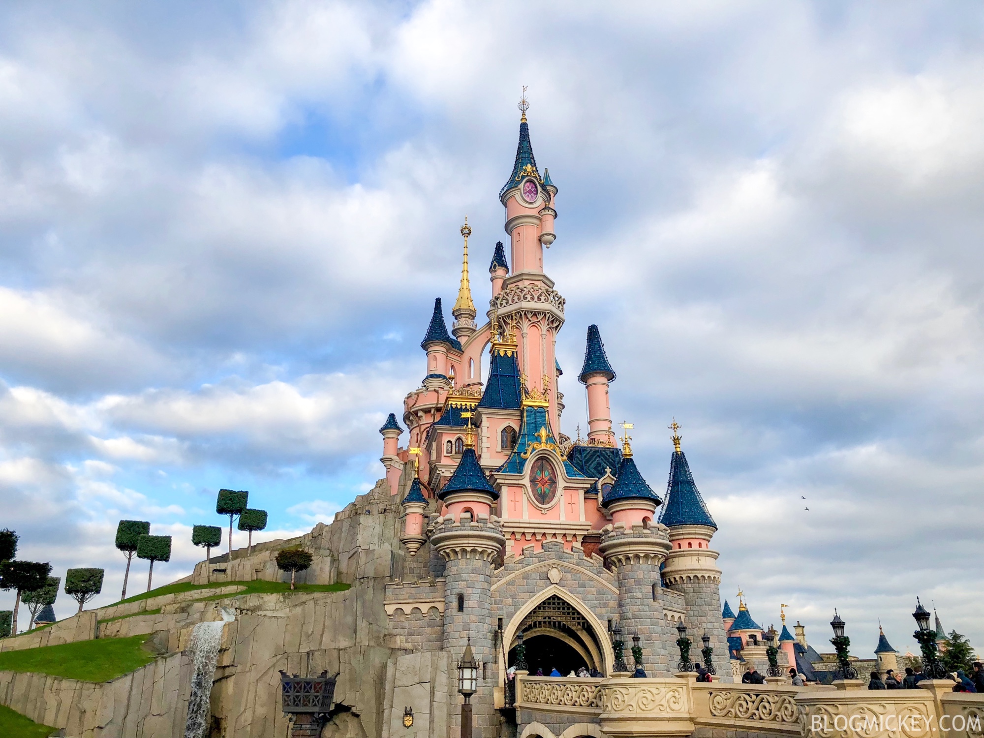

This post perfectly highlights my frustration at the decision to change Cinderella Castle. The castles don't all have to look the same. In fact, they should all have their own identity.
...weird take, but you do you.
I’m a science professor and, in general, agree. Unless you are in a program that directly leads to a job, you’re wasting your money.
...weird take, but you do you.
I Agree. I just feel that the pink can look good when paired with the correct blue, but IMO the blue they have chosen will always appear Fisher-Price.Cinderella Castle was never pink (except for the 25th). That’s the problem. They each have their own identities, but apparently that’s been lost on the new WDI.
As devastating as it is, COVID is getting a bad rap...being blamed for everything, when actually in this case it would be BEING CHEAP!(for the BIGGEST Disney AREA on earth!)Biggest shaft for me is the lack of a New Anniversary Parade. MK only getting a HEA 50th tag is pathetic. But I know, blame covid. At least that’s what Disney will do.
Rain, humidity, and tropical systems are the issue.California has just as hot weather if not hotter...Disney used fabric for their decor!!!! IF it were MY company I would treat every park the same with the same decor and love for attention!
Register on WDWMAGIC. This sidebar will go away, and you'll see fewer ads.