When Epcot Center opened in 1982 the entire park and each Attraction had it's own uniqe yet similar circular logo.
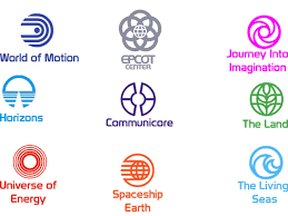
This stayed pretty consistent until Innoventions opened in 1994 with it's upside down Triangle logo and the active use of the matching circular logos began to decline.

Things remained steady until Test Track opened in 1999 in which the closest thing to a circular logo it had was the testing symbol
.

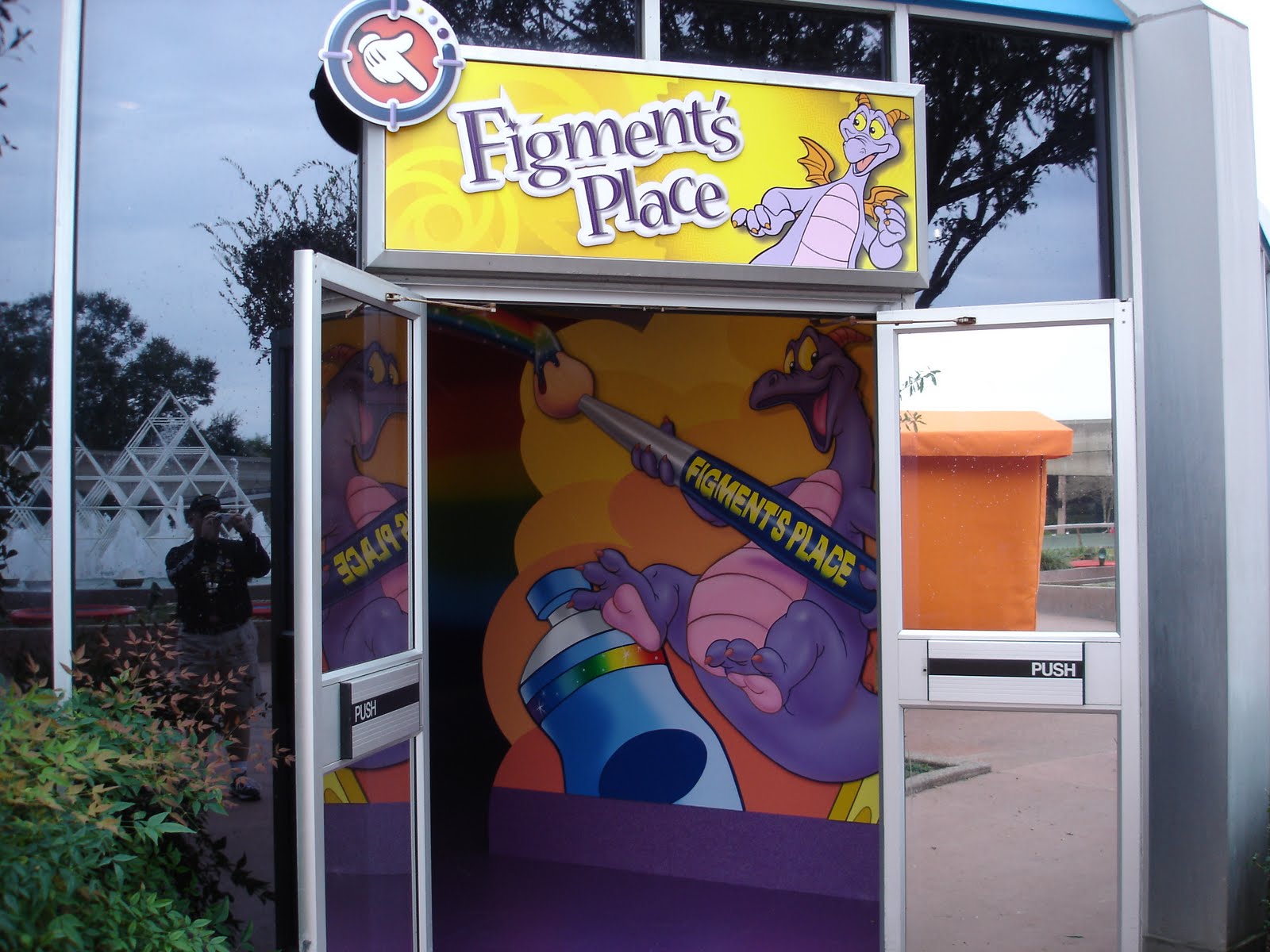
In 1999 this semi-circular logo became the logo of Imagination!

Mission Space had this semi-circular logo

In 2007 Spaceship Earth lost it's original circular logo to be replaced with this

It seemed that the SSE 07 Imagineers were trying to bring back a unified logo aesthetic considering how they utilized the Swirl motif in Project Tomorrow

Complicating matters was the new Innoventions Logo which came out at the same time but does not follow the circle or swirl motif.

With the new Test Track rather than continuing the swirl motif they created circular logos for not only the Attraction but for each individual test and on top of that brought back the World of Motion logo

So as things stand right now considering that UOE, and the Land and now Test Track feature matching logos and Imagination! and Mission Space have somewhat similar logos The Spaceship Earth, Project Tomorrow and Innoventions logos stick out like sore thumbs. Hopefully, The New Test Track example is followed in future refurbs to restore the balence of logos.
This stayed pretty consistent until Innoventions opened in 1994 with it's upside down Triangle logo and the active use of the matching circular logos began to decline.
Things remained steady until Test Track opened in 1999 in which the closest thing to a circular logo it had was the testing symbol
.
In 1999 this semi-circular logo became the logo of Imagination!
Mission Space had this semi-circular logo
In 2007 Spaceship Earth lost it's original circular logo to be replaced with this
It seemed that the SSE 07 Imagineers were trying to bring back a unified logo aesthetic considering how they utilized the Swirl motif in Project Tomorrow
Complicating matters was the new Innoventions Logo which came out at the same time but does not follow the circle or swirl motif.
With the new Test Track rather than continuing the swirl motif they created circular logos for not only the Attraction but for each individual test and on top of that brought back the World of Motion logo
So as things stand right now considering that UOE, and the Land and now Test Track feature matching logos and Imagination! and Mission Space have somewhat similar logos The Spaceship Earth, Project Tomorrow and Innoventions logos stick out like sore thumbs. Hopefully, The New Test Track example is followed in future refurbs to restore the balence of logos.