
Option E - All of the above!Option D - Pay even more and glorify every aspect!
-
Welcome to the WDWMAGIC.COM Forums!
Please take a look around, and feel free to sign up and join the community.
You are using an out of date browser. It may not display this or other websites correctly.
You should upgrade or use an alternative browser.
You should upgrade or use an alternative browser.
News Refurbishment coming soon to Disney's Polynesian Village Resort - Moana details to be included
- Thread starter wdwmagic
- Start date
Sirwalterraleigh
Premium Member
Those lighted slabs (which were the kinda thing that makes the Bobs just look obtuse) probably cost them $1.67 of electricity (solar generated) per year and could not be tolerated by accounting. No ROIYa know what would've been cool. If they had to stick with the concrete pillars so badly - why not integrate fiber optics tiki designs like this INTO the concrete and then light it up at night. Like they had on the walkways at Epcot before they ripped it out...
itsy bitsy spider
Well-Known Member
It looks better than the All Star resorts... I mean Contemporary's.
Last edited:
Walt d
Well-Known Member
Oh” boy! Is the Queen coming….??What needed to be refurbished? They just re-did the place.
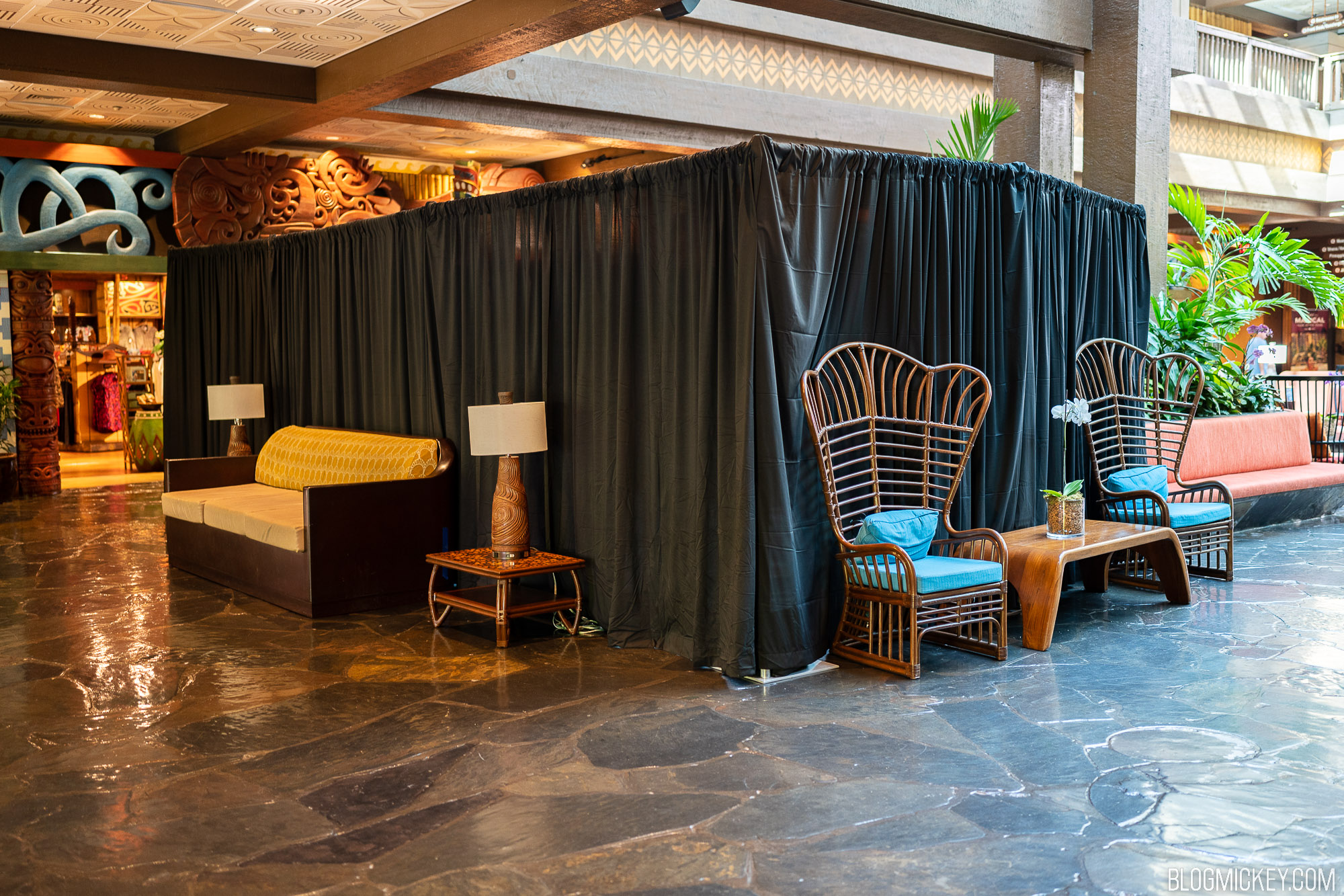
Polynesian Village Resort Lobby Refurbishment Underway
Drapes are up and work is underway on a soft goods refurbishment of the lobby furniture at Disney's Polynesian Village Resort
 blogmickey.com
I believe this is for College Program yearbook pictures...
nickf456
Active Member
Now this is one for the books: contrary to all the other lobby refurbs, they seem to be trying to make the Polynesian lobby look more like the 1990s!
Maybe it's just me, but whoever Disney is employing to refurbish their hotels these days has very bad taste.
I kind of agree, the design really looks modern-retro and I can't complain!
Disney Analyst
Well-Known Member
Now this is one for the books: contrary to all the other lobby refurbs, they seem to be trying to make the Polynesian lobby look more like the 1990s!
Maybe it's just me, but whoever Disney is employing to refurbish their hotels these days has very bad taste.
Love how that looks! Very mid century modern, without the tacky 90s Disney design styling.
Totally my vibe. Love love love.
castlecake2.0
Well-Known Member
Now this is one for the books: contrary to all the other lobby refurbs, they seem to be trying to make the Polynesian lobby look more like the 1990s!
Maybe it's just me, but whoever Disney is employing to refurbish their hotels these days has very bad taste.
All the fans complained all the lobby’s were being turned into 50 shades of beige. They’re listening!
Sir_Cliff
Well-Known Member
I love mid-century modern, but this doesn't read to me as a mid-century tiki aesthetic.Love how that looks! Very mid century modern, without the tacky 90s Disney design styling.
Totally my vibe. Love love love.
I actually like the clean, bright colours like the orange and blues elsewhere in the lobby. This gives me more old-Kona Cafe vibes than new-Kona Cafe (which I like!) vibes. This may come down to personal tastes, though.
More generally, I think they really need to get someone who knows the tiki aesthetic to go through and get rid of things like the crazy-painted tikis in the store. I feel like it's the sort of thing they would get spot-on at Disneyland, but for some reason in Florida can't seem to quite land.
Disney Analyst
Well-Known Member
I love mid-century modern, but this doesn't read to me as a mid-century tiki aesthetic.
I actually like the clean, bright colours like the orange and blues elsewhere in the lobby. This gives me more old-Kona Cafe vibes than new-Kona Cafe (which I like!) vibes. This may come down to personal tastes, though.
More generally, I think they really need to get someone who knows the tiki aesthetic to go through and get rid of things like the crazy-painted tikis in the store. I feel like it's the sort of thing they would get spot-on at Disneyland, but for some reason in Florida can't seem to quite land.
Maybe you’re right. Not quite mid-century modern, but it feels in the same vein, with tiki styling thrown in.
CaptainAmerica
Premium Member
Completely agree.I love mid-century modern, but this doesn't read to me as a mid-century tiki aesthetic.
I actually like the clean, bright colours like the orange and blues elsewhere in the lobby. This gives me more old-Kona Cafe vibes than new-Kona Cafe (which I like!) vibes. This may come down to personal tastes, though.
More generally, I think they really need to get someone who knows the tiki aesthetic to go through and get rid of things like the crazy-painted tikis in the store. I feel like it's the sort of thing they would get spot-on at Disneyland, but for some reason in Florida can't seem to quite land.
That upholstery might fit in the Contemporary, but there's nothing "Polynesian" about it.
James Alucobond
Well-Known Member
I'll give it credit for at least not looking like it's from the West Elm catalogue like many other things lately, but I'm especially confused by this in light of the recent changes to the carpet. The latter is an oversized distressed floral print with beachy colors, whereas this is a compact repeating abstract pattern in earth tones. They don't seem to have much to do with one another.
Epcot82Guy
Well-Known Member
That does seem pretty bad. The carpet has a definite perspective that works. This looks like reality vs. approval via the tiny swatch on the design board viewed over Zoom.
SplashJacket
Well-Known Member
See, y’all complain when they produce banal designs, but y’all also complain when they produce flamboyant designs.
CaptainAmerica
Premium Member
Bingo. Poly shouldn't be abstract or geometric, it should be organic.I'll give it credit for at least not looking like it's from the West Elm catalogue like many other things lately, but I'm especially confused by this in light of the recent changes to the carpet. The latter is an oversized distressed floral print with beachy colors, whereas this is a compact repeating abstract pattern in earth tones. They don't seem to have much to do with one another.
I liked the banal designs. They were classy, this is gauche.See, y’all complain when they produce banal designs, but y’all also complain when they produce flamboyant designs.
James Alucobond
Well-Known Member
It's that they're picking two things in the same re-design that seem completely incongruous. I honestly just struggle to understand why it's so difficult for them to source a cohesive set of furnishings, finishes, and fixtures that fit within a specific style, especially given the resources likely at their disposal.See, y’all complain when they produce banal designs, but y’all also complain when they produce flamboyant designs.
Sir_Cliff
Well-Known Member
This is where I am curious why they can't get better interior designers. Neither the bland West Elm-catalogue interiors nor this mismatch of styles suggest that they're working with particularly top-level designers.I'll give it credit for at least not looking like it's from the West Elm catalogue like many other things lately, but I'm especially confused by this in light of the recent changes to the carpet. The latter is an oversized distressed floral print with beachy colors, whereas this is a compact repeating abstract pattern in earth tones. They don't seem to have much to do with one another.
While this isn't one of the most egregious examples, with contemporary Disney you get such wild swings of quality that you never know whether a new project is going to be more or less spot on (e.g. the new Kona Cafe) or embarrassingly bad (e.g. the new Polynesian porte cochere). Isn't Imagineering supposed to be overseeing all of this in order to ensure consistency?
Register on WDWMAGIC. This sidebar will go away, and you'll see fewer ads.