SpectroMagician
Well-Known Member
The pink is just a little too salmon-y
Tacky is in the eye of the beholderI think Phase 1 is a success. It looks fun and special without being overly in your face and tacky. I can't wait to see work on phase 2 pick up!
")
Wait til they install the ribbons on the roofsNot to play armchair imagineer, but I couldn't help myself... Using the existing castle pink as an undercoat and adding in dimension with the more bisque color of the initial artist rendering. I'll tell my kids it looked like this lol. Thank you for the photos @wdwmagic — I hope you don't mind me using one for this!
How it should look.
Even with the ribbons on the turrets?While I do think the decorations are nice, I just don’t see the overall decor/marketing package reading as a 50th anniversary. Disneyland’s 50th clearly did, but I’m not too sure what’s not reading well with what I’ve seen so far from WDW.
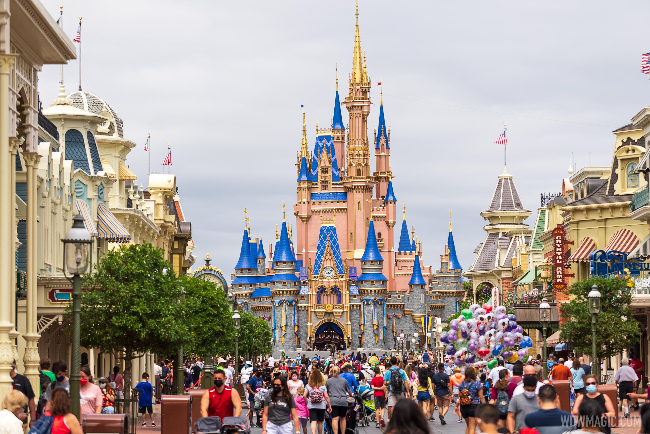
Low clouds, soft morning light through the fog, and a camera with settings that darken the blue turrets and mute the pink - it actually looks pretty good and fairly close to the concept art.
But then it can also look like this. No more low clouds, harsher mid-day light, and a camera with higher saturation levels that makes for a much more plasticy and tacky looking castle.
).This highlights my issue as to why they didn't go darker blue on the shingles, as long as they were repainting them? As much as I don't like the pink, the darker blue would have made the pink read lighter than it is which would have helped a lot. I guess I don't get any of the decisions regarding the castle lately.The vast difference between concept and reality. View attachment 544361
Especially considering how it will fade quite a bit and end up that dusty looking blue by the end of the 50th, at latest.This highlights my issue as to why they didn't go darker blue on the shingles, as long as they were repainting them?
Especially considering how it will fade quite a bit and end up that dusty looking blue by the end of the 50th, at latest.
While I know it’s a bit early to really declare, I just think the whole rose gold scheme doesn’t work for a 50th anniversary. Especially with the specific palette choices found in costumes, logos, and such. I’d much rather see something much more regal and elegant, versus contemporary and trendy. While the anniversary decor isn’t complete, we definitely have a flavor of the tone and styling already.Even with the ribbons on the turrets?
The castle used to resemble a castle, not a toy version of a castle. It's tastefully done I think, but it takes away more than it delivers in my opinion.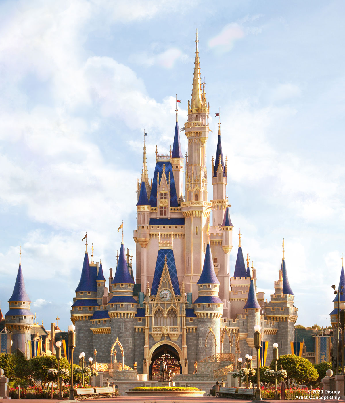
PHOTOS - Cinderella Castle at the Magic Kingdom to receive enhancements this summer
A makeover is planned for the centerpiece of Magic Kingdom at Walt Disney World.www.wdwmagic.com
Register on WDWMAGIC. This sidebar will go away, and you'll see fewer ads.