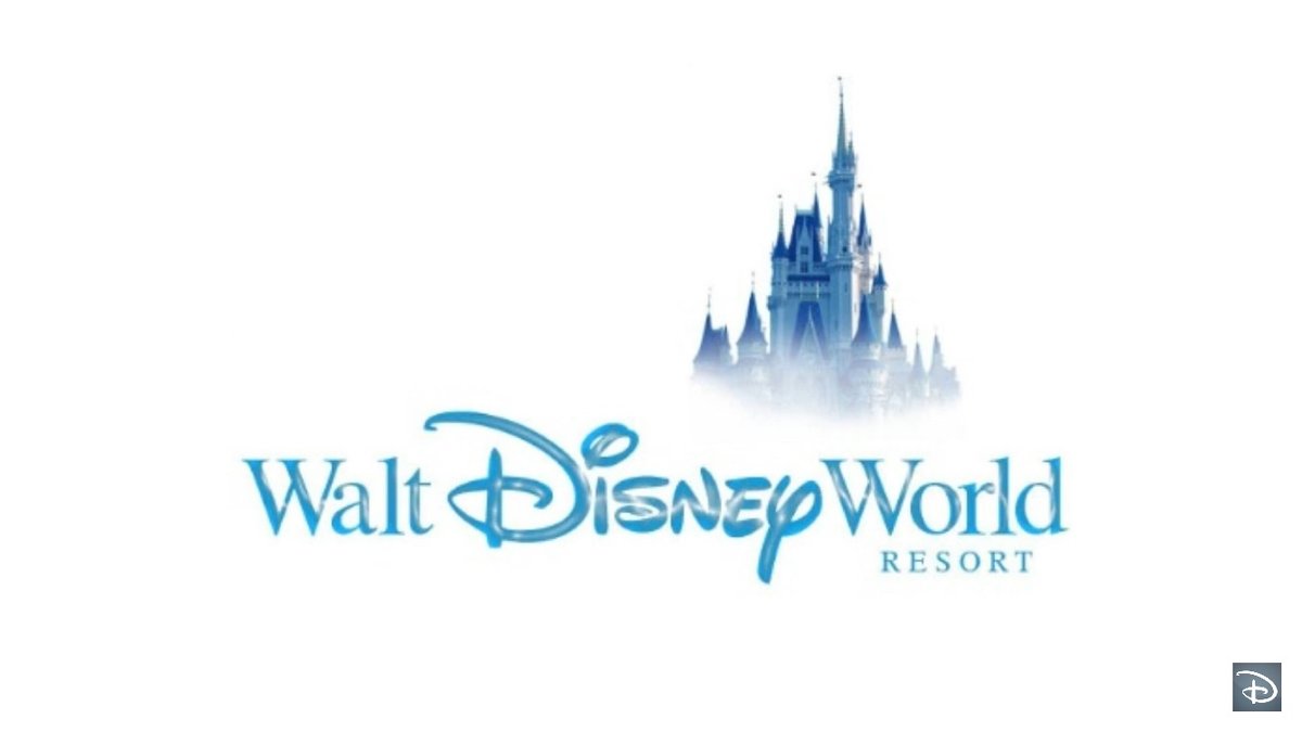
This was at the end of a DPB YouTube video about lounges around the resort. Has anyone ever seen the font presented this way before for “walt”?

-
Welcome to the WDWMAGIC.COM Forums!
Please take a look around, and feel free to sign up and join the community.
You are using an out of date browser. It may not display this or other websites correctly.
You should upgrade or use an alternative browser.
You should upgrade or use an alternative browser.
New WDW logo?
- Thread starter castlecake2.0
- Start date
KBLovedDisney
Well-Known Member
That...doesn't look right with Walt's first name not in his signature.This was at the end of a DPB YouTube video about lounges around the resort. Has anyone ever seen the font presented this way before for “walt”?View attachment 435147
It should either be his full signature and "World" or just "Disney World".
WondersOfLife
Blink, blink. Breathe, breathe. Day in, day out.
I concur. That's messed up.That...doesn't look right with Walt's first name not in his signature.
It should either be his full signature and "World" or just "Disney World".
DisFanMark
Active Member
They've been using this 'alternative' logo for at least a year now, using the Waltograph font only on 'Disney' to emphasize the word 'Disney' itself in the logo.
DisFanMark
Active Member
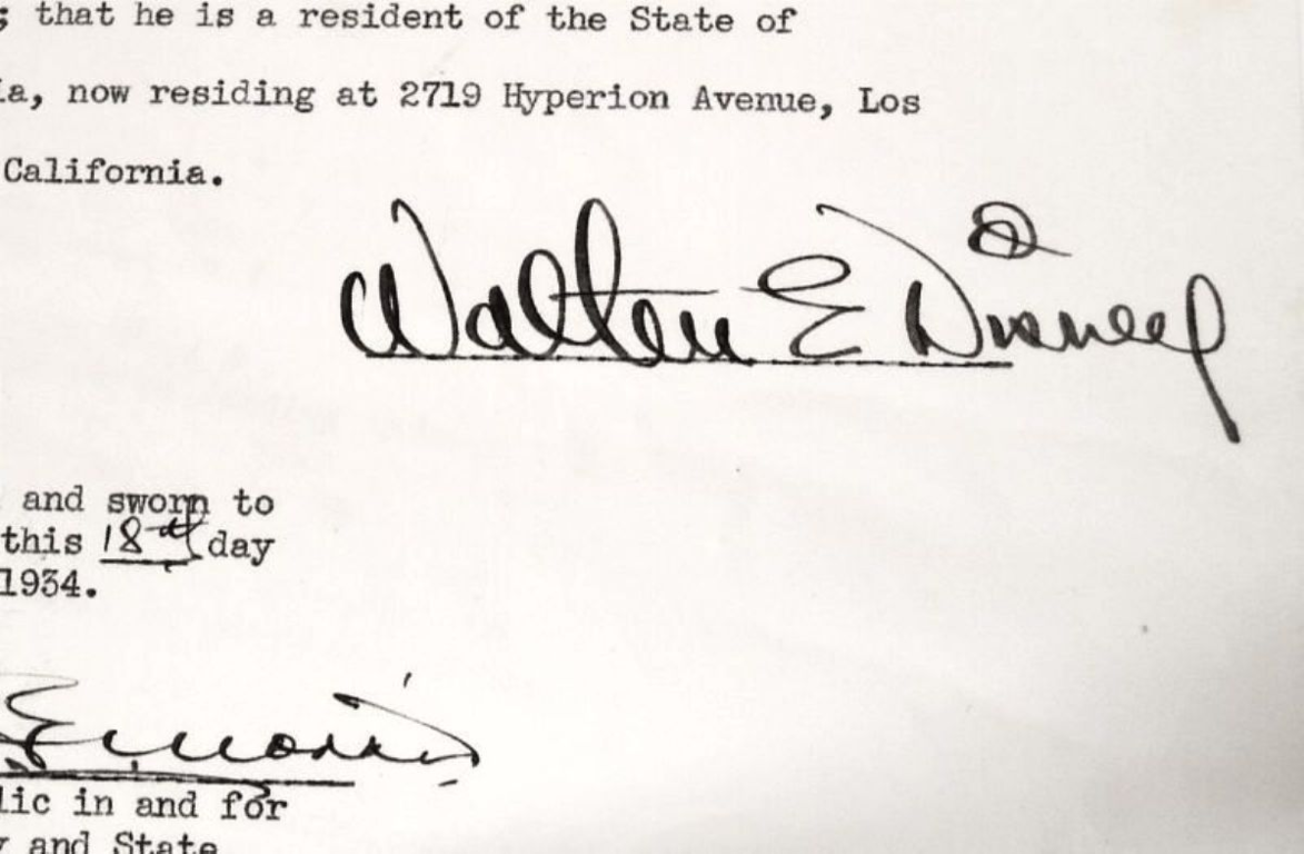
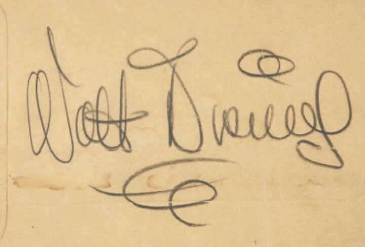
I can add that the Waltograph font doesn't really reflect Walt's signature.


Today’s the first time it caught my eye, it looks so odd. Have you seen it mostly in the parks blog?They've been using this 'alternative' logo for at least a year now, using the Waltograph font only on 'Disney' to emphasize the word 'Disney' itself in the logo.
DisFanMark
Active Member
Parks Blog, TA sites, various areas actually. The impression I've had is that they use this logo when referencing the entire resort, including hotels, but not when referencing the Parks specifically.Today’s the first time it caught my eye, it looks so odd. Have you seen it mostly in the parks blog?
Cmdr_Crimson
Well-Known Member
Lemme give this a good long look...This was at the end of a DPB YouTube video about lounges around the resort. Has anyone ever seen the font presented this way before for “walt”?View attachment 435147

JIMINYCR
Well-Known Member
I think some in the company have for years tried to downplay "Walt" since hes been gone for some time. They want to show the company has moved forward, progressed, advanced past the "Walts" years and although he started it and it holds the Disney name, it is no longer Walts. Disney is now more than Walt and his outdated style/positions. Thus the fading prominence of Walt.
KBLovedDisney
Well-Known Member
Just bring back the 80s promo home video one without "home video".

(You just heard the music in your head that went with this clip. Didn't you? )
)

(You just heard the music in your head that went with this clip. Didn't you?
eliza61nyc
Well-Known Member
Lol absolutelyJust bring back the 80s promo home video one without "home video".

(You just heard the music in your head that went with this clip. Didn't you?)
VJ
Well-Known Member
the biggest issue i have with this logo is the kerning on Walt...This was at the end of a DPB YouTube video about lounges around the resort. Has anyone ever seen the font presented this way before for “walt”?View attachment 435147
SyracuseDisneyFan
Well-Known Member
I don't think I've ever seen that logo.
Waltograph isn't a cursive font.I can add that the Waltograph font doesn't really reflect Walt's signature.
Register on WDWMAGIC. This sidebar will go away, and you'll see fewer ads.
