ParkPeeker
Well-Known Member
This particular rough edit was done right before the castle was topped off. I’m nervous.
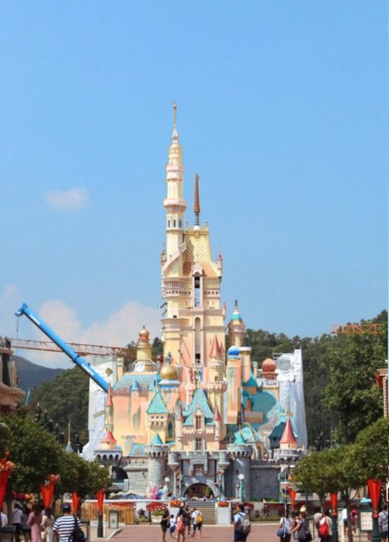
Designing to the constraints of your site is a fairly basic tenant of architecture. I’m not sure how the mix of styles in Fantasyland is at all relevant. The castle contradicts itself.You're correct about the columns, but assuming they needed to be so thin for accessibility reasons (accurate, in-proportion columns would need to be much wider and significantly narrow the space between them), I can forgive the oddity in Fantasyland. Particularly in light of the rest of the land's grab bag of architecture and execution (from fiberglass "tournament tens" to timber framed "fairytale fachewerk").
I can tell you there are already signs that that back box has been slightly reworked. Hopefully the final design looks less odd.Designing to the constraints of your site is a fairly basic tenant of architecture. I’m not sure how the mix of styles in Fantasyland is at all relevant. The castle contradicts itself.
Designing to the constraints of your site is a fairly basic tenant of architecture. I’m not sure how the mix of styles in Fantasyland is at all relevant. The castle contradicts itself.
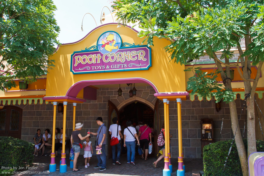
Signage in HKD is especially bad.
My point being that some of the facade "styles", if you can call them that, in HK Fantasyland are of such a low level, that I would happily take take the new castle's absurdly thin columns (magic?) or contradictory elements over them.
Ha! I love that magic explanation xD. A stone structure couldn't support that so it's obviously a steel structure. Well unless it's magic of course.
My point being that some of the facade "styles", if you can call them that, in HK Fantasyland are of such a low level, that I would happily take take the new castle's absurdly thin columns (magic?) or contradictory elements over them.
Yeah, I'm also nervous about that cardboard Ice Cream sign for the new Mainstreet shop.. with drawn on lightsSignage in HKD is especially bad.
Most of them look extremely amateur.
Especially if you compare them to the other parks
A tacky McMansion is still a tacky McMansion, even in a neighborhood full of tacky McMansions. Not being the worst design isn’t exactly a bar that will encourage any sort of improvement, just successive mediocrity.My point is that HK fantasyland is not some brilliantly-rendered area (as Paris), so the new castle, defects and all, isn't a tacky McMansion plopped down in a formerly-pristine historic district.

I would happily take the new castle's absurdly thin columns (magic?) or contradictory elements over a good portion of the original HK Fantasyland aesthetic.
From this picture it seems like the old castle was out of scale compared with the front buildings of main street. Loving the new castle!!!golden castle with mountains, damn what a view!
View attachment 410199
This is what I was talking about a few pages ago, and why I was glad they moved that blue domed tower forward a bit in the final design.I don’t think I’m liking how flat it’s profile looks from the other areas of the park. At the other magic kingdoms, the profiles of the castles have bulk and more dimension. It will take a little getting used to.
But one change I'm really happy about is the movement of the blue domed tower forward (not completely sure if the roofs beside/below it are also moved forward, but I hope they are).
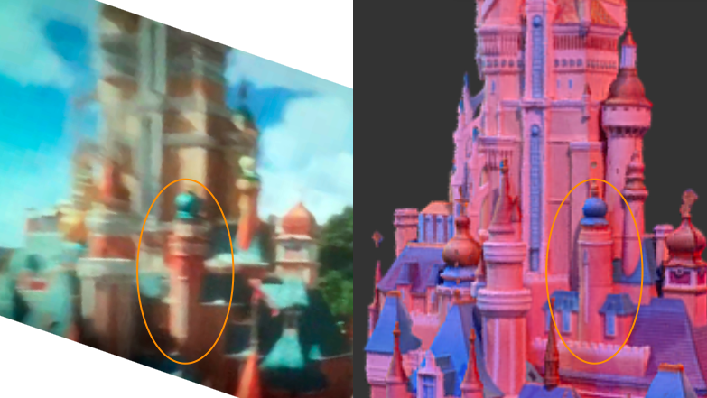
why? because this gap between the old and new castle really bothered me.
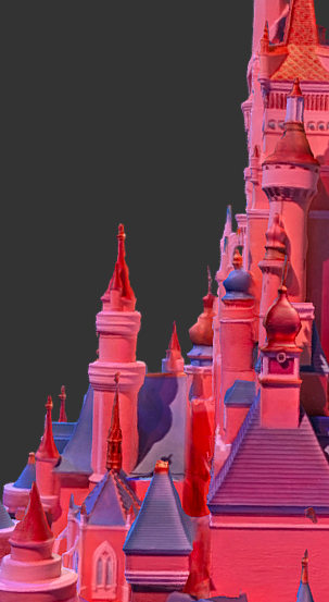
Also it'll look a little less flat than the model does (let's be real, the added castle looks like a pancake from the side ). pls pls pls have the roofs that are attached to that tower also be moved forward a bit.
The idea of Main Street being ⅔ is just poor understanding of massing, scale and forced perspective. Full size isn’t a thing. The doors on Main Street aren’t 2’ wide and 4’-6” tall which is what they would be in a ⅔ scale replica of a typical building. The park being too small compared to its setting isn’t improved by a castle that is now too big for its immediate setting.The scale was ruined the moment they imported Disneyland into an environment with a real mountainous backdrop. The effect of Sleeping beauty's castled is amplified wonderfully by a miniature Matterhorn, it is dwarfed by real hills.
Main Street is what, 2/3rds scale? This castle is now also technically in the realm of 2/3rds.
Frankly, for me, this was always an improvement. I really disliked SBC in this setting long, long before this project.
The idea of Main Street being ⅔ is just poor understanding of massing, scale and forced perspective. Full size isn’t a thing. The doors on Main Street aren’t 2’ wide and 4’-6” tall which is what they would be in a ⅔ scale replica of a typical building. The park being too small compared to its setting isn’t improved by a castle that is now too big for its immediate setting.
I thought the castle looked great against the mountains. Buildings being smaller than mountains isn’t crazy. Even Neuschwanstein, perched atop a mountain, has a mountain backdrop (the ad as I type this is for the Biltmore Estate, the largest house in the US, with the Blue Ridge Mountains filling the background). Scale in architecture is about the relationship to the human body, so the idea of being scaled to mountains is kind of nonsensical. The smaller scale having all of this stuff glommed onto creates a ripple effect in regards to massing and tectonics. It’s far too slender to be a stone construction with even an illusion of usable space inside, making it more like a miniature replica because it now is actually a miniature replica.I understand that, but did the effect honestly truly work for you in Hong Kong? Main Street still convincingly feels like a quaint but functionally real Main Street. SBC felt like a miniature replica.
The new castle actually looks like a properly scaled castle in relation to the street and the mountains behind it. Too big would have been Shanghai, which tries to actually be a full sized castle. I actually still think this looks quaint.
I thought the castle looked great against the mountains. Buildings being smaller than mountains isn’t crazy. Even Neuschwanstein, perched atop a mountain, has a mountain backdrop (the ad as I type this is for the Biltmore Estate, the largest house in the US, with the Blue Ridge Mountains filling the background). Scale in architecture is about the relationship to the human body, so the idea of being scaled to mountains is kind of nonsensical. The smaller scale having all of this stuff glommed onto creates a ripple effect in regards to massing and tectonics. It’s far too slender to be a stone construction with even an illusion of usable space inside, making it more like a miniature replica because it now is actually a miniature replica.
Register on WDWMAGIC. This sidebar will go away, and you'll see fewer ads.