
-
Welcome to the WDWMAGIC.COM Forums!
Please take a look around, and feel free to sign up and join the community.
You are using an out of date browser. It may not display this or other websites correctly.
You should upgrade or use an alternative browser.
You should upgrade or use an alternative browser.
Grand Floridian to Magic Kingdom Walkway
- Thread starter danlb_2000
- Start date
trainplane3
Well-Known Member
Not sure when this was filmed but it posted yesterday, and at 4:38 - 5:45 there's a bit of info:
To add, it's not just because of the pageant. They also have to get the Liberty Belle over to dry dock when it's time for proper maintenance.
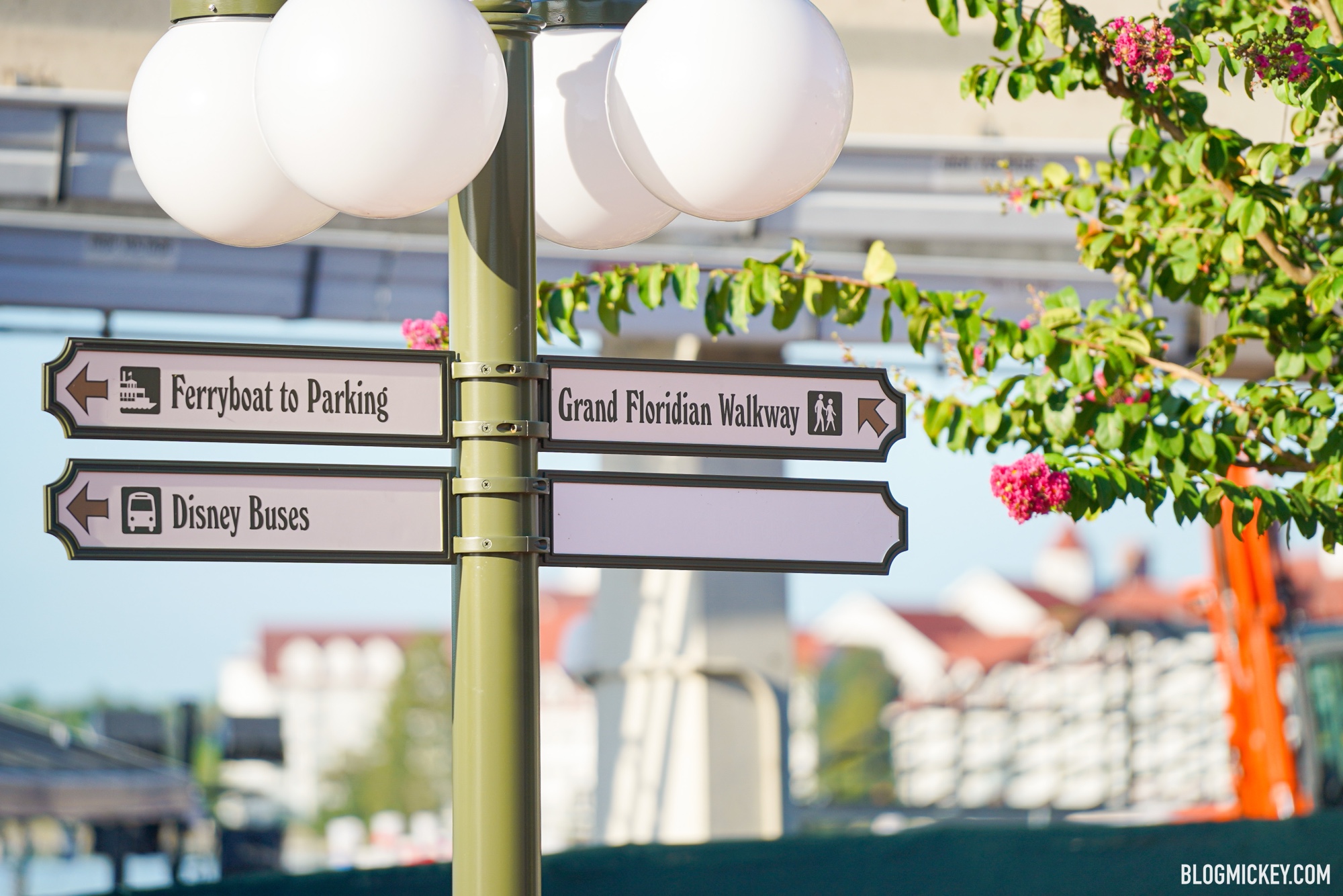
Grand Floridian Walkway Signage Installed at Magic Kingdom
Walt Disney World news, photos, and reviews! We provide you with daily news from the Walt Disney World theme parks and beyond
DisneyJeff
Well-Known Member
- In the Parks
- No
Grand Floridian Walkway Signage Installed at Magic Kingdom
Walt Disney World news, photos, and reviews! We provide you with daily news from the Walt Disney World theme parks and beyondblogmickey.com
Is it just me, or is that sign a little misleading? Normally, when the sign is on the right side of a pole, you would think that you need to go that way. In this case, even though the sign is on the right side of the pole, the arrow points to the left, indicating that you need to go to the left side of the pole. Maybe it makes more sense in person.
ImperfectPixie
Well-Known Member
Having worked in the sign business for decades, that is an odd layout for a light-post sign. Rule of thumb is the slat should stick out in the direction you need to go. My thoughts are that they wanted to keep the number of slats even, so they sacrificed clarity for design...never a wise choice.Is it just me, or is that sign a little misleading? Normally, when the sign is on the right side of a pole, you would think that you need to go that way. In this case, even though the sign is on the right side of the pole, the arrow points to the left, indicating that you need to go to the left side of the pole. Maybe it makes more sense in person.
JoeCamel
Well-Known Member
Is it just me, or is that sign a little misleading? Normally, when the sign is on the right side of a pole, you would think that you need to go that way. In this case, even though the sign is on the right side of the pole, the arrow points to the left, indicating that you need to go to the left side of the pole. Maybe it makes more sense in person.
Seems that the resort boat will be added to the blank and the path to the boat is the same as the GF so it will have the same arrow. The others are a hard left towards the buses. Makes some sense to meHaving worked in the sign business for decades, that is an odd layout for a light-post sign. Rule of thumb is the slat should stick out in the direction you need to go. My thoughts are that they wanted to keep the number of slats even, so they sacrificed clarity for design...never a wise choice.
Mike730
Well-Known Member
It seems misleading. I think its the arrow on the sign that's weird. The walkway is more like "straight then bare right". You can see it in this photo:Is it just me, or is that sign a little misleading? Normally, when the sign is on the right side of a pole, you would think that you need to go that way. In this case, even though the sign is on the right side of the pole, the arrow points to the left, indicating that you need to go to the left side of the pole. Maybe it makes more sense in person.
In this case, if they put the slat pointed in the direction of the walkway, nobody looking at the post from the direction of walking would be able to see it... it would be hidden by the post.Having worked in the sign business for decades, that is an odd layout for a light-post sign. Rule of thumb is the slat should stick out in the direction you need to go. My thoughts are that they wanted to keep the number of slats even, so they sacrificed clarity for design...never a wise choice.
Yes, it's potentially confusing -- a flat sign (like the bus/boat signs) would make more sense.
ImperfectPixie
Well-Known Member
It does...when you're looking at a picture and notice the arrows.Seems that the resort boat will be added to the blank and the path to the boat is the same as the GF so it will have the same arrow. The others are a hard left towards the buses. Makes some sense to me
But people actually there, not having seen the pictures, will likely not notice the arrows at all especially because they're in a lighter color than the lettering. The shapes of the slats aren't helpful, either, because the ends draw your eye in the direction they're pointing.
We run across these kinds of issues when designing/installing hospital signage all the time. Sometimes a design just isn't functional on the ground when there are people looking for where to go.
ImperfectPixie
Well-Known Member
Flat would have been so much better. They could even still have mounted it to the light pole...not quite as pretty, but much better in functionality and clarity, and all the arrows could have been on one side. The arrows not being along one edge of the sign (like bullet points) screws people up way more often than you'd think.In this case, if they put the slat pointed in the direction of the walkway, nobody looking at the post from the direction of walking would be able to see it... it would be hidden by the post.
Yes, it's potentially confusing -- a flat sign (like the bus/boat signs) would make more sense.
EPCOT-O.G.
Well-Known Member
So, is the full walkway to MK from GF accessible yet? Like, is that an option in lieu of bus/monorail?
Rteetz
Well-Known Member
Walkway is not yet open.So, is the full walkway to MK from GF accessible yet? Like, is that an option in lieu of bus/monorail?
JoeCamel
Well-Known Member
No, soonest is when the NBA vacates the premisesSo, is the full walkway to MK from GF accessible yet? Like, is that an option in lieu of bus/monorail?
MonorailCoral
Active Member
Great view of the Great Wall of BSOD.
Grand Floridian Walkway Signage Installed at Magic Kingdom
Walt Disney World news, photos, and reviews! We provide you with daily news from the Walt Disney World theme parks and beyond
What will the 4th sign be for?

Tuvalu
Premium Member
Resort boats ~ WL, Ft. Wilderness, Poly, GFWhat will the 4th sign be for?
MonorailCoral
Active Member
Well that's anticlimactic.Resort boats ~ WL, Ft. Wilderness, Poly, GF

Animaniac93-98
Well-Known Member
What will the 4th sign be for?
"Monorail to Disney Florida Adventure"
Register on WDWMAGIC. This sidebar will go away, and you'll see fewer ads.