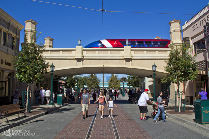
It appears that what they
actually did was a multi-stage paint process to bring the shade of the structure up by several degrees, with a reddish undertone to give it depth. Previously, the entire bridge was all one shade of very light beige. Everything on the bridge was sun-bleached beige; pediments, towers, trim, everything all the same shade.
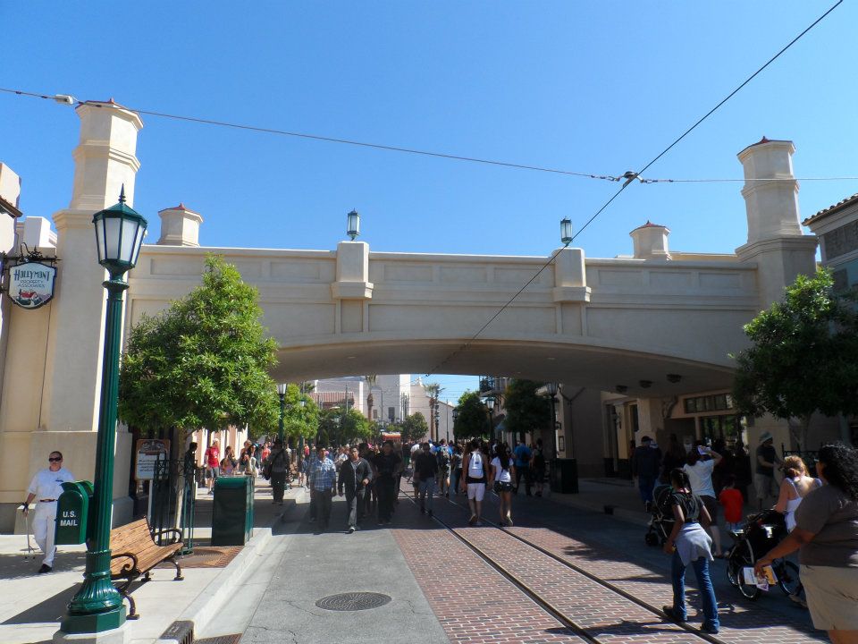
Buena Vista Street Bridge, 2012 - You can have it any color you want as long as it's light beige.
http://www.sasakitime.com/2012/06/buena-vista-street-history-hyperion.html
Now this bridge is subtly two-toned, with the red undertones on the flat panels giving it more depth. It also sets off nicely against the other light colored buildings around it, and no longer matches the Carthay Circle Theater beyond. (Thus, it no longer competes with the Carthay architecturally since it's no longer an identical color)
What we saw was that purposeful multi-stage painting project taking place overnights in an operating theme park. The bridge looks great now, and no longer blends blandly with the surrounding streetscape. It now has depth, and an undertone of distressed color and patina. It looks great!

")