Are you trying to convince me,... Or yourself?Except it wasn't tu toque, it was get over yourselves, the antipathy is disproportionate to the offense.
Plus, you can tell it wasn't tu toque because I acknowledged the new logo was worthy of some critique.
-
Welcome to the WDWMAGIC.COM Forums!
Please take a look around, and feel free to sign up and join the community.
You are using an out of date browser. It may not display this or other websites correctly.
You should upgrade or use an alternative browser.
You should upgrade or use an alternative browser.
Big Reveal, New Logo
- Thread starter FigmentFan82
- Start date
Tony the Tigger
Well-Known Member
Oh.. its another step in leaving the "Studio" part of the park on history books only.
In the old logo the "Studios" is the most important part. In the new one there is almost nothing left of the studios. Like in the park
Btw. The new logo looks twoo simple and the black ears of mickey gets mixed with the font color. I like more the old style more "Art deco" more timeless and the new one more like "fast fashion / instagram stlye"
View attachment 368946
Why should they emphasize non-existent studios?
For your personal nostalgia and "feels?"
Because it's misleading for everyone else. That's what the park was, not what it is, not where it's going. A new logo made sense. (The one you pictured even has (gasp!) a character in the 'O' - will it make you feel better if someone tells you the new one is a nod to that? Was that awful because it contained IP?
This board has lost all perspective.
The trend in new/modern logos is clean, simple, not too busy. Amazon. eBay. UPS. (Yes, I know they're not theme parks.)
Again: the new logo is all of those things, and demonstrates the three main areas of focus for at least the near future: classic Disney (Mickey) Pixar (Toy Story) and Star Wars (BB8.) These correctly represent the park. They also - yes - indirectly push sales of merch. That is what the company is supposed to do. IP is not bad. Disney would not exist without IP, period. The movies not only inspired but paid for the parks, not the other way around. Nobody goes to Disney World the first time to see It's A Small World or Carousel of Progress. They go to see Mickey Mouse, Winnie The Pooh, The Little Mermaid, and the Lion King. And in the process, they discover Haunted Mansion, and other non-IP specific attractions. That's great. No need to bash either side. Neither is better than the other. Neither is more intellectually stimulating. Neither is high class opera.
Before anybody tells me I don't care or I'm not that into it, that's baloney. Not only did I take two years of basic Commercial Art (including packaging design, logo design, etc.) but I own my own business, and my own logo has evolved over 20 years, it has become more streamlined and lost some of it's original "flash" in favor of a more straightforward, easy to read/get presentation. In addition, I sometimes use different versions of the logo for t-shirts vs. for signage vs. for ads, etc.
Sometimes it's just good as part of a refresh or reset, as HS is clearly doing. It signifies a clean slate. In this case, it's going to match the parking lot signs and other things throughout the parks. That makes sense. It makes artistic sense. It makes business sense. There is no "nostalgia sense."
I hear a lot of "it's awful" without anything specific other than, "omg IP!" and it looks simple. There's nothing wrong with simple. Simple can be simply professional. And some of the suggestions presented as superior are simply not.
Some of you will just destroy anything and everything for no good reason.
I can't tell you how much it means when a customer tells me they've loved my business for x number of years. It means I've made something like the similar businesses I used to frequent that I loved. But none of them have any business critiquing my logo, old or new. Neither do I have any business critiquing Disney's as if they owed me something. I may comment on things I like or don't like, but they are not obligated to make something I like vs. what somebody else likes or vs. what the decision maker in the company wants to use.
Like it or don't like it. Don't make it out to be some kind of epic fail or "they don't care" or any other BS like that. That's messed up.
/rant.
tomast
Well-Known Member
Why should they emphasize non-existent studios?
For your personal nostalgia and "feels?"
I have no problem with removing the studio part. As much as I enjoy it, it is time to let it go. My point was just remark that. The old logo has mickey on the StudiO "o" and the new one has the characters on the Holywood "O".
But what I regret is using those clean logos. You might feel its "trendy" but to stay trendy you need to keep updating the logos. What I mean is that making something following a style will never be out of "fashion" while making something "Trendy" will.
DHS has lots of influence in an "Art deco" style, while the new logo does not fit correctly with the enviroment.
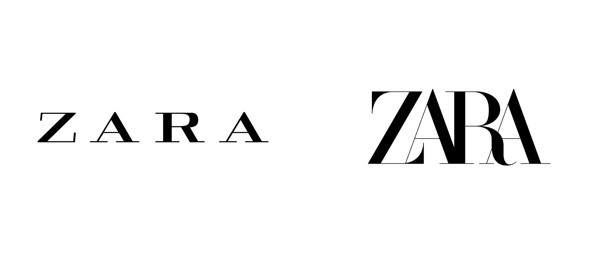
And by the way everyday more and more companys are returning to their original logos leaving the "cleans" ones as they do not represent the brand. An example of this might be "Avon" cosmetics, "Zara" clothing, etc. they are moving into a trend that is getting old and lack of personality.


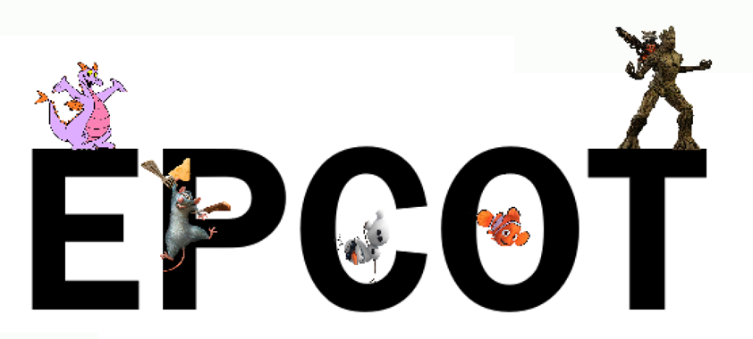
This was the one, true, beautiful logo of the park! None will ever compare!
View attachment 369026
That is a graphical mashup from hell.
And the MGM part was mostly a lie.
No Name
Well-Known Member
A park that focus on Lucasfilm, Pixar and classic Disney animation? With the later needing a lot more work but obviously the direction they're taking?
You have a deep misunderstanding of story and theme. The park in no way focuses on Lucasfilm, Pixar, or classic Disney animation, it simply uses properties created by those studios. The stories and themes of the attractions are unrelated to the studios which made films which spawned franchises which are then used in theme parks. Ironically the current direction of the park has them more unrelated than they've ever been. Launch Bay used to be an animation studio and engage visitors in the art,
You would be no more incorrect in saying that the park focuses on Vekoma, Mack, and the Otis Elevator Company. It simple contains rides manufactured by those companies.
Tony the Tigger
Well-Known Member
That is a graphical mashup from hell.
And the MGM part was mostly a lie.
That lion doesn’t even resemble the real Leo(s)!
JustInTime
Well-Known Member
Disney announced they will NOT be changing the name. Like the made an official announcement. So not happening.During the 30th Anniversary presentation, they kept saying "Adventure" over and over. A potential hint that the park will be renamed to Disney's Hollywood Adventure after the 30th anniversary year is over"
Pam Hates Penguins
Well-Known Member
Are they honestly trying to fail?
No Name
Well-Known Member
The "it's not a big deal" argument falls flat on its face because to 99% of human beings anything we discuss on this forum is not a big deal. And you can probably find a bunch of discussion boards for things you have no interest in like ice chewing or lady gaga or ski lifts. Some people are interested in discussing seemingly minute details in themed entertainment, and they have every right to do so.
If you're not interested, ignore it, if you are, chime in.
If you're not interested, ignore it, if you are, chime in.
Wngo905
Well-Known Member
- In the Parks
- No
Okay, I am going to be That Guy and say what has always been a ponder to me.....
WHY is there one arch, with the name of the Park you are in, WELL with inside the park?! I mean I already Know I am in Disney's Hollywood Studios when I am near Animation Courtyard. It is not like I wonder in a park get halfway through and think "what park am I in?"
Seriously, why is the arch there? There is no other park (MK, Epcot, or Animal Kingdom) or even area within Hollywood Studios that has signage proudly displaying the name of the park you are in (like the arch does). Is there some truly Hollywood studio in LA that this is playing an homage? If this was at or near the front it would make sense, but it is the right side of the middle.
What am I missing?
lazyboy97o
Well-Known Member
This was answered yesterday by @juniorthomas. It is a reference to the arched entrances of Paramount and Universal. It is in the middle of the park, unlike at the front as is the case with Universal Studios Florida, because it is where you entered the actual studio part of the Disney-MGM Studios.Okay, I am going to be That Guy and say what has always been a ponder to me.....
WHY is there one arch, with the name of the Park you are in, WELL with inside the park?! I mean I already Know I am in Disney's Hollywood Studios when I am near Animation Courtyard. It is not like I wonder in a park get halfway through and think "what park am I in?"
Seriously, why is the arch there? There is no other park (MK, Epcot, or Animal Kingdom) or even area within Hollywood Studios that has signage proudly displaying the name of the park you are in (like the arch does). Is there some truly Hollywood studio in LA that this is playing an homage? If this was at or near the front it would make sense, but it is the right side of the middle.
What am I missing?
That archway is a throwback reference to entry gates at Paramount and Universal. Another way to give the Hollywood look and feel, even if it doesn't welcome you to an active studio anymore.
View attachment 368934
No Name
Well-Known Member
As an aside I encourage you all to read Werner Weiss's series on real buildings that inspired buildings in the park. There are six pages starting with this one: https://www.yesterland.com/replicas.html
Our man Werner Weiss explains it well:
"Did you ever wonder why there is such an imposing studio gate at the entrance to the Animation Courtyard? It’s because it originally served as the entrance into the “movie studio” where the Backstage Studio Tour began. The idea was that you were leaving the public street (Hollywood Boulevard) and entering a movie studio complex. Real movie studios in Hollywood had entrance gates from city streets."
Okay, I am going to be That Guy and say what has always been a ponder to me.....
WHY is there one arch, with the name of the Park you are in, WELL with inside the park?! I mean I already Know I am in Disney's Hollywood Studios when I am near Animation Courtyard. It is not like I wonder in a park get halfway through and think "what park am I in?"
Seriously, why is the arch there? There is no other park (MK, Epcot, or Animal Kingdom) or even area within Hollywood Studios that has signage proudly displaying the name of the park you are in (like the arch does). Is there some truly Hollywood studio in LA that this is playing an homage? If this was at or near the front it would make sense, but it is the right side of the middle.
What am I missing?
Our man Werner Weiss explains it well:
"Did you ever wonder why there is such an imposing studio gate at the entrance to the Animation Courtyard? It’s because it originally served as the entrance into the “movie studio” where the Backstage Studio Tour began. The idea was that you were leaving the public street (Hollywood Boulevard) and entering a movie studio complex. Real movie studios in Hollywood had entrance gates from city streets."
Pam Hates Penguins
Well-Known Member
I'm frightened for the future


Smooth
Well-Known Member
I personally do not think they would use the word 'Adventure'. Perhaps too much confusion with Islands of 'Adventure'.During the 30th Anniversary presentation, they kept saying "Adventure" over and over. A potential hint that the park will be renamed to Disney's Hollywood Adventure after the 30th anniversary year is over"
lazyboy97o
Well-Known Member
They’ll rename it Disney’s Hollywood Escape!I personally do not think they would use the word 'Adventure'. Perhaps too much confusion with Islands of 'Adventure'.
solidyne
Well-Known Member
I think we understand the arch tribute/homage and its placement near animation, but the name on the sign for the "land" should not be the same as that on the sign for the whole park. Strictly speaking, how can you enter Disney MGM Studios if you're already in same? Why not "animation studios" in the Paramount style?This was answered yesterday by @juniorthomas. It is a reference to the arched entrances of Paramount and Universal. It is in the middle of the park, unlike at the front as is the case with Universal Studios Florida, because it is where you entered the actual studio part of the Disney-MGM Studios.
Movielover
Well-Known Member
They’ll rename it Disney’s Hollywood Escape!

Sharon&Susan
Well-Known Member
Register on WDWMAGIC. This sidebar will go away, and you'll see fewer ads.

