Babysinclair
New Member
Thanks for the update. I really like the look of the building. I wonder if it will have a good look at night. That's my favorite time in TL would be nice if this added to the excitement with a cool lights/vibe after dark.
Photo update as of Thursday, Mar. 2. Signage installed on new kiosk next to the Tomorrowland stage.
View attachment 192236
View attachment 192237
View attachment 192238
I like the new color scheme for the land.Very blue. And very white.
Isn't it?
Very blue. And very white.
Full circle.I like the new color scheme for the land.
Very blue. And very white.
Isn't it?
What's do you suppose the rough cost of would be then?I think they would have to rebuild the entire system. Imagineering tried to put a Test Track like ride on a structure from the 50s, and it ruined it. It would cost a ridiculous amount of money to fix something that should never have been tampered with.
The structure was 1967 vintage, does not make the rest any less true though.I think they would have to rebuild the entire system. Imagineering tried to put a Test Track like ride on a structure from the 50s, and it ruined it. It would cost a ridiculous amount of money to fix something that should never have been tampered with.
Why not just put a Peoplemover back on it? Is there some legitimate reason (besides money) to not restore it? I thought the notions of nostalgia, originality, and "this was Walt's park" were strong forces there?
That's part of the Tomorrowland stage, not the new kiosk.I like the swoosh of soft green/teal. Looks good!
Five words can reveal so much, eh.Very blue. And very white.
Get rid of that dance party stage! It's just awful and a huge eyesore! I don't know which I hate more, the tomorrowland stage or the DJ in Asia at animal kingdom.
Very blue. And very white.
Isn't it?
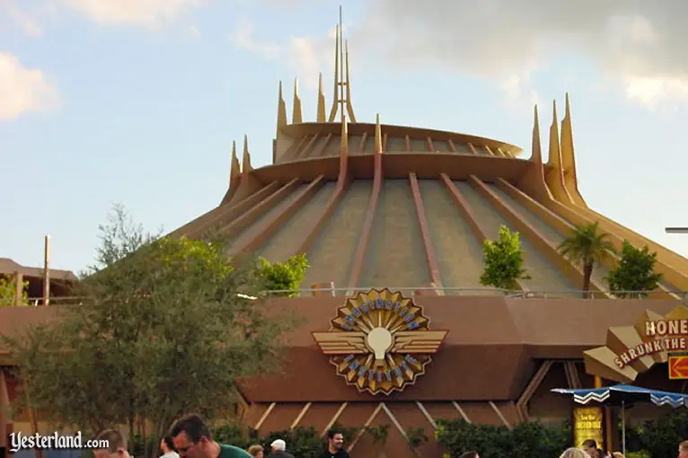
Yeah and we saw at Disneyland what adapting Space Mountain to the new land aesthetic looks like.Well, it's REALLY hard to come up with any other color scheme when you have Space Mountain back there.
Even back in 1994, they start with this strong new direction at the Tomorrowland entrance, and then as you walk through the land, bit by bit dilute it so that it won't clash TOO badly with Space Mountain.
It's better to just embrace the brilliant crystalline modernism.

Register on WDWMAGIC. This sidebar will go away, and you'll see fewer ads.