
drnilescrane
Well-Known Member
I don't think they got rid of purple because they were worried about people confusing the road with a Electronic Toll Road.Except you’re supposed legal decision is one that is clearly contrary to the law. These are “higher level signs” that have their own entirely separate set of criteria. It would be like Disney lowering all of the grab bar is the restrooms because there is a separate criteria for kids and ignoring the primary one for the general public.
If anything, it seems more like the law was written to protect the use of purple since one entity was really using that color in such a manner.
I think they got rid of Univers/switched to Highway Gothic, center aligned the text, changed the instruction to all caps, rounded the corners and changed the position of the guide arrows because Florida decided to more specifically enumerate the standards. All the 1989 signs were much closer to California standards anyway - such as the California style shield for 192 (albeit in Futura).
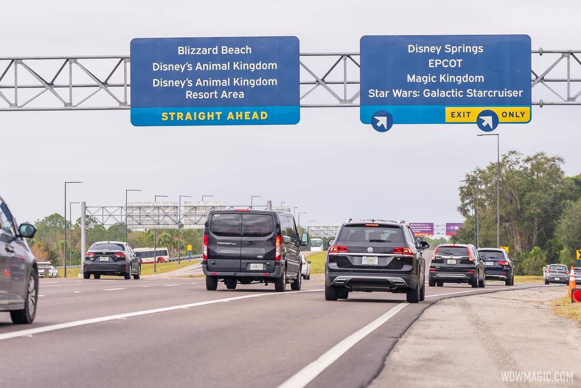
They made the signs blue because they've decided to paint everything blue anyway.
Last edited:
 They could have at the very least gone with the lovely colors of the 50th redesign. But so many changes are in this dull scheme…room refurbs? SNORE.
  Those of us that love sweet and clever Disney touches will have to wait for a regime that loves that too. I predict I’ll die
  before then though.