This thread comes out of a discussion about theming that started in the thread about the new crêperie at the France pavilion. Some of those involved, especially @lazyboy97o, argued that the concept art for the new restaurant contravened a number of French architectural norms, resulting in a bad design out of keeping with earlier Epcot standards. While I agree that the design falls a little flat, I also think it should be acknowledged that World Showcase has always been full of architectural hodgepodges and aberrations that defy the rules of real-world architecture. To be clear, this isn't a dig at the Epoct/EPCOT of old, nor is it a whataboutism in defence of today's Epcot; on the contrary, I believe that what makes the art of theming so special is precisely the fact that it deviates from our actual world even as it evokes it. Half the fun is seeing something familiar reinterpreted in fantastical yet convincing terms. World Showcase is just this type of persuasive fiction.
I was asked to provide some pictures demonstrating the kinds of architectural "mistakes" I'm talking about. I'll keep my examples to those pavilions that deal with the traditions I know best, but others should feel free to add further images.
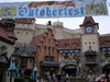
American Adventure
This one I already discussed in the crêperie thread:
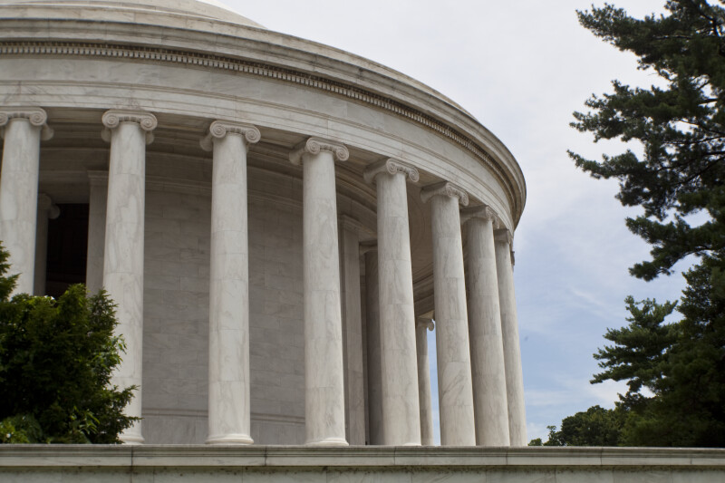
The Ionic column capitals here are perpendicular to the architrave, when they should run parallel with it, as they do at the Jefferson Memorial:
Italy
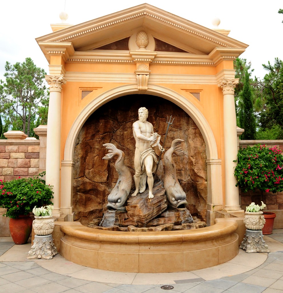
A charming but nonsensical melange (bits of various columns stacked one on top of the other):

The triangular pediment of the fountain contains a pine-cone finial:
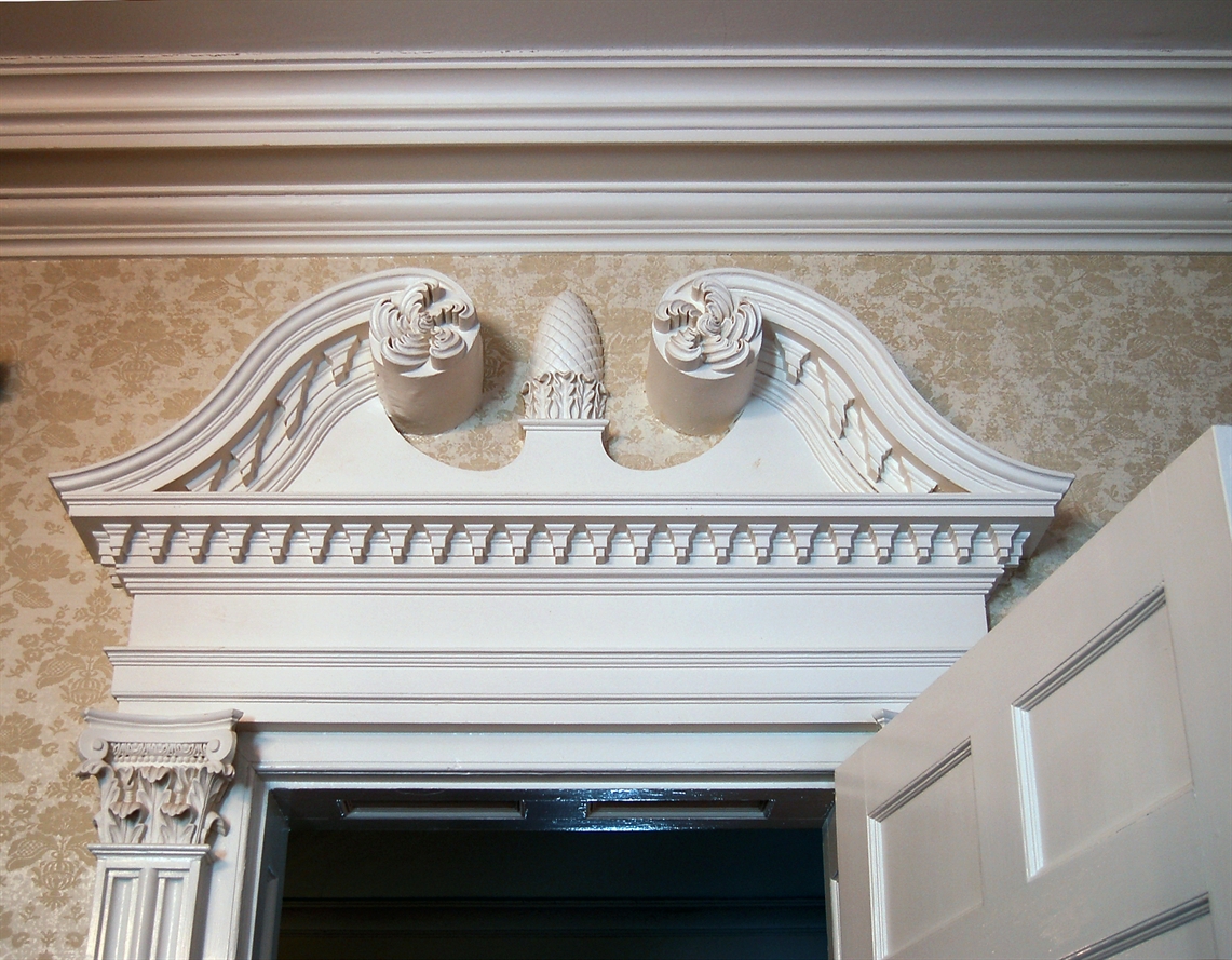
In actual Neoclassical architecture, such finials occur only as elements of broken and swan-neck pediments:
United Kingdom
There's a curious miniature Georgian house jutting out of the side of a larger Georgian building with which it has no logical relationship:

The placement of the chimney would put the fireplaces in the corner of the rooms, right next to the left windows, which is, of course, impossible. (ETA: To correct myself a little, chimneys don't always align with the fireplaces they serve, but the way that this one rises directly out of the building's left corner, breaking up the cornice in the process, is not at all what one would expect of such architecture.) The vertical misalignment of the upper- and lower-storey windows may seem another "off" detail, but there are many Georgian houses in the UK with such irregularity in their facades.
These examples are to say nothing of the cartoonish finish that even some of the more accurately designed buildings exhibit. While a number of the pavilions have elements that are executed using traditional techniques and materials (Morocco really stands out in this regard), others are patently artificial/caricatural in their look and texture. The thatched cottage in the UK pavilion has far more to do with Disney's Alice in Wonderland than anything you'll see in a British village!

And so while the crêperie as shown in the concept art does indeed look uninspired, I for one hope that the Imagineers continue in the quirky footsteps of their predecessors rather than attempt an exact reproduction of an actual French building. If I wanted to see that, I'd go to France.
I was asked to provide some pictures demonstrating the kinds of architectural "mistakes" I'm talking about. I'll keep my examples to those pavilions that deal with the traditions I know best, but others should feel free to add further images.
American Adventure
This one I already discussed in the crêperie thread:
The Ionic column capitals here are perpendicular to the architrave, when they should run parallel with it, as they do at the Jefferson Memorial:
Italy
A charming but nonsensical melange (bits of various columns stacked one on top of the other):
The triangular pediment of the fountain contains a pine-cone finial:
In actual Neoclassical architecture, such finials occur only as elements of broken and swan-neck pediments:
United Kingdom
There's a curious miniature Georgian house jutting out of the side of a larger Georgian building with which it has no logical relationship:
The placement of the chimney would put the fireplaces in the corner of the rooms, right next to the left windows, which is, of course, impossible. (ETA: To correct myself a little, chimneys don't always align with the fireplaces they serve, but the way that this one rises directly out of the building's left corner, breaking up the cornice in the process, is not at all what one would expect of such architecture.) The vertical misalignment of the upper- and lower-storey windows may seem another "off" detail, but there are many Georgian houses in the UK with such irregularity in their facades.
These examples are to say nothing of the cartoonish finish that even some of the more accurately designed buildings exhibit. While a number of the pavilions have elements that are executed using traditional techniques and materials (Morocco really stands out in this regard), others are patently artificial/caricatural in their look and texture. The thatched cottage in the UK pavilion has far more to do with Disney's Alice in Wonderland than anything you'll see in a British village!
And so while the crêperie as shown in the concept art does indeed look uninspired, I for one hope that the Imagineers continue in the quirky footsteps of their predecessors rather than attempt an exact reproduction of an actual French building. If I wanted to see that, I'd go to France.
Last edited: