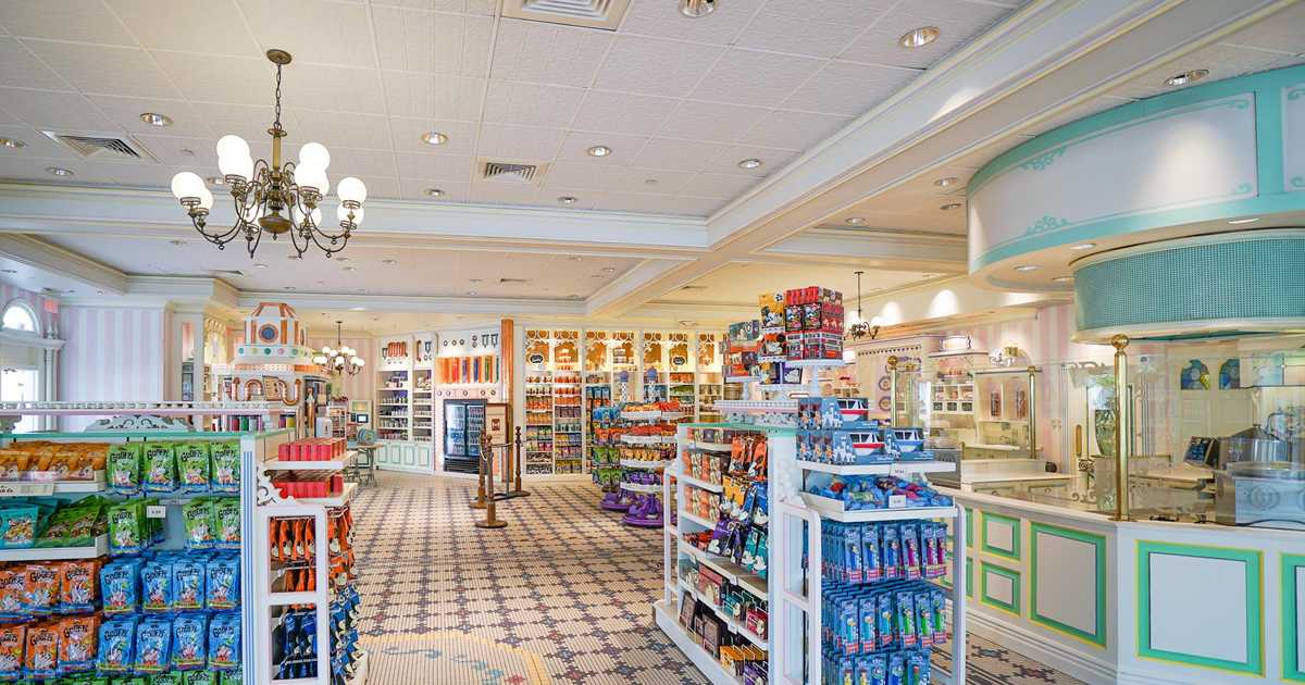
I'm finding hard to feel strongly about this one. A bit bland, but perhaps also slightly better than the old confectionary store and the popcorn area actually looks really well-done.
The only thing that kind of puzzles me is the whole "sweetist spoon" conceit. I take it this is some invented backstory about a prize awarded by the store? If so, it's one of those ways modern WDI understands how to tell stories in the parks that really doesn't appeal to me. Rather than creating convincing environments that tell a story in and of themselves, they seem to love inserting overly elaborate backstories that people really have to stop and read (or lookup online) to understand. In this case, the cartoon images in the front window and on the signs also don't look like either a picture or drawing from the same period as the store which torpedos the effectiveness of the whole thing fleshing out the store as a real place. In other words, that kind of bugs me the most out of all of this as it is the kind of 'theming' that feels forced rather than underwhelming.
Hmm, I guess we all have our triggers!