Scrapbook Challenge October 1-10ish

Fran98765

Member
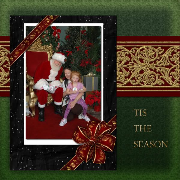
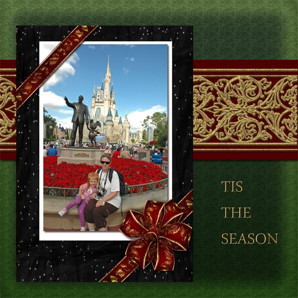
I like that bow too. I agree about the background, it's kinda wishy washy. I would also crop the top ribbon to just on top of the pic and mat, just like the lower one is, that would balance that out better. I would put the horizontal red strip/mat of paper underneath the black mat. And I might suggest putting the title on top of that mat, I am guessing you didn't to show the pattern, but maybe a golden classy font wouldn't detract from that. If you didn't want to do that, maybe make the title smaller and take off the strips or ribbon or whatever the text is on now and just make it smaller and underneath the red strip in a matching red color. I'd also change it to a script font.

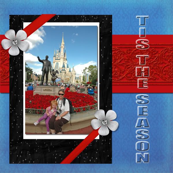
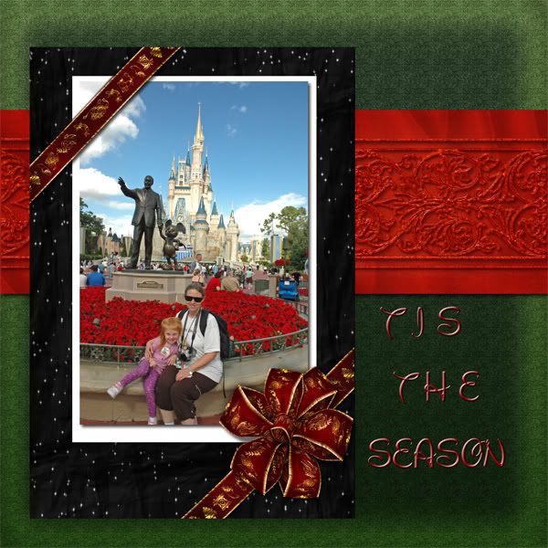
Another thing you might want to do is to straighten out the pic a bit, if your program can do this. Make it so the castle turrets are straight vertical, it will improve the whole layout, just with that one step.
 

eagles

Active Member
is this any better? oops i forgot to check into that straightening tool. i will see if i have that now.

point1.jpg
 

eagles

Active Member
well i found a straighten tool, but it rotated the whole thing all layers. so i guess i don't know how to use it. so this is what i have to work with.

any other suggestions?

oh and thanks for the critiques. any more?
 

eagles

Active Member
i don't know, maybe this picture just doesn't go with any of the layout. something just isn't right. i think i went too christmasey. but the picture itself isn't really christmasey. maybe that is the problem.

so give me some ideas of something to do with this photo! help!! please. :shrug:
 

Disneyfalcon

Well-Known Member
Original Poster
Oh the last one!! I like it. That background is much better. I think the picture is christmassy with all the poinsettas.

Were you trying to use the straighten tool on just the photo? Because you will definitely have to do it that way.

The straighten tool is one of my best friends.:D I had no idea I took so many crooked pictures!!:lol:
 

eagles

Active Member
well see, i just threw in a more christmasey pic, and i like it better. i probably won't use this particular one, but i was just trying it out.

point1b.jpg
 

HollyBelle

Well-Known Member
I think that looks great! My favorite is probably the second to last one. I like the brighter red horizontal layer... I think it ties in with the poinsettias nicely.

I understand what you mean with the "too christmassy" comment. What if you went with a pale-ish blue background (maybe snowflakes on a crisp blue color sky)? I think it would tie into the picture better and still keep the cool christmas feel without going red/green :shrug:.

Either way.. looks good. I like the changes you've made so far.
 

eagles

Active Member
tammy, i tried the straighten tool on just this layer. so are you saying that i have to just use it on the pic in its own canvas, and not in a layer?

you have photoshop, i have elements. so what do i do?


i think the one pic with the pointsettas has to have a different layout. what would you do with that pic?
 

HollyBelle

Well-Known Member
Oooh wait... I posted before I saw your most recent addition! I think you're right about the picture switch...the santa one really ties it all together and balances the page. Looks good!
 

eagles

Active Member
thanks holybelle.

maybe i could try it though with a blueish background.

i just really want that photo to be enhanced more so than most of the pics. i really like my gd and myself in front of walt and the castle. i just have to balance it with the right layout, papers, colors.
 

eagles

Active Member
ok i changed a lot around. what do you think of this one with this photo? oh and look, it has flowers in it! rofl

POINT2.jpg
 

HollyBelle

Well-Known Member
I like the color switch and think it ties in well with the picture. But I think I prefer the "tis the season" horizontally!

Don't you just love digital? It's like a double edge sword... you have the option to make changes, which is wonderful; however, on the other hand you can keep changing til you go crazy... not so wonderful :dazzle:!
 

Disneyfalcon

Well-Known Member
Original Poster
Louella you are cracking me up!! Holly's right, Tis the Season looks better horizontal. I like the new colors but now I'm not really sure Tis the Season works as well for a title. I like the santa one!! That all goes great!

Yes, I mean straighten just the photo before you add it to the page. It works like a charm!
 

eagles

Active Member
ok then, i need something to go down the side. some title or something.

i have no problem getting rid of the tis the season. any ideas for replacing it?

hollybelle, you are so right, it drives me crazy sometimes!
 

Disneyfalcon

Well-Known Member
Original Poster
ok then, i need something to go down the side. some title or something.

i have no problem getting rid of the tis the season. any ideas for replacing it?

hollybelle, you are so right, it drives me crazy sometimes!

No ideas. I am the worst at thinking up titles!!!!:lol:
 

mouselvrmom

Well-Known Member
love your minnie page, minnie. :lol: The pinks are so pretty.

And, eagles, I love your six pages or so you did for this one! I love the christmasy themes you had going, but I also like the one you did with blue later. Gotta love digital.
 

Register on WDWMAGIC. This sidebar will go away, and you'll see fewer ads.

Back
Top Bottom