
-
Welcome to the WDWMAGIC.COM Forums!
Please take a look around, and feel free to sign up and join the community.
You are using an out of date browser. It may not display this or other websites correctly.
You should upgrade or use an alternative browser.
You should upgrade or use an alternative browser.
Repainting of Epcot Central Plaza?
- Thread starter Donald96
- Start date
DisneyGentleman
Well-Known Member
The odd twist is that when Communicore had the metal cladding like SSE, painting was never needed.Painting this area is a good idea, plain and simple. It needs it.
TDO decided to replace the cladding with stucco and paint it in "more inviting" colors.
Odd how our perspective changes with time.
Tom Morrow
Well-Known Member
Painting the buildings back to white, grey, and silver will only emphasize their 1980's design. Painting them warmer colors was to make them look less outdated in the first place. These new colors look fine to me so far, a much needed change from the pink, earthy tones.
jdmdisney99
Well-Known Member
They should re-clad it with a silver and gold look.The odd twist is that when Communicore had the metal cladding like SSE, painting was never needed.
TDO decided to replace the cladding with stucco and paint it in "more inviting" colors.
Odd how our perspective changes with time.
A la...
Tom Morrow
Well-Known Member
Recently some of the neon lighting near Mouse Gear has changed from pink to red. That alone made it look so much more modern and less 90's.
bhg469
Well-Known Member
Im always partial to matte blue.Please go with the black/white/silver.
Figments Friend
Well-Known Member
Yes. The entire EPCOT park-like hub has been replaced the way they have and are now replacing the MK park-lke hub.
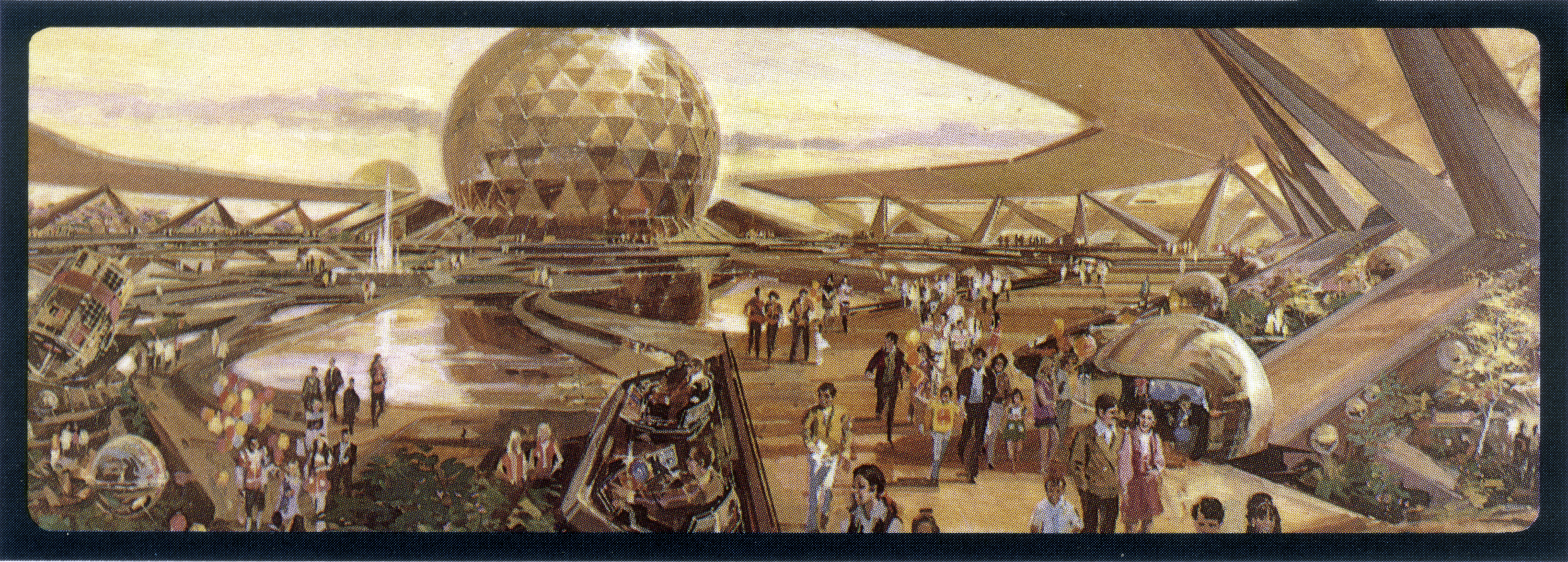
The CC/Innoventions buildings should be subdued colours, set in a park-like plaza, with water and fountains and trees. Then their subdued colours and repetitive facades become elegance. On their own, having to carry an otherwise empty plaza, the restraint and repetition of the architecture turns into boring. The plaza is too large, the architecture too restraint. So this then has to be remedied. But each subsequent attempt to remedy that boring look then only adds clutter and tackiness, from those triangles to cutting the Innoventions buildings in half to those swirly things to current (possible?) polychrome paintjobs.

Beautifully expressed...and dead on correct.
Great photo by the way to hit home the point, of what used to be and how all the original design choices *worked* well together in that area.
Last edited:
articos
Well-Known Member
Sadly, I doubt it will ever look this good again.Yes. The entire EPCOT parklike hub has been replaced the way they have and are now replacing the MK park-lke hub.
The CC/Innoventions buildings should be subdued colours, set in a park-like plaza, with water and fountains and trees. Then their subdued colours and repetitive facades become elegance. On their own, having to carry an otherwise empty plaza, the restraint and repetition of the architecture turns into boring. The plaza is too large, the architecture too restraint. So this then has to be remedied. But each subsequent attempt to remedy that boring look then only adds clutter and tackiness, from those trianges to cutting the Innoventions buildings in half to those swirly things to current (possible?) polychrome paintjobs.
MarkTwain
Well-Known Member
I can dig it. The pink/peach/whatever really needs to go, although I'd prefer they pick a singular color scheme over a mottled approach.
Agreed. It's as if the Imagineers believe all of Disney's "futuristic" is interchangeable. (Actually they probably do)
The "FOUNTAIN VIEW" part looks way too Tomorrowland '94. I love Tomorrowland '94, but not in FW.
Agreed. It's as if the Imagineers believe all of Disney's "futuristic" is interchangeable. (Actually they probably do)
DManRightHere
Well-Known Member
Looks like I'm the only pixie sniffer that likes the color scheme. Maybe I just like the fresh paint look and the color doesn't seem overpowering.
Yes. The entire EPCOT parklike hub has been replaced the way they have and are now replacing the MK park-lke hub.
The CC/Innoventions buildings should be subdued colours, set in a park-like plaza, with water and fountains and trees. Then their subdued colours and repetitive facades become elegance. On their own, having to carry an otherwise empty plaza, the restraint and repetition of the architecture turns into boring. The plaza is too large, the architecture too restraint. So this then has to be remedied. But each subsequent attempt to remedy that boring look then only adds clutter and tackiness, from those trianges to cutting the Innoventions buildings in half to those swirly things to current (possible?) polychrome paintjobs.
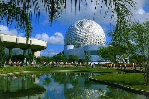
I remember that. I miss that. It was beautiful.
Great picture.
Figment2005
Well-Known Member
I tend to agree and I like it as well. The colors are different but still the same shades. They blend together while also standing out.Looks like I'm the only pixie sniffer that likes the color scheme. Maybe I just like the fresh paint look and the color doesn't seem overpowering.
aladdin2007
Well-Known Member
All the purple poles and triangles need to go while they are at it, but not happening I guess.
Goofnut1980
Well-Known Member
Really with all of the new colors, the neon should just be changed to a white color to compliment all of the colors added.
Better yet! Cut all of the plants down that are blocking those buildings and uplight everything!
Better yet! Cut all of the plants down that are blocking those buildings and uplight everything!
Figments Friend
Well-Known Member
I disagree regarding the removal of more greenery/plants.
What that area needs more of are those very elements, to help visually soften the expansive concrete sprawl.
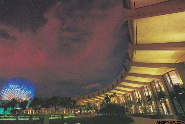
Too much concrete...not enough variety.
It has a urbanized, somewhat cold and disconnected feeling to it...and has for some time since the 90s refresh.
No number of spinning whirlygigs or bright neon lights can cover that up.
It just adds to the overly-cluttered look instead of actually enhancing anything.
The new paint job gives the impression of also being slightly disjointed.
The different hues take away from the sweeping architecture already present.
Just my opinion of course and others will feel differently.
What that area needs more of are those very elements, to help visually soften the expansive concrete sprawl.
Too much concrete...not enough variety.
It has a urbanized, somewhat cold and disconnected feeling to it...and has for some time since the 90s refresh.
No number of spinning whirlygigs or bright neon lights can cover that up.
It just adds to the overly-cluttered look instead of actually enhancing anything.
The new paint job gives the impression of also being slightly disjointed.
The different hues take away from the sweeping architecture already present.
Just my opinion of course and others will feel differently.
jdmdisney99
Well-Known Member
I disagree regarding the removal of more greenery/plants.
What that area needs more of are those very elements, to help visually soften the expansive concrete sprawl.
Too much concrete...not enough variety.
It has a urbanized, somewhat cold and disconnected feeling to it...and has for some time since the 90s refresh.
No number of spinning whirlygigs or bright neon lights can cover that up.
It just adds to the overly-cluttered look instead of actually enhancing anything.
The new paint job gives the impression of also being slightly disjointed.
The different hues take away from the sweeping architecture already present.
Just my opinion of course and others will feel differently.
Oh plaza of yore, how I yearn for thee...
The Empress Lilly
Well-Known Member
Yes, I doubt that too.Sadly, I doubt it will ever look this good again.
The EPCOT hub does not need kinetics. That is alien to its design. It was not build for it, it resists it. The result is nervous unrest at best, crossing over into tackiness at worst.
CC/Innoventions Plaza, the center of EPCOT Center, the spiritual heart of the entire Florida resort, is build for Zen, for calm inspiration. Lively and in motion, but tranquil and subdued. A place of simplicity of design - which is the height of elegant good taste, not the absense of it.
FW in many ways felt like a Japanese garden. Very restraint, every plant and rock and water part serving a purpose. Adding to the harmony, from which the beauty was derived.
Wild colours and 'kinetics additions' feel like taking a Japanese rock garden and adding a statue of Ronald McDonald blowing on a vuvuzela to it, to 'liven it up a bit'. It is buffoonery.

Register on WDWMAGIC. This sidebar will go away, and you'll see fewer ads.