News New Gondola Transportation - Disney Skyliner -

brb1006

Well-Known Member
I'm not saying it does or it doesn't, but, I do not mind the way TTC looks now. What is the big fuss about? I think it looks fine. It's fun, upbeat and bright. Should things be funeral home colors?
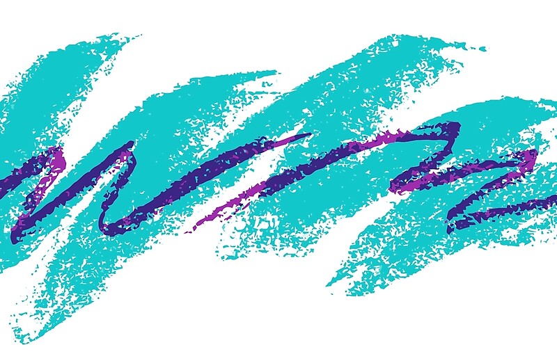
I'm not saying there's anything wrong with the current look. But it feels very 90's with the colors and is just asking for a new design.
 
Last edited:

WDWtraveler

Well-Known Member
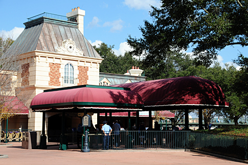
Photo update as of Wednesday, July 5. Construction walls surround the open area at Epcot's International Gateway for the new gondola station.

IMG_9791.JPG

Looking back towards the Beach Club Resort.

IMG_9792.JPG
 

Rob562

Well-Known Member
Updated version with Brazil added at the end. Increased fly speed.


I know this isn't the right forum, but is that definitely the plot they're looking at for Brazil? If the CBR tower will be visible from within the park, it seems like they could put Brazil in the Africa Outpost plot and blend the CBR tower's design into the Brazil pavilion ala Morocco and ToT... It appears to line up perfectly from your video viewpoint.

-Rob
 

nickys

Premium Member
Parisian = International Gateway
Art Deco = DHS
After this, it gets harder...
Stoney = CBR South? Maybe something either like the pool or the PotC queue?
Wavey = AoA/Pop? Something kinda generic to fit both resorts, or tied into the Nemo area, or the station is on the water, after all.
Regal = The only one left would be the new tower, which I believe the theme was called "surprising"? Hmm...
!

Catching up on this thread....

The IG station is behind the UK, not France. That one will be regal.
Martin already gave a huge hint about the "Wave" theme for AOA / POP.
Art Deco has to be DHS.
So a "Stoney" and a Parisian theme for CBR. Maybe the surprising theme for the tower is Parisian?
 

nickys

Premium Member
The International Gateway always seemed more French to me. It's not very close to the UK pavilion, even though it's on the same side of the canal. But maybe they're redoing the shop.

International_Gateway_Epcot.jpg

I agree, kind of! But my reasoning was threefold:

1. It is on the wrong side of the water for France - and the water has always been explained as representing the English Chanel between the UK and France.
2. The plans look like they will have to move the boundary back into the UK slightly.
3. It's much easier to envisage a Parisian theme at the CBR tower than a Regal one. Unless of course by regal Martin is meaning knights and princesses ..... And we're getting a princess themed DVC resort. They wouldn't do that would they? :eek: :eek:
 

GCTales

Well-Known Member
I agree, kind of! But my reasoning was threefold:

1. It is on the wrong side of the water for France - and the water has always been explained as representing the English Chanel between the UK and France.
2. The plans look like they will have to move the boundary back into the UK slightly.
3. It's much easier to envisage a Parisian theme at the CBR tower than a Regal one. Unless of course by regal Martin is meaning knights and princesses ..... And we're getting a princess themed DVC resort. They wouldn't do that would they? :eek: :eek:
An example of French Carribean architecture....

https://s-media-cache-ak0.pinimg.co...ff95474120--huge-houses-dream-home-design.jpg
 

Cosmic Commando

Well-Known Member
I agree, kind of! But my reasoning was threefold:

1. It is on the wrong side of the water for France - and the water has always been explained as representing the English Chanel between the UK and France.
2. The plans look like they will have to move the boundary back into the UK slightly.
3. It's much easier to envisage a Parisian theme at the CBR tower than a Regal one. Unless of course by regal Martin is meaning knights and princesses ..... And we're getting a princess themed DVC resort. They wouldn't do that would they? :eek: :eek:
I wouldn't be shocked if you were right, but I still don't see it that way.
1. The IG has always looked this way, and I think you could call it "Parisian" pretty easily. WDI loses meanings for things as people move on.
2. The way the station is, it will only bump into the backstage of the pavilion. It's already pretty far from the UK pavilion, and I don't think the gondola will make it any closer. I think the safest bet is that it will look like the IG looks like now. See #1.
3. I could see a tower that takes a heavy French influence, since France has/had a presence in the region. I could see a regal tower. I could see a Parisian IG station. I can't really see a "regal" IG station, as the regular stations that people are posing as reference are all pretty small. I think a regal tower with a gondola station as a part of it makes more sense.
 

Goofyernmost

Well-Known Member
I'm not saying there's anything wrong with the current look. But it feels very 90's with the colors and is just asking for a new design.
I guess that is what I don't understand. What exactly is a 90's color. Do we not have the same color pallet today that we had 20 years ago. Did someone change colors on us. What would make it look like the 2000's? What would be different if you were trying to convey light hearted fun, whimsy and entertainment? I don't understand. I can understand clothing fashion changing with the times, but, I do not understand what color(s) the look should be like for now.

Is it, once again, a problem that is confined to only those of us that go there often and feel the need to see something different or do we feel that it affects or "turns off" first timers as well as veterans? Please don't tell me that it should be some type of variation of that godawful purple that they have painted the rocks in Tomorrowland, because that color is terrible and doesn't even have a connection to anything that means the future. Besides there is enough purple in WDW already.
 

Minthorne

Well-Known Member
I guess that is what I don't understand. What exactly is a 90's color. Do we not have the same color pallet today that we had 20 years ago. Did someone change colors on us. What would make it look like the 2000's? What would be different if you were trying to convey light hearted fun, whimsy and entertainment? I don't understand. I can understand clothing fashion changing with the times, but, I do not understand what color(s) the look should be like for now.

Is it, once again, a problem that is confined to only those of us that go there often and feel the need to see something different or do we feel that it affects or "turns off" first timers as well as veterans? Please don't tell me that it should be some type of variation of that godawful purple that they have painted the rocks in Tomorrowland, because that color is terrible and doesn't even have a connection to anything that means the future. Besides there is enough purple in WDW already.

It's exactly that purple/green/yellow clash of colors I dislike at the TTC - but you can't please everyone's taste. I really dislike the GF but I like the Contemporary - so I'm glad there are lots of different aesthetics.
 

Creathir

Premium Member
I guess that is what I don't understand. What exactly is a 90's color. Do we not have the same color pallet today that we had 20 years ago. Did someone change colors on us. What would make it look like the 2000's? What would be different if you were trying to convey light hearted fun, whimsy and entertainment? I don't understand. I can understand clothing fashion changing with the times, but, I do not understand what color(s) the look should be like for now.

Is it, once again, a problem that is confined to only those of us that go there often and feel the need to see something different or do we feel that it affects or "turns off" first timers as well as veterans? Please don't tell me that it should be some type of variation of that godawful purple that they have painted the rocks in Tomorrowland, because that color is terrible and doesn't even have a connection to anything that means the future. Besides there is enough purple in WDW already.

I personally do not care for the architecture of the TTC, but the colors themselves are representative of Disney Transportation in general.

The same color scheme is carried thru on buses, parking lot trams, even road signage across the entire resort.

I doubt they would abandon the entire scheme, but they could incorporate it differently than has been done today.

Honestly, the TTC looks dated in my opinion. I'm not sure "90s" is even recent enough.

From my eye, it looks like late 70s/early 80s hopes of what the future would appear to be, similar to Futureworld. It does this while having the feeling of being the snack stand at a 50s drive in theater.

Nothing about it screams the entrance to a magical kingdom just ahead, but some of that might be my being used to it due to the number of trips I've taken over my life.

But alas, it won't matter.

I'm sure redesigning something that works just for asthetics is at the very bottom of the to do list for WDW.
 

Goofyernmost

Well-Known Member
That's not color, that is design. The design at TTC doesn't express any date to me. It is a show piece. So again, we are talking about individual tastes, not a hard fact of easily defined parameters. We may think of it as 90's because that is when we started to see it, to people that never saw it before it doesn't define any era. We must grasp that a place like WDW has to be neutral in the respect that you don't alter things because a few have an image. It is done to work with the majority and in this case, the majority doesn't give a rats tail about it except in the sense that it helps identify a feeling. I have always felt that the feeling was that of happy and fun, bright and cheery!
 

Monorail_Orange

Well-Known Member
It's exactly that purple/green/yellow clash of colors I dislike at the TTC - but you can't please everyone's taste. I really dislike the GF but I like the Contemporary - so I'm glad there are lots of different aesthetics.
Just to be funny, hope you don't plan on heading to New Orleans for Mardi Gras, the whole town becomes purple, green, and gold/yellow.
 

Register on WDWMAGIC. This sidebar will go away, and you'll see fewer ads.

Back
Top Bottom