Repainting of Epcot Central Plaza?

ToTBellHop

Well-Known Member
Oh, ok. Then why do you...


?
Just because this is the final paint scheme for a portion of the plaza does not mean this is the finished product. There is more to the plaza than these walls.

This is in no way to suggest that we will LIKE the finished product. Just that they aren't done with the plaza yet.
 

Figments Friend

Well-Known Member
To address the comments on WDI..... There is always going to be the case of young, inexperienced designers getting their feet wet on projects. One has the ambition to create and feel like you are going to be the one to make a profound difference in the projects you work on. But the reality is that starting out you just don't have all the tools and experience to bring projects to a level of sophistication they need to be.

I feel that Mentors are the key to the success of a design studio. Good mentors will be able to recognize the talents of their new designers and help them to be their best -- and most important, make them feel included in the creative process. Too many times I have seen people move on because they feel under-appreciated. When it become a battle of wills, the project deteriorates. A successful effort is collaborative as it brings out the best talents of everyone.

But it works both ways as well -- being a young arrogant designer is not going to get you anywhere because the keys to success is expanding your abilities and experience. Many of the people I have seen move on do so because they allowed their egos to get in the way. Even if you are working for someone you don't like, they may have the knowledge you need to improve yourself. Thus as a young designer it's important to have an open mind so that you can uncover the important things that will make you a success later on.

Not sure if this exactly applies to WDI, (my experience is in architecture), though design realities seem to be pretty similar everywhere. It may help those who encounter Imagineering to understand the dynamics better, and offer some advise to those pursuing a design career.

THIS....so much this.
The second paragraph in particular.
A great post that cuts directly to the heart of the matter.

This is why there have been such missteps - the breakdown of the once illustrious Mentor/Mentee program.
 

Figments Friend

Well-Known Member
Definitely. There's no better example of that than all those flat screens installed on Spaceship Earth. The concept of those being a finale to a show to the exclusion of all else says a lot about the mindset involved. (At least when George McGinnis developed the traveling screens for Horizons he was thinking on a more encompassing scale.) Look beyond your screens!

I have also noticed, (for a while now), a growing reliance on being "clever" as if adding puns everywhere is a new level of sophistication, (case in point, the original DCA and it's pun-tabulous signs everywhere). I'm not sure if that is a generational mindset or the direction of a few misguided directors at WDI, (hopefully long gone now).

Agree. I also always found the addition of the screens into SSE a negative.
I also find it bitterly ironic, as tv screens were painted as the arch enemy of humankinds progress in one of the famous novels that inspired the Attraction.
How is that for paying attention to your sources..?

Putting screens in there...it was a sad sign of the times to me.
It sounded promising pre-reopening after the addition...ala a *Horizons* more serious approach...but when it came to light it was yet another joke-infused interactive gimmick...well.....
Yeah. SSE kind of lost a bit of it*s once towering grandeur.

It hurts to see this happen to a work of art you had a lot of appreciation and respect for over the years.
It hurts more then just a bunch of *Park geeks* too...it hurts the art form.
 
Last edited:

xdan0920

Think for yourselfer
Just because this is the final paint scheme for a portion of the plaza does not mean this is the finished product. There is more to the plaza than these walls.

This is in no way to suggest that we will LIKE the finished product. Just that they aren't done with the plaza yet.

The other poster was saying this wasn't the final paint scheme. That's what I was referencing. I know the plaza has more work coming, I think Steve actually confirmed that earlier in the thread?
 

Omnispace

Well-Known Member
THIS....so much this.
The second paragraph in particular.
A great post that cuts directly to the heart of the matter.

This is why there have been such missteps - the breakdown of the once illustrious Mentor/Mentee program.

I got to say that I don't know whether or not this paint scheme is an example of some breakdown in mentoring at WDI. It could have been generated outside that realm. It could be the result of a creative collaboration. I was just trying to provide some insight into the world of design. You are going to meet people at all levels and abilities and it's always going to be a matter of bold fresh ideas versus a more moderated level of expertise. One needs those crazy ideas to push the realm of creativity -- and then temper it a bit to make it work properly.

To me this new paint scheme is pretty bold -- perhaps too bold -- but I get what they are trying to do. To me it seems more Mid-Century Modern, like what one would see in the early 60's, perhaps even at the Seattle or New York fairs. I like the use of color on buildings but a more muted scheme would have allowed for the variations in the colors to jazz up the buildings a bit without being so visually overpowering. But it does generate visual excitement and good or bad that's what they may still be going for.

Certainly, several people on this board are able to react more from a perspective of experience, their personal experience of what those initial years at Epcot felt like -- grand spaces that felt modern because of their scale and minimalist approach. In the original Epcot, there was an attempt to have the content of the shows drive the excitement and the grounds to be more contemplative.

When it comes to futuristic environments, I personally like Syd Mead's "supersonic baroque" approach where he "wraps" pattern around simple forms to create a wonderful balance of tech and ornamentation. It's an incredible skill that he has and in the wrong hands I am sure can be disastrous. But I honestly wish that was more the direction that Disney would take with Future World rather than trying to be trendy in any regard.
 

Omnispace

Well-Known Member
Agree. I also always found the addition of the screens into SSE a negative.
I also find it bitterly ironic, as tv screens were painted as the arch enemy of humankinds progress in one of the famous novels that inspired the Attraction.
How is that for paying attention to your sources..?

Putting screens in there...it was a sad sign of the times to me.
It sounded promising pre-reopening after the addition...ala a *Horizons* more serious approach...but when it came to light it was yet another joke-infused interactive gimmick...well.....
Yeah. SSE kind of lost a bit of it*s once towering grandeur.

It hurts to see this happen to a work of art you had a lot of appreciation and respect for over the years.
It hurts more then just a bunch of *Park geeks* too...it hurts the art form.

That's an interesting take on it. I wasn't aware that Bradbury based his treatment of SSE on any particular novel though he did seem very sensitive to the human condition in much of his work. With regards to the touchscreens, to me it comes off as if someone thought they were very cool to the exclusion of all else, or perhaps they were a simple idea that got out of hand. Technology was used for the sake of showing off technology. I'll admit that I see a certain appeal to them, but as you say it has a lot to do with the execution. Whatever the intent, it unfortunately comes off as gimmicky and trite. The addition of the touchscreens adds no profound concept to the experience and to me speaks of the limited mindset regarding the concept of "interaction". Perhaps at some time someone will figure out something better to do with them but for the time being we are stuck with an Esurance commercial -- even Esurance has since moved on, (gotta love Beatrice).

To me, that limited mindset regarding a concept also applies to the Leave A Legacy project. Those involved were stuck in the mindset that such a memorial had to be physical. The irony is that on the dawn of a new millennium, large static stones were being erected, ignoring any lessens learned about sight lines in the process. Wouldn't it have been exciting to have people's "legacy" be a message (video) they record for those in the future? It would be infinitely accessible, even today -- metaphysical in the sense of having our ideas and thoughts transcend time. It would have tied-in wonderfully with Spaceship Earth which at that time was a story about communication. You just have to look beyond those screens.
 

ChrisFL

Premium Member
That's an interesting take on it. I wasn't aware that Bradbury based his treatment of SSE on any particular novel though he did seem very sensitive to the human condition in much of his work. With regards to the touchscreens, to me it comes off as if someone thought they were very cool to the exclusion of all else, or perhaps they were a simple idea that got out of hand. Technology was used for the sake of showing off technology. I'll admit that I see a certain appeal to them, but as you say it has a lot to do with the execution. Whatever the intent, it unfortunately comes off as gimmicky and trite. The addition of the touchscreens adds no profound concept to the experience and to me speaks of the limited mindset regarding the concept of "interaction". Perhaps at some time someone will figure out something better to do with them but for the time being we are stuck with an Esurance commercial -- even Esurance has since moved on, (gotta love Beatrice).

To me, that limited mindset regarding a concept also applies to the Leave A Legacy project. Those involved were stuck in the mindset that such a memorial had to be physical. The irony is that on the dawn of a new millennium, large static stones were being erected, ignoring any lessens learned about sight lines in the process. Wouldn't it have been exciting to have people's "legacy" be a message (video) they record for those in the future? It would be infinitely accessible, even today -- metaphysical in the sense of having our ideas and thoughts transcend time. It would have tied-in wonderfully with Spaceship Earth which at that time was a story about communication. You just have to look beyond those screens.

Excellent post.
 

Bocabear

Well-Known Member
That's an interesting take on it. I wasn't aware that Bradbury based his treatment of SSE on any particular novel though he did seem very sensitive to the human condition in much of his work. With regards to the touchscreens, to me it comes off as if someone thought they were very cool to the exclusion of all else, or perhaps they were a simple idea that got out of hand. Technology was used for the sake of showing off technology. I'll admit that I see a certain appeal to them, but as you say it has a lot to do with the execution. Whatever the intent, it unfortunately comes off as gimmicky and trite. The addition of the touchscreens adds no profound concept to the experience and to me speaks of the limited mindset regarding the concept of "interaction". Perhaps at some time someone will figure out something better to do with them but for the time being we are stuck with an Esurance commercial -- even Esurance has since moved on, (gotta love Beatrice).

To me, that limited mindset regarding a concept also applies to the Leave A Legacy project. Those involved were stuck in the mindset that such a memorial had to be physical. The irony is that on the dawn of a new millennium, large static stones were being erected, ignoring any lessens learned about sight lines in the process. Wouldn't it have been exciting to have people's "legacy" be a message (video) they record for those in the future? It would be infinitely accessible, even today -- metaphysical in the sense of having our ideas and thoughts transcend time. It would have tied-in wonderfully with Spaceship Earth which at that time was a story about communication. You just have to look beyond those screens.
THIS! Yes! Look forward not back to dead stone monuments… The grandeur that was Communicore and the entry plaza are lost at this point… the very expensive and massive Lucite sculpture has been missing for a decade or more, the entry looks cramped and littered…the same with the plaza beyond. There are so many ways this could be improved without employing multicolor stripes on the buildings…
 

Horizons1

Well-Known Member
image.jpg image.jpg image.jpg

Today.
 

DisneyGentleman

Well-Known Member
To me this new paint scheme is pretty bold -- perhaps too bold -- but I get what they are trying to do. To me it seems more Mid-Century Modern, like what one would see in the early 60's, perhaps even at the Seattle or New York fairs. I like the use of color on buildings but a more muted scheme would have allowed for the variations in the colors to jazz up the buildings a bit without being so visually overpowering. But it does generate visual excitement and good or bad that's what they may still be going for.

Well, you may get what they are trying to do, but the color scheme has nothing in common with Mid-Century Modern. Rae Eames would be turning over in her grave to see her wonders invoked in this nightmare. And Mary Blair, who understood color like no other, would be aghast at this monstrosity.

If you want to see Mid-Century Modern in WDW, ride ISW. Mary Blair got it! Innoventions looks more like a Walmart trash bin.
 

TP2000

Well-Known Member
To me this new paint scheme is pretty bold -- perhaps too bold -- but I get what they are trying to do. To me it seems more Mid-Century Modern, like what one would see in the early 60's, perhaps even at the Seattle or New York fairs. I like the use of color on buildings but a more muted scheme would have allowed for the variations in the colors to jazz up the buildings a bit without being so visually overpowering.

I really appreciate your thoughts, but this new Future World palette looks far more brutal and tacky than the relatively cohesive and tasteful design language of the 1962 Seattle World's Fair. Particularly the big pavilions and host buildings built by Seattle, the federal government, or the state of Washington, all of them done uniformly in tasteful white at the direction of the Fair organizers.

nk_c21_pac_sci_ctr_1962.jpg


Now the far more garish New York fair, where there were no real uniform design standards applied to the various pavilions, is another story.

But the latest Epcot paint party seems like just what it is; a misguided "freshening" attempt by WDW leadership who have no idea what Epcot is supposed to be, being project managed by third-string Imagineers who were probably in diapers when Epcot was in its heyday in the 1980's. Call it "Kaleidoscope" or call it "Kitty Litter", I don't care, but it's still tacky looking. :arghh:
 

Father Robinson

Well-Known Member
I will say one thing, and I do apologize if it's been mentioned before.. At least to me, it's refreshing to know that there is this massive repainting project going on in the heart of FW, and yet there are no visible workers, no cranes or scrims, etc.. I'm not saying I agree with the color scheme, but for once I am agreeing with their approach to keeping the maintenance work for times when guests aren't present.
 

The Empress Lilly

Well-Known Member
That pic on the left looks really good. Nice, subdued, harmonious two-colour scheme. Calm, self-assured design. They should've gone with just that. One can argue whether that is the best paint job possible for InnoVentions, but at least it has got merit of its own.

The second and third pictures of the kaleidoscope are Kitty Litter. The work of people whose transgression from playing with the crayon box to professional designer has been to learn to apply fancy terminology and postmodern non-babble to their drawings.
 

note2001

Well-Known Member

Agreed. I'm hoping the buildings don't look as nauseating in person as they do in pic (however, what a horrible way for Disney to leave photo memories of EPCOT for families)

I suspect I'll need to pass by distracted to keep my eyes in line with my stomach. Keep looking at the phone... keep looking at the phone.
 

Omnispace

Well-Known Member
Well, you may get what they are trying to do, but the color scheme has nothing in common with Mid-Century Modern. Rae Eames would be turning over in her grave to see her wonders invoked in this nightmare. And Mary Blair, who understood color like no other, would be aghast at this monstrosity.

If you want to see Mid-Century Modern in WDW, ride ISW. Mary Blair got it! Innoventions looks more like a Walmart trash bin.

Sorry I didn't explain my thoughts on that better. It just seems that MCM used to a certain extent the theme of "blocks" of color in the designs of the day. Sometimes the blocks were more like blobs or stripes but the pallet often included alternating or contrasting colors. I'm not sure if it was because of artists like Alexander Calder or Piet Mondrian and their vivid use of colors but to me it's something I notice was in vogue. So to me, the paint scheme on the Innoventions buildings makes me think of that period of design -- blocks of color -- that's all.

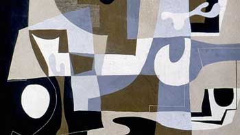
It's cool you are such an admirer of Mary Blair and Ray Eames. They are definitely worthy examples to study. There was recently an excellent exhibit on Ray Eames in Sacramento. Ray didn't seem to use as saturated colors as Mary but she had a wonderful sense of color combinations and I love the biomorphic shapes she used in her work. Here's an example of one of her paintings.

ray-eames-painting.jpg


I also like this photo of Ray Eames with some tall stacking forms which I recall from the exhibit. They were a prototype for "The Toy".

ccb405f233a1488dffb7d1b52a70c43f.jpg
 

Omnispace

Well-Known Member
I really appreciate your thoughts, but this new Future World palette looks far more brutal and tacky than the relatively cohesive and tasteful design language of the 1962 Seattle World's Fair. Particularly the big pavilions and host buildings built by Seattle, the federal government, or the state of Washington, all of them done uniformly in tasteful white at the direction of the Fair organizers.

nk_c21_pac_sci_ctr_1962.jpg


Now the far more garish New York fair, where there were no real uniform design standards applied to the various pavilions, is another story.

But the latest Epcot paint party seems like just what it is; a misguided "freshening" attempt by WDW leadership who have no idea what Epcot is supposed to be, being project managed by third-string Imagineers who were probably in diapers when Epcot was in its heyday in the 1980's. Call it "Kaleidoscope" or call it "Kitty Litter", I don't care, but it's still tacky looking. :arghh:

That's an amazing photo of the US Science Pavilion! It's still there! ...and they haven't painted the panels all different colors. ;) I agree with what you say and I am not trying to defend the decisions taken with the Innoventions Buildings. Personally, I am more of the camp that would prefer the buildings be understated as they were intended to be, remove the covers on all those windows, and allow the excitement to be created in other ways. Or even better, go Syd Mead "supersonic baroque" in the design. But that's just me.

Here's a favorite photo of mine from the Seattle '62 fair. It is basically standing in front of the science pavilion looking north. Unfortunately, I forgot where I found it. It's taken looking into the light and it's not quite level but the photographer was able to capture a special energy about the place -- the way the people are moving about, the layering of pavilions and blocks of colors! Those panels of colors are similar to what I was describing above. They are actually suspended on wires from the supports above and add a visual excitement to the area. I suppose one could call it a fair or festival aesthetic. I'm not saying it's right for Epcot but the Seattle Fair did have color -- it was just done judiciously.

5086203565_1b6cf376c0_o.jpg
 

Register on WDWMAGIC. This sidebar will go away, and you'll see fewer ads.

Back
Top Bottom